## Comparative Histograms: Logit-Boost and Entropy Drop Distributions
### Overview
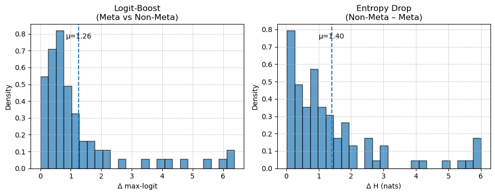
The image displays two side-by-side histograms comparing statistical distributions related to a "Meta" versus "Non-Meta" analysis. The left histogram visualizes the distribution of "Logit-Boost," while the right histogram visualizes the distribution of "Entropy Drop." Both charts share a similar visual style, using blue bars on a white background with grid lines, and each includes a vertical dashed line indicating the mean (μ) of the distribution.
### Components/Axes
**Left Histogram:**
* **Title:** `Logit-Boost (Meta vs Non-Meta)`
* **X-axis Label:** `Δ max-logit`
* **Y-axis Label:** `Density`
* **X-axis Scale:** Linear scale from 0 to 6, with major tick marks at every integer (0, 1, 2, 3, 4, 5, 6).
* **Y-axis Scale:** Linear scale from 0.0 to 0.8, with major tick marks at 0.0, 0.1, 0.2, 0.3, 0.4, 0.5, 0.6, 0.7, 0.8.
* **Annotation:** A vertical, dashed blue line is positioned at approximately x = 1.26. The text `μ=1.26` is placed to the right of this line, near the top of the chart.
**Right Histogram:**
* **Title:** `Entropy Drop (Non-Meta – Meta)`
* **X-axis Label:** `Δ H (nats)`
* **Y-axis Label:** `Density`
* **X-axis Scale:** Linear scale from 0 to 6, with major tick marks at every integer (0, 1, 2, 3, 4, 5, 6).
* **Y-axis Scale:** Linear scale from 0.0 to 0.8, with major tick marks at 0.0, 0.1, 0.2, 0.3, 0.4, 0.5, 0.6, 0.7, 0.8.
* **Annotation:** A vertical, dashed blue line is positioned at approximately x = 1.40. The text `μ=1.40` is placed to the right of this line, near the top of the chart.
### Detailed Analysis
**Left Histogram (Logit-Boost):**
* **Trend Verification:** The distribution is strongly right-skewed (positively skewed). The highest density of data points is concentrated on the left side (low Δ max-logit values), with a long tail extending to the right towards higher values.
* **Data Points (Approximate Bar Heights):**
* Bin 0.0-0.5: Density ≈ 0.55
* Bin 0.5-1.0: Density ≈ 0.71
* Bin 1.0-1.5: Density ≈ 0.82 (This is the peak of the distribution)
* Bin 1.5-2.0: Density ≈ 0.49
* Bin 2.0-2.5: Density ≈ 0.32
* Bin 2.5-3.0: Density ≈ 0.16
* Bin 3.0-3.5: Density ≈ 0.11
* Bin 3.5-4.0: Density ≈ 0.05
* Bin 4.0-4.5: Density ≈ 0.05
* Bin 4.5-5.0: Density ≈ 0.05
* Bin 5.0-5.5: Density ≈ 0.05
* Bin 5.5-6.0: Density ≈ 0.05
* Bin 6.0-6.5: Density ≈ 0.11
* **Mean (μ):** 1.26. The mean is located to the right of the distribution's peak (mode), which is characteristic of a right-skewed distribution.
**Right Histogram (Entropy Drop):**
* **Trend Verification:** This distribution is also right-skewed, with the highest density at the lowest values and a tail extending to the right.
* **Data Points (Approximate Bar Heights):**
* Bin 0.0-0.5: Density ≈ 0.79 (This is the peak of the distribution)
* Bin 0.5-1.0: Density ≈ 0.48
* Bin 1.0-1.5: Density ≈ 0.35
* Bin 1.5-2.0: Density ≈ 0.57
* Bin 2.0-2.5: Density ≈ 0.35
* Bin 2.5-3.0: Density ≈ 0.30
* Bin 3.0-3.5: Density ≈ 0.17
* Bin 3.5-4.0: Density ≈ 0.26
* Bin 4.0-4.5: Density ≈ 0.13
* Bin 4.5-5.0: Density ≈ 0.05
* Bin 5.0-5.5: Density ≈ 0.05
* Bin 5.5-6.0: Density ≈ 0.05
* Bin 6.0-6.5: Density ≈ 0.17
* **Mean (μ):** 1.40. Similar to the left chart, the mean is to the right of the peak.
### Key Observations
1. **Skewness:** Both distributions are right-skewed, indicating that for most observations, the difference (`Δ`) between Meta and Non-Meta conditions is relatively small. However, there is a subset of observations where the difference is considerably larger.
2. **Peak Location:** The peak density for Logit-Boost occurs in the 1.0-1.5 bin, while for Entropy Drop, it occurs in the 0.0-0.5 bin. This suggests the most common magnitude of change is slightly different between the two metrics.
3. **Mean vs. Peak:** In both charts, the mean (μ) is greater than the value at the peak density (mode), confirming the right skew.
4. **Range:** Both metrics show differences spanning the full observed range from 0 to over 6 units.
5. **Visual Similarity:** The overall shape and spread of the two distributions are visually similar, suggesting a potential correlation in how these two metrics (logit boost and entropy drop) respond to the Meta vs. Non-Meta comparison.
### Interpretation
These histograms provide a comparative statistical view of two performance or behavioral metrics—Logit-Boost and Entropy Drop—in a "Meta" learning or modeling context versus a "Non-Meta" baseline.
* **What the data suggests:** The right-skewed distributions imply that the "Meta" approach typically yields a modest improvement (or change) over the "Non-Meta" approach for the majority of cases. The long tail to the right indicates that for a smaller number of instances, the Meta approach leads to a substantially larger boost in logit scores or a larger drop in entropy.
* **Relationship between elements:** The side-by-side presentation invites direct comparison. The fact that both metrics show similar distributional shapes (right-skewed, similar range) suggests they may be capturing related aspects of the Meta method's effect. A larger `Δ max-logit` (left chart) likely corresponds to a more confident prediction from the Meta model. A larger `Δ H` (right chart) indicates a greater reduction in uncertainty (entropy) by the Meta model compared to the Non-Meta model.
* **Notable patterns/anomalies:** The presence of data points at the far right of both histograms (Δ > 6) is notable. These represent outlier cases where the Meta method had an exceptionally strong effect. The slight difference in peak location (1.0-1.5 for Logit-Boost vs. 0.0-0.5 for Entropy Drop) might indicate that while entropy often drops by a very small amount, the corresponding logit boost is slightly more distributed. The analysis would benefit from knowing the sample size and the specific context of "Meta" (e.g., meta-learning, metadata) to draw more concrete conclusions about the practical significance of these distributions.