## Line Chart with Scatter Plots and Histograms: Prompt Type vs. Mean Accuracy
### Overview
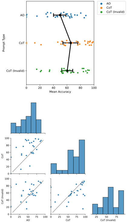
The image presents a line chart with scatter plots overlaid, alongside three scatter plots with histograms. The primary chart shows the relationship between "Prompt Type" (AO, CoT, CoT (Invalid)) and "Mean Accuracy". The lower section contains three scatter plots, each comparing two prompt types (AO vs. CoT, CoT vs. CoT (Invalid), and AO vs. CoT (Invalid)), with corresponding histograms on the x and y axes.
### Components/Axes
* **Y-axis (Main Chart):** "Prompt Type" with categories: "AO", "CoT", and "CoT (Invalid)".
* **X-axis (Main Chart):** "Mean Accuracy" ranging from 0 to 100.
* **Legend (Top-Right):**
* Blue: "AO"
* Orange: "CoT"
* Green: "CoT (Invalid)"
* **X-axis (Scatter Plots):** Varies depending on the plot, but represents one of the prompt types (AO, CoT, CoT (Invalid)) ranging from 0 to 100.
* **Y-axis (Scatter Plots):** Represents the other prompt type (AO, CoT, CoT (Invalid)) ranging from 0 to 100.
* **Histograms (Scatter Plots):** Display the distribution of values for each prompt type along the respective axes.
### Detailed Analysis or Content Details
**Main Chart:**
* **AO (Blue):** The blue scatter points are relatively consistent across the "Mean Accuracy" range, generally between 60 and 90, with a slight downward trend. Approximately 20 data points are visible.
* **CoT (Orange):** The orange scatter points show a wider spread, starting around 20 and increasing to approximately 90. Approximately 15 data points are visible.
* **CoT (Invalid) (Green):** The green scatter points are clustered between 0 and 60, with a decreasing trend. Approximately 10 data points are visible.
* **Connecting Line (Black):** A black line connects the average "Mean Accuracy" for each "Prompt Type". It starts at approximately 70 for AO, decreases to approximately 50 for CoT, and then drops sharply to approximately 20 for CoT (Invalid). Error bars are present for AO and CoT, indicating variability.
**Scatter Plots:**
* **AO vs. CoT (Top-Left):** A positive correlation is visible, with points generally trending upwards. The black dashed line represents the trendline. The histogram for AO is centered around 75, while the histogram for CoT is centered around 50.
* **CoT vs. CoT (Invalid) (Top-Center):** A positive correlation is visible, with points generally trending upwards. The black dashed line represents the trendline. The histogram for CoT is centered around 60, while the histogram for CoT (Invalid) is centered around 20.
* **AO vs. CoT (Invalid) (Bottom-Right):** A positive correlation is visible, with points generally trending upwards. The black dashed line represents the trendline. The histogram for AO is centered around 75, while the histogram for CoT (Invalid) is centered around 20.
### Key Observations
* "CoT (Invalid)" consistently exhibits the lowest "Mean Accuracy" across all charts.
* "AO" generally performs better than "CoT" and significantly better than "CoT (Invalid)".
* Positive correlations are observed between all prompt type pairs in the scatter plots.
* The histograms reveal that "CoT (Invalid)" has a distribution skewed towards lower accuracy values.
### Interpretation
The data suggests that the "CoT (Invalid)" prompt type leads to significantly lower accuracy compared to "AO" and "CoT". The line chart clearly demonstrates this performance gap. The scatter plots confirm a positive correlation between prompt types, meaning higher accuracy with one prompt type generally corresponds to higher accuracy with another. However, the "CoT (Invalid)" prompt consistently underperforms.
The histograms provide insight into the distribution of accuracy scores for each prompt type. The skewed distribution of "CoT (Invalid)" indicates a higher frequency of low accuracy scores. The positive correlations in the scatter plots suggest that the underlying capabilities of the model are consistent across prompt types, but the "CoT (Invalid)" prompt is hindering performance.
The "CoT" prompt appears to be less effective than "AO", but still significantly better than "CoT (Invalid)". This suggests that the issue isn't simply the use of Chain-of-Thought prompting, but rather the specific implementation or validity of the "CoT" prompts being used. The error bars on the main chart indicate that there is variability within each prompt type, but the overall trend remains consistent.