\n
## Line Chart: Perplexity Improvement vs. Iteration
### Overview
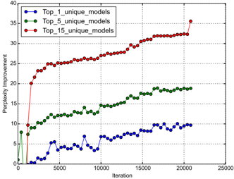
The image presents a line chart illustrating the relationship between iteration number and perplexity improvement for three different model configurations: Top_1_unique_models, Top_5_unique_models, and Top_15_unique_models. The chart displays how perplexity improvement changes as the number of iterations increases.
### Components/Axes
* **X-axis:** Iteration (ranging from approximately 0 to 25000)
* **Y-axis:** Perplexity Improvement (ranging from approximately 0 to 40)
* **Data Series:**
* Top_1_unique_models (Blue line with circle markers)
* Top_5_unique_models (Green line with triangle markers)
* Top_15_unique_models (Red line with circle markers)
* **Legend:** Located in the top-left corner, clearly labeling each data series with its corresponding color.
### Detailed Analysis
* **Top_1_unique_models (Blue):** The line initially fluctuates around a perplexity improvement of approximately 2-8 for the first 5000 iterations. It then exhibits more pronounced oscillations, reaching a peak of around 12 at approximately 7500 iterations, before settling around 8-10 for the remainder of the iterations, ending at approximately 9 at 20000 iterations.
* **Top_5_unique_models (Green):** This line shows a consistent upward trend from the beginning. Starting at approximately 10 at iteration 0, it steadily increases to around 15 at 5000 iterations, and continues to rise, reaching approximately 22 at 20000 iterations. The slope of this line is relatively constant throughout.
* **Top_15_unique_models (Red):** This line demonstrates the most significant and rapid improvement. It starts at approximately 20 at iteration 0 and quickly rises to around 25 at 5000 iterations. The improvement continues at a slightly decreasing rate, reaching approximately 32 at 15000 iterations, and finally leveling off around 34 at 20000 iterations. There is a slight dip to approximately 31 at 22000 iterations.
### Key Observations
* The Top_15_unique_models consistently exhibits the highest perplexity improvement throughout all iterations.
* The Top_5_unique_models shows a steady, moderate improvement.
* The Top_1_unique_models demonstrates the least improvement and the most fluctuation.
* All three models show diminishing returns in perplexity improvement as the number of iterations increases. The rate of improvement slows down over time.
* The initial jump in perplexity improvement for the Top_15_unique_models is particularly noticeable.
### Interpretation
The chart suggests that increasing the number of unique models considered (from 1 to 5 to 15) leads to a higher overall perplexity improvement during the training process. This indicates that exploring a wider range of model configurations can result in better performance. The diminishing returns observed in all three models suggest that there is a point beyond which further iterations provide only marginal improvements. The fluctuations in the Top_1_unique_models line might indicate instability or sensitivity to the specific training data. The data demonstrates a clear trade-off between model complexity (number of unique models) and performance (perplexity improvement). The Top_15 model achieves the best performance, but it also likely requires more computational resources and training time. The chart provides valuable insights into the optimization process and can help guide decisions about model selection and training duration.