## Bar Chart: TCI Distribution by Percentile
### Overview
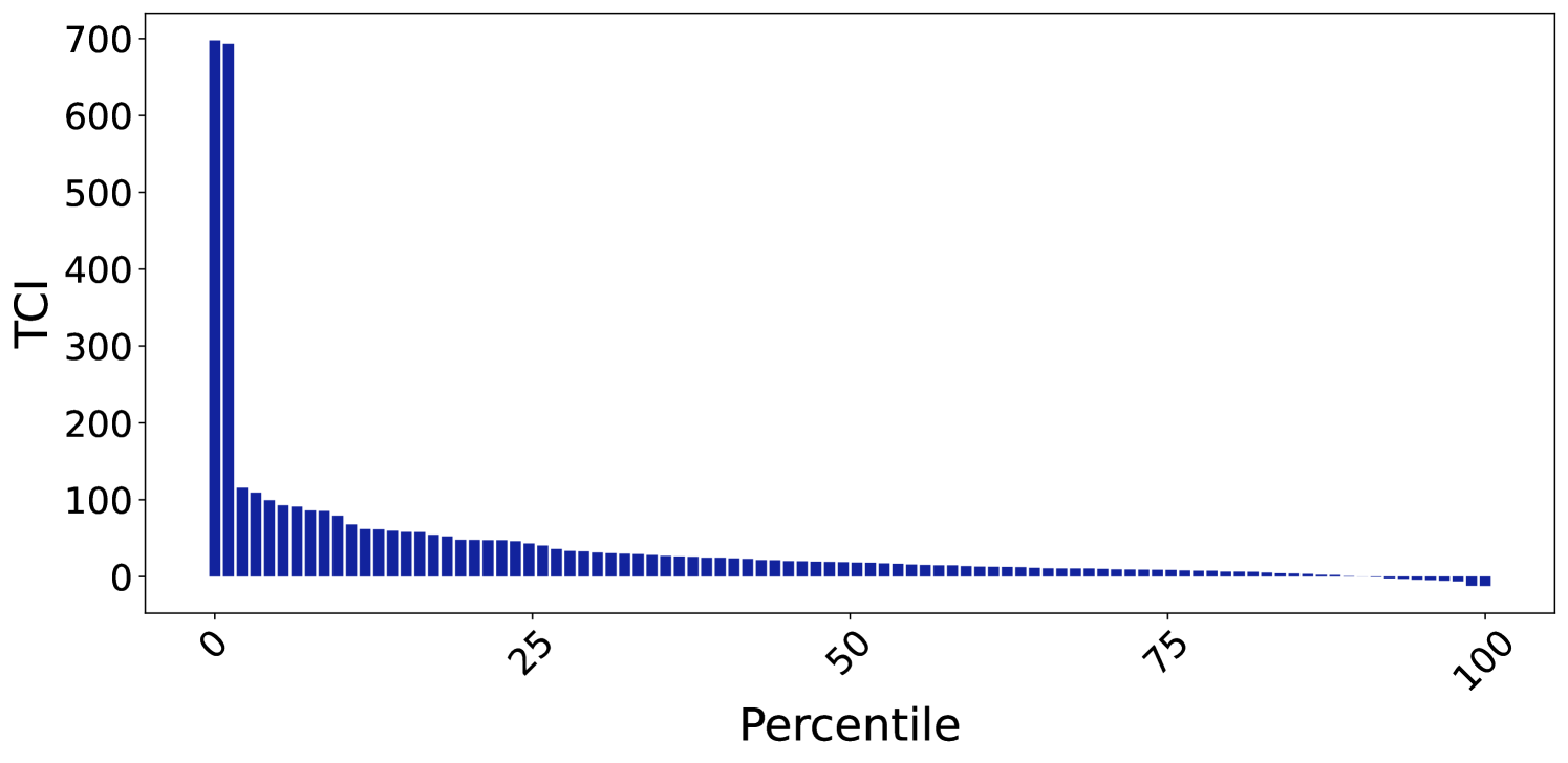
The image displays a bar chart representing the distribution of a metric labeled "TCI" across a population sorted by percentile. The chart illustrates a highly skewed, "long-tail" distribution where a very small fraction of the population accounts for a disproportionately large share of the total TCI value.
### Components/Axes
* **Y-Axis (Vertical):** Labeled "TCI". The scale ranges from 0 to 700, with major tick marks at intervals of 100.
* **X-Axis (Horizontal):** Labeled "Percentile". The scale ranges from 0 to 100, with major tick marks at 0, 25, 50, 75, and 100.
* **Data Series:** Represented by dark blue vertical bars. The bars are sorted in descending order of TCI value from left to right.
* **Layout:** The chart is oriented with the Y-axis on the left and the X-axis at the bottom. The data fills the central plotting area.
### Detailed Analysis
The data follows a steep, non-linear decay pattern.
* **Trend Verification:** The bars are strictly sorted in descending order. The trend is a rapid, exponential-like decay from the 0th percentile, transitioning into a very gradual, linear-like decline as it approaches the 100th percentile.
* **Data Point Estimates:**
* **0th - 2nd Percentile:** There are two distinct, very tall bars at the far left. These represent the maximum values, reaching approximately 700 TCI.
* **2nd - 10th Percentile:** A sharp, immediate drop occurs. The values fall rapidly from approximately 120 down to roughly 80.
* **10th - 25th Percentile:** The decline continues but begins to flatten, moving from approximately 80 down to roughly 40.
* **25th - 75th Percentile:** The slope is much shallower. Values decrease gradually from approximately 40 down to roughly 10.
* **75th - 100th Percentile:** The values approach zero. At the extreme right (near the 100th percentile), the bars appear to dip slightly below the X-axis, indicating negative TCI values (approximately -10 to -20).
### Key Observations
* **Extreme Skewness:** The distribution is heavily right-skewed. The top 2% of the data accounts for a massive portion of the total TCI, while the vast majority of the population (the 25th to 100th percentile) has relatively low TCI values.
* **Negative Outliers:** The presence of bars below the X-axis at the 100th percentile suggests that the TCI metric can result in negative values, representing a net loss or inverse performance for the lowest-ranked entities.
* **Data Density:** The chart appears to plot individual data points or very small bins, given the high number of individual bars visible across the X-axis.
### Interpretation
This chart demonstrates a classic "winner-take-all" or Pareto distribution.
* **What the data suggests:** The "TCI" metric is not evenly distributed. A tiny minority of the population (the extreme left) possesses an exceptionally high TCI, while the majority of the population clusters at the lower end of the spectrum.
* **Why it matters:** If TCI represents a resource, wealth, or performance metric, this chart indicates extreme inequality or concentration. The system is dominated by a few high-performing or high-value entities.
* **Peircean Investigative Note:** The transition from positive to negative values at the extreme right suggests that the TCI metric is not bounded by zero. This implies that the underlying process generating TCI allows for "debt" or "negative performance," which is a critical detail for understanding the nature of the metric being measured. The sharp drop-off at the start suggests that the "high-TCI" state is difficult to achieve or maintain, acting as a significant outlier compared to the rest of the dataset.