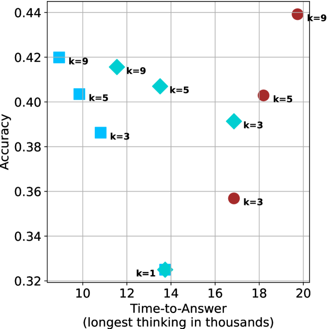
## Scatter Plot: Accuracy vs. Time-to-Answer
### Overview
The image is a scatter plot comparing the accuracy of a model against the time taken to answer, with data points grouped by the parameter 'k'. The x-axis represents "Time-to-Answer (longest thinking in thousands)", and the y-axis represents "Accuracy". There are three distinct series of data points, each represented by a different shape and color: blue squares, cyan diamonds, and brown circles. Each data point is labeled with its corresponding 'k' value.
### Components/Axes
* **X-axis:** Time-to-Answer (longest thinking in thousands). Scale ranges from 10 to 20, with gridlines at intervals of 2.
* **Y-axis:** Accuracy. Scale ranges from 0.32 to 0.44, with gridlines at intervals of 0.02.
* **Data Series:**
* Blue Squares: Represent one series of data points.
* Cyan Diamonds: Represent another series of data points.
* Brown Circles: Represent a third series of data points.
* **Labels:** Each data point is labeled with "k=[value]", where [value] is 1, 3, 5, or 9.
### Detailed Analysis
Here's a breakdown of the data points for each series:
* **Blue Squares:**
* k=9: Located at approximately (10, 0.42).
* k=5: Located at approximately (10, 0.40).
* k=3: Located at approximately (11, 0.39).
The trend for the blue squares is that as k decreases, both the time-to-answer and accuracy decrease.
* **Cyan Diamonds:**
* k=9: Located at approximately (12, 0.42).
* k=5: Located at approximately (14, 0.41).
* k=3: Located at approximately (16.5, 0.39).
* k=1: Located at approximately (13.5, 0.325).
The trend for the cyan diamonds is that as k decreases, the time-to-answer increases slightly from k=9 to k=3, then decreases significantly for k=1, while accuracy decreases overall.
* **Brown Circles:**
* k=9: Located at approximately (20, 0.44).
* k=5: Located at approximately (18, 0.40).
* k=3: Located at approximately (17.5, 0.355).
The trend for the brown circles is that as k decreases, both the time-to-answer and accuracy decrease.
### Key Observations
* The brown circles generally have higher time-to-answer values compared to the blue squares and cyan diamonds for the same k values.
* The cyan diamonds show a non-linear relationship between k, time-to-answer, and accuracy, with the lowest k value (k=1) having the lowest accuracy and a moderate time-to-answer.
* The highest accuracy is achieved by the brown circle with k=9, but it also has the highest time-to-answer.
### Interpretation
The scatter plot visualizes the trade-off between accuracy and time-to-answer for different values of the parameter 'k'. The data suggests that increasing 'k' generally leads to higher accuracy but also increases the time required to generate an answer. However, this relationship is not strictly linear, as seen with the cyan diamonds, where a very low 'k' value (k=1) results in a significant drop in accuracy. The choice of 'k' would depend on the specific application and the relative importance of accuracy versus speed. The different shapes (blue squares, cyan diamonds, and brown circles) likely represent different models or configurations, each exhibiting a unique relationship between 'k', accuracy, and time-to-answer.