## Scatter Plot: Accuracy vs. Time-to-Answer
### Overview
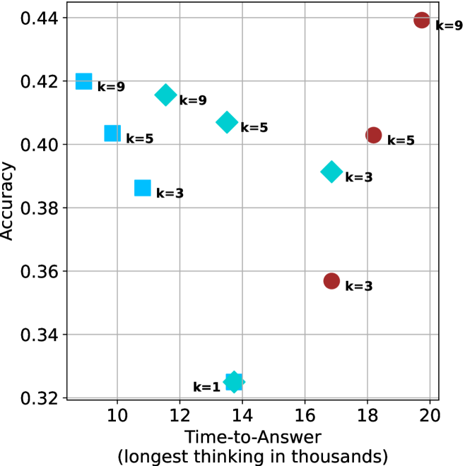
This image is a scatter plot visualizing the relationship between "Time-to-Answer" (measured in thousands of units) and "Accuracy" (a decimal value). The plot contains three distinct data series, differentiated by shape and color, with each point labeled with a "k" value (likely representing a parameter such as beam width, number of samples, or chain-of-thought iterations).
### Components/Axes
* **Y-Axis (Vertical):** Labeled "Accuracy". The scale ranges from 0.32 to 0.44, with major grid lines at 0.02 intervals.
* **X-Axis (Horizontal):** Labeled "Time-to-Answer (longest thinking in thousands)". The scale ranges from 10 to 20, with major grid lines at 2-unit intervals.
* **Data Series (Categorized by Shape/Color):**
* **Light Blue Squares:** Located in the top-left quadrant.
* **Cyan Diamonds:** Distributed across the center and bottom-center.
* **Dark Red Circles:** Located in the right-hand side of the plot.
### Detailed Analysis
The following data points are extracted based on visual estimation against the grid lines.
**1. Light Blue Squares (Top-Left Cluster)**
* **Trend:** These points show a clear negative correlation between time and accuracy; as time increases, accuracy decreases.
* **k=9:** Positioned at approximately (9.2, 0.42).
* **k=5:** Positioned at approximately (10.2, 0.405).
* **k=3:** Positioned at approximately (11.2, 0.385).
**2. Cyan Diamonds (Center/Bottom Cluster)**
* **Trend:** These points show a slight negative correlation between time and accuracy, with one significant outlier at the bottom.
* **k=9:** Positioned at approximately (11.5, 0.415).
* **k=5:** Positioned at approximately (13.5, 0.405).
* **k=3:** Positioned at approximately (16.8, 0.39).
* **k=1:** Positioned at approximately (13.8, 0.325). This is the lowest accuracy point on the entire chart.
**3. Dark Red Circles (Right-Hand Cluster)**
* **Trend:** These points show a positive correlation between time and accuracy; as time increases, accuracy increases.
* **k=9:** Positioned at approximately (19.5, 0.44). This is the highest accuracy point on the chart.
* **k=5:** Positioned at approximately (18.2, 0.405).
* **k=3:** Positioned at approximately (16.8, 0.355).
### Key Observations
* **Performance Ceiling:** The "k=9" (Dark Red Circle) at (19.5, 0.44) represents the maximum accuracy achieved, but it also requires the longest time-to-answer.
* **Performance Floor:** The "k=1" (Cyan Diamond) at (13.8, 0.325) is a significant outlier, demonstrating the lowest accuracy despite a moderate time-to-answer.
* **Clustering:** There is a notable convergence of accuracy around the 0.40–0.41 range for "k=5" across all three shapes (Light Blue Square, Cyan Diamond, Dark Red Circle), despite these points having vastly different time-to-answer values (ranging from ~10 to ~18).
### Interpretation
This chart likely illustrates a performance trade-off analysis for an AI model or algorithm, where "k" represents a computational resource parameter (e.g., number of reasoning steps or search breadth).
* **Efficiency vs. Accuracy:** The data suggests that simply increasing "k" does not guarantee better performance across all methods. The Light Blue Squares show that for that specific method, increasing "k" actually *decreases* accuracy while increasing time, suggesting a potential overfitting or noise issue.
* **Methodology Differences:** The three shapes likely represent three different model architectures or prompting strategies. The Dark Red Circles represent a strategy that scales well with time (accuracy improves as time increases), whereas the Light Blue Squares represent a strategy that degrades with increased time.
* **The "k=1" Anomaly:** The "k=1" point is significantly underperforming compared to all other data points. This suggests that a minimum threshold of "k" (likely k=3 or higher) is required for the system to function effectively.