## Line Chart: Overall Accuracy (%) vs. Training Steps
### Overview
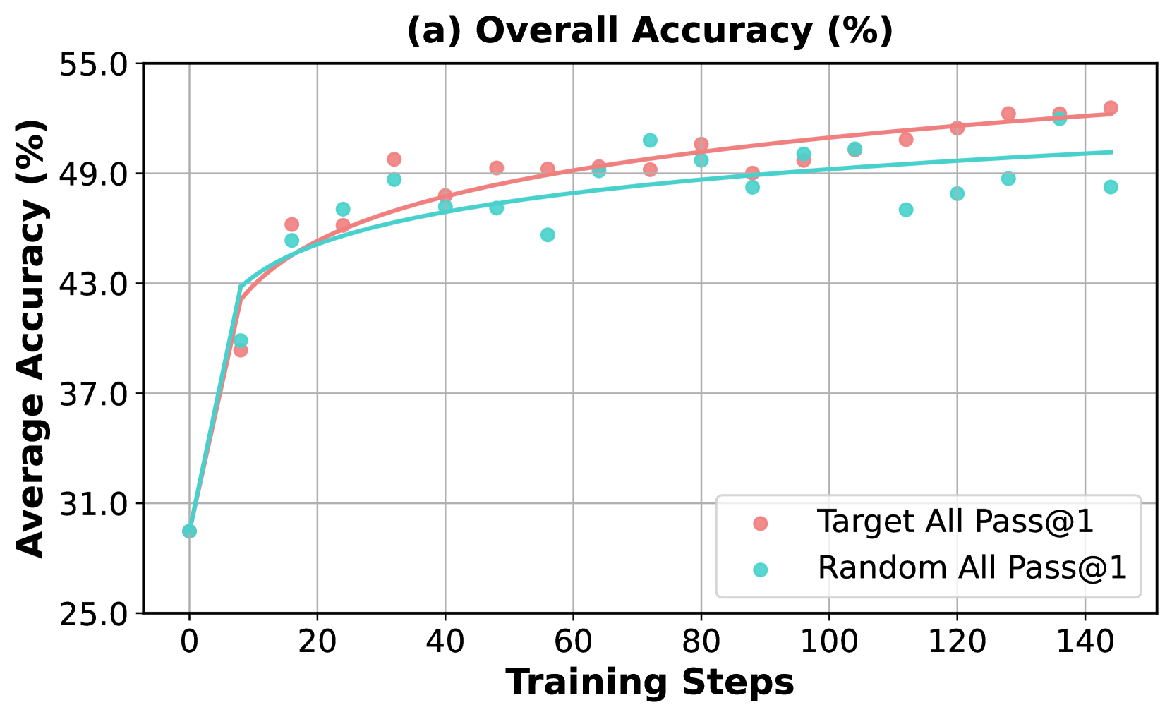
This image displays a line chart titled "(a) Overall Accuracy (%)". The chart plots the "Average Accuracy (%)" on the y-axis against "Training Steps" on the x-axis. Two data series are presented, representing "Target All Pass@1" and "Random All Pass@1", each with corresponding data points and trend lines.
### Components/Axes
* **Title:** (a) Overall Accuracy (%)
* **Y-axis Label:** Average Accuracy (%)
* **Scale:** Ranges from 25.0 to 55.0, with major ticks at 25.0, 31.0, 37.0, 43.0, 49.0, and 55.0.
* **X-axis Label:** Training Steps
* **Scale:** Ranges from 0 to 140, with major ticks at 0, 20, 40, 60, 80, 100, 120, and 140.
* **Legend:** Located in the bottom-right quadrant of the chart.
* **"Target All Pass@1"**: Represented by pink dots and a pink trend line.
* **"Random All Pass@1"**: Represented by cyan dots and a cyan trend line.
### Detailed Analysis
**Data Series: Target All Pass@1 (Pink)**
* **Trend:** The pink line, representing "Target All Pass@1", shows a generally upward trend, indicating increasing accuracy as training steps progress. The initial increase is steep, followed by a plateauing effect at higher training steps.
* **Data Points (approximate values with uncertainty of +/- 0.5% for accuracy and +/- 2 steps for training steps):**
* (0, 30.5)
* (5, 39.0)
* (10, 42.0)
* (15, 44.0)
* (20, 45.0)
* (25, 46.0)
* (30, 46.5)
* (35, 47.0)
* (40, 47.5)
* (45, 48.0)
* (50, 48.5)
* (55, 49.0)
* (60, 49.2)
* (70, 49.5)
* (80, 49.8)
* (90, 50.0)
* (100, 50.2)
* (110, 50.3)
* (120, 50.4)
* (130, 50.5)
* (140, 50.6)
**Data Series: Random All Pass@1 (Cyan)**
* **Trend:** The cyan line, representing "Random All Pass@1", also shows an upward trend, but generally at a lower accuracy level than the "Target All Pass@1" series. The initial increase is steep, and it also appears to plateau, but at a lower overall accuracy.
* **Data Points (approximate values with uncertainty of +/- 0.5% for accuracy and +/- 2 steps for training steps):**
* (0, 29.0)
* (5, 37.5)
* (10, 40.5)
* (15, 42.5)
* (20, 43.5)
* (25, 44.0)
* (30, 44.5)
* (35, 45.0)
* (40, 45.5)
* (45, 46.0)
* (50, 46.5)
* (55, 47.0)
* (60, 45.0) - *Outlier*
* (70, 47.5)
* (80, 48.0)
* (90, 48.5)
* (100, 49.0)
* (110, 49.2)
* (120, 48.8)
* (130, 49.0)
* (140, 49.0)
### Key Observations
* Both "Target All Pass@1" and "Random All Pass@1" show significant improvements in accuracy during the initial training steps.
* The "Target All Pass@1" series consistently achieves higher average accuracy than the "Random All Pass@1" series throughout the observed training steps.
* The rate of accuracy improvement appears to slow down at higher training steps for both series, suggesting a potential convergence or saturation point.
* There is a notable outlier in the "Random All Pass@1" data at approximately 60 training steps, where the accuracy drops significantly compared to the surrounding data points.
### Interpretation
The data presented in this chart suggests that a "Target All Pass@1" strategy is more effective in improving overall accuracy compared to a "Random All Pass@1" strategy during the training process. The "Target All Pass@1" method leads to consistently higher accuracy scores. The initial rapid increase in accuracy for both methods indicates that the model learns effectively from the training data. However, the observed plateauing suggests that further training might yield diminishing returns, or that the model's capacity is being reached. The outlier in the "Random All Pass@1" series at 60 training steps could indicate a temporary setback, a noisy data point, or a specific learning challenge encountered at that stage. This chart demonstrates the performance difference between two distinct training approaches, highlighting the potential benefits of a targeted strategy for achieving higher accuracy.