## Bar Chart: Distribution of Singular Values
### Overview
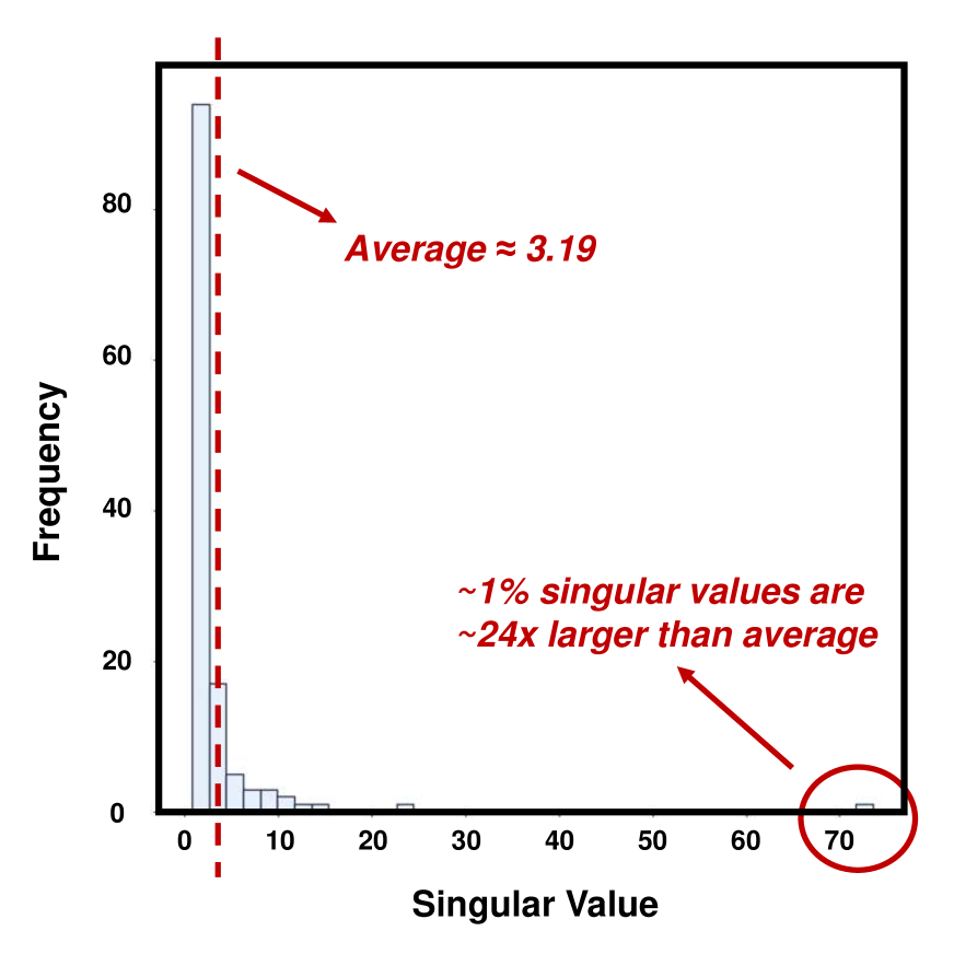
The image is a bar chart displaying the frequency distribution of singular values. The x-axis represents "Singular Value," and the y-axis represents "Frequency." A vertical dashed red line indicates the average singular value (~3.19), while annotations highlight key observations about outliers.
---
### Components/Axes
- **X-axis (Singular Value)**: Ranges from 0 to 70, with discrete intervals.
- **Y-axis (Frequency)**: Ranges from 0 to 90, with discrete intervals.
- **Legend**: Not explicitly labeled, but visual elements (e.g., dashed line, annotations) are color-coded (red for emphasis).
- **Key Elements**:
- A vertical dashed red line at ~3.19 (average).
- Two bars:
- A tall bar at **Singular Value = 0** with frequency ~85.
- A short bar at **Singular Value = 70** with frequency ~1.
- Annotations:
- "Average ≈ 3.19" (red arrow pointing to the dashed line).
- "~1% singular values are ~24x larger than average" (red arrow pointing to the bar at 70).
---
### Detailed Analysis
- **Singular Value = 0**: Dominates the distribution with a frequency of ~85, indicating most data points cluster near zero.
- **Singular Value = 70**: A single outlier with frequency ~1, far from the average.
- **Average**: The dashed line at ~3.19 suggests the central tendency of the data.
- **Outlier Analysis**: The bar at 70 is explicitly noted as being ~24 times larger than the average (3.19 × 24 ≈ 76.56), though the actual value is 70. This discrepancy may reflect rounding or approximation in the annotation.
---
### Key Observations
1. **High Concentration at Zero**: ~85% of singular values are at 0, suggesting a sparse or degenerate structure in the underlying data.
2. **Extreme Outlier**: The singular value of 70 is an extreme outlier, far exceeding the average and other values.
3. **Annotation Inconsistency**: The claim that the outlier is "24x larger than average" (3.19 × 24 ≈ 76.56) does not align with the actual value of 70, indicating potential rounding or estimation in the annotation.
---
### Interpretation
The chart reveals a **highly skewed distribution** of singular values, with nearly all data points concentrated at zero and a single extreme outlier. This pattern is typical in scenarios where:
- The data matrix is **rank-deficient** (e.g., low-rank approximations in PCA or SVD).
- There is a **dominant feature** (e.g., a single dominant singular value) that overshadows others.
- The outlier at 70 may represent an **anomaly** or **special case** in the dataset, warranting further investigation.
The annotation about the outlier being "24x larger than average" highlights the **magnitude of deviation** from the norm, even if the exact value is slightly lower than the calculated 24× threshold. This suggests the data may contain **hidden structure** or **non-uniformity** that requires deeper analysis.