## UI/Code Comparison: Mobile App Redesign
### Overview
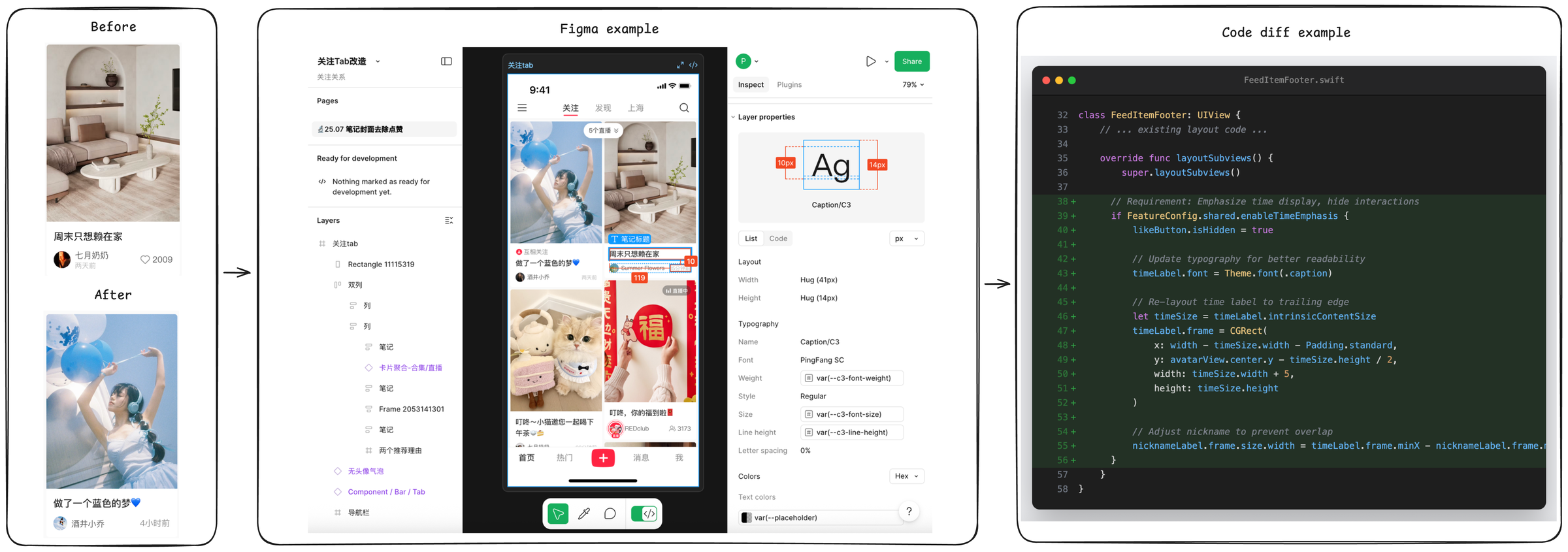
The image presents a comparison of a mobile app's UI "Before" and "After" a redesign, alongside a Figma example showing design specifications and a code snippet illustrating the implementation of UI elements. The image is divided into four main sections: "Before" UI, "Figma example", "After" UI, and "Code diff example".
### Components/Axes
* **"Before" UI:** Shows a mobile app screen with a post featuring a living room image.
* **"After" UI:** Shows a redesigned mobile app screen with a post featuring a person with balloons.
* **"Figma example":** Displays a Figma interface with design specifications for UI elements, including layer properties, layout, typography, and colors.
* **"Code diff example":** Presents a code snippet (Swift) showing the implementation of UI elements, specifically related to the `FeedItemFooter` class.
### Detailed Analysis or ### Content Details
**1. "Before" UI:**
* Image: A living room interior.
* Text: "周末只想赖在家" (Chinese, translates to "Just want to stay at home on weekends").
* User: "七月奶奶" (Chinese, translates to "July Grandma").
* Timestamp: "两天前" (Chinese, translates to "Two days ago").
* Likes: 2009
**2. "After" UI:**
* Image: A person with blue balloons.
* Text: "做了一个蓝色的梦♥" (Chinese, translates to "Had a blue dream♥").
* User: "酒井小乔" (Chinese, a name).
* Timestamp: "4小时前" (Chinese, translates to "4 hours ago").
**3. "Figma example":**
* **Top Bar:** Displays "关注Tab" (Chinese, translates to "Follow Tab"), "关注" (Chinese, translates to "Follow"), "发现" (Chinese, translates to "Discover"), "上海" (Chinese, translates to "Shanghai"), and a search icon.
* **Layer Properties:**
* "Caption/C3" element with dimensions indicated as 10px (left margin) and 14px (right margin).
* Layout: Width Hug (41px), Height Hug (14px).
* Typography: Name Caption/C3, Font PingFang SC, Weight var(--c3-font-weight), Style Regular, Size var(--c3-font-size), Line height var(--c3-line-height), Letter spacing 0%.
* Colors: Text colors var(--placeholder).
**4. "Code diff example":**
* File: `FeedItemFooter.swift`
* Class: `FeedItemFooter: UIView`
* Function: `layoutSubviews()`
* Code Snippets:
* `if FeatureConfig.shared.enableTimeEmphasis { likeButton.isHidden = true }`
* `timeLabel.font = Theme.font(.caption)`
* `timeLabel.frame = CGRect(x: width - timeSize.width - Padding.standard, y: avatarView.center.y - timeSize.height / 2, width: timeSize.width + 5, height: timeSize.height)`
* `nicknameLabel.frame.size.width = timeLabel.frame.minX - nicknameLabel.frame.`
**5. Additional UI Elements (Figma):**
* Pages section with "25.07 笔记封面去除点赞" (Chinese, translates to "25.07 Note cover to remove likes").
* Ready for development section.
* Layers section with various UI elements listed in Chinese, including "关注tab" (Follow Tab), "Rectangle 11115319", "双列" (Double Column), "笔记" (Note), "卡片聚合-合集/直播" (Card Aggregation - Collection/Live Stream), "Frame 2053141301", "两个推荐理由" (Two Recommended Reasons), "无头像气泡" (No Avatar Bubble), "Component / Bar / Tab", "导航栏" (Navigation Bar).
* Bottom navigation bar with icons for "首页" (Home), "热门" (Hot), "+", "消息" (Messages), "我" (Me).
### Key Observations
* The redesign involves changes to the visual style of the app, including the type of content displayed in posts.
* The Figma example provides detailed specifications for UI elements, ensuring consistency and precision in the design.
* The code snippet demonstrates how UI elements are implemented programmatically, including layout and styling.
### Interpretation
The image illustrates the process of redesigning a mobile app's UI, from initial concept to implementation. The "Before" and "After" sections show the visual changes, while the Figma example provides the design specifications and the code snippet demonstrates the technical implementation. The redesign appears to focus on modernizing the app's look and feel, potentially improving user engagement. The use of Figma and code examples highlights the importance of collaboration between designers and developers in creating a cohesive and functional user experience. The Chinese text indicates the app is likely targeted at a Chinese-speaking audience.