## Line Chart: Model Performance Comparison (DROP vs. ECLeKTic)
### Overview
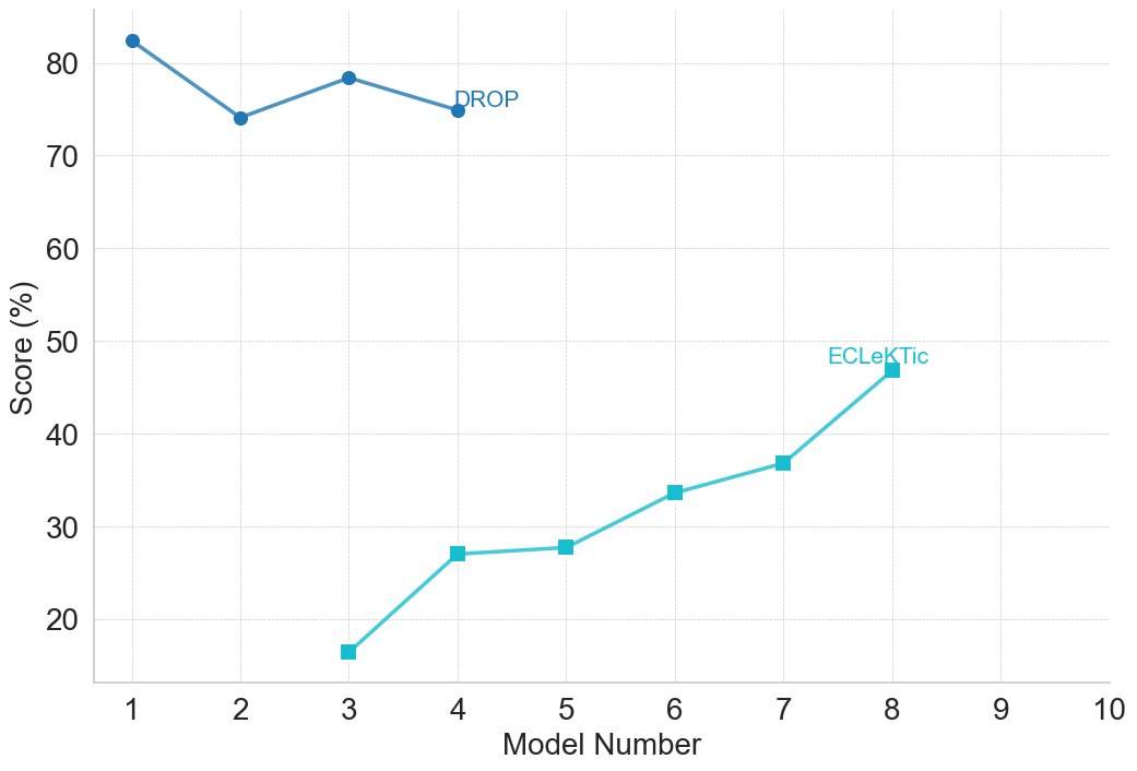
The image is a line chart comparing the performance scores (in percentage) of two different model series, labeled "DROP" and "ECLeKTic," across a sequence of model numbers. The chart displays two distinct data series with different starting points and trends.
### Components/Axes
* **Chart Type:** Line chart with markers.
* **X-Axis:** Labeled **"Model Number"**. It has major tick marks and labels for integers from 1 to 10.
* **Y-Axis:** Labeled **"Score (%)"**. It has major tick marks and labels at intervals of 10, from 20 to 80.
* **Data Series 1 (DROP):**
* **Color:** Darker blue.
* **Marker:** Solid circle.
* **Label:** The text **"DROP"** is placed directly on the chart, positioned to the right of the final data point for this series (at Model Number 4).
* **Data Series 2 (ECLeKTic):**
* **Color:** Lighter cyan/turquoise.
* **Marker:** Solid square.
* **Label:** The text **"ECLeKTic"** is placed directly on the chart, positioned above and to the right of the final data point for this series (at Model Number 8).
* **Grid:** A light gray grid is present in the background.
### Detailed Analysis
**Data Series: DROP (Blue Line with Circle Markers)**
* **Trend:** The line shows a slight overall downward trend with a dip and partial recovery. It starts high, dips, rises, and then falls slightly again.
* **Data Points (Approximate):**
* Model 1: ~82%
* Model 2: ~74%
* Model 3: ~78%
* Model 4: ~75%
* **Spatial Grounding:** This series occupies the upper portion of the chart. The label "DROP" is located in the upper-center area, adjacent to the data point at (4, ~75).
**Data Series: ECLeKTic (Cyan Line with Square Markers)**
* **Trend:** The line shows a consistent, positive upward trend. It starts low and increases with each subsequent model number.
* **Data Points (Approximate):**
* Model 3: ~16%
* Model 4: ~27%
* Model 5: ~28%
* Model 6: ~34%
* Model 7: ~37%
* Model 8: ~47%
* **Spatial Grounding:** This series occupies the lower to middle portion of the chart. The label "ECLeKTic" is located in the center-right area, above the data point at (8, ~47).
### Key Observations
1. **Non-Overlapping Ranges:** The two series do not share the same model numbers. The DROP series is plotted for Models 1-4, while the ECLeKTic series is plotted for Models 3-8. They only overlap at Models 3 and 4.
2. **Performance Gap:** At the overlapping model numbers (3 and 4), the DROP models significantly outperform the ECLeKTic models (78% vs. 16% at Model 3; 75% vs. 27% at Model 4).
3. **Divergent Trajectories:** The trends move in opposite directions. DROP performance declines slightly after an initial high, while ECLeKTic performance improves steadily from a low base.
4. **Data Range:** The ECLeKTic series shows a much wider range of scores (from ~16% to ~47%, a 31-point increase) compared to the DROP series (from ~74% to ~82%, an 8-point range).
### Interpretation
This chart likely compares the performance of two different model families or training approaches on a specific task or benchmark. The "DROP" models appear to be a more mature or high-performing series, starting with strong results but showing slight degradation or plateauing in later iterations (Models 2-4). In contrast, the "ECLeKTic" models represent a series that starts with much lower performance but demonstrates clear and consistent improvement with each successive model number, suggesting effective iterative development or learning.
The absence of data points for ECLeKTic before Model 3 and for DROP after Model 4 is a critical observation. It could indicate that these are results from different phases of a project, that the models are not directly comparable across all numbers, or that the evaluation was conducted on different subsets of models. The chart effectively highlights a trade-off: one series offers high but potentially stagnant performance, while the other offers lower but rapidly improving performance. The key takeaway is the contrasting development trajectories of the two model families.