## Line Chart: Information Gain vs. R² Value During Training
### Overview
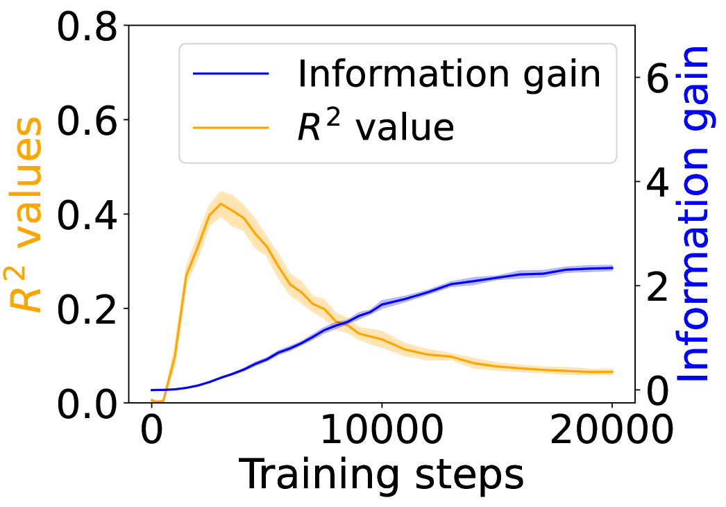
The image is a line chart showing the relationship between "Training steps" on the x-axis and two different metrics: "Information gain" and "R² value" on the y-axis. The "Information gain" is plotted against the right y-axis, while the "R² value" is plotted against the left y-axis. The chart illustrates how these two metrics change as the training progresses. The R² value has a shaded region around the line, indicating variance.
### Components/Axes
* **X-axis:** "Training steps" ranging from 0 to 20000. Axis markers are present at 0, 10000, and 20000.
* **Left Y-axis:** "R² values" ranging from 0.0 to 0.8. Axis markers are present at 0.0, 0.2, 0.4, 0.6, and 0.8. The axis label is in orange.
* **Right Y-axis:** "Information gain" ranging from 0 to 6. Axis markers are present at 0, 2, 4, and 6. The axis label is in blue.
* **Legend:** Located at the top-center of the chart.
* Blue line: "Information gain"
* Orange line: "R² value"
### Detailed Analysis
* **Information gain (Blue line):** The information gain starts near 0 at 0 training steps. It increases steadily with training steps, reaching approximately 2.3 at 10000 training steps, and plateaus around 2.8 at 20000 training steps. The trend is generally upward, with a decreasing rate of increase as training progresses.
* (0, ~0)
* (10000, ~2.3)
* (20000, ~2.8)
* **R² value (Orange line):** The R² value starts near 0 at 0 training steps. It increases rapidly, peaking at approximately 0.42 around 4000 training steps. After the peak, it decreases steadily, reaching approximately 0.12 at 20000 training steps. The trend is initially upward, then downward. There is a shaded region around the orange line, indicating the variance or uncertainty in the R² value.
* (0, ~0)
* (4000, ~0.42)
* (10000, ~0.18)
* (20000, ~0.12)
### Key Observations
* The "Information gain" increases as the "Training steps" increase, indicating that the model learns and gains more information as it is trained.
* The "R² value" initially increases, suggesting that the model's fit improves early in training. However, after a certain point, the "R² value" decreases, which could indicate overfitting.
* The peak of the "R² value" occurs around 4000 training steps, after which it declines.
* The "Information gain" plateaus towards the end of the training, suggesting that the model's learning slows down.
### Interpretation
The chart illustrates the trade-off between "Information gain" and "R² value" during the training process. Initially, both metrics increase, indicating that the model is learning and fitting the data well. However, as training continues, the "R² value" decreases, suggesting that the model may be overfitting to the training data. The "Information gain" continues to increase, but at a slower rate, indicating that the model is still learning, but the benefits are diminishing. This suggests that there is an optimal point in the training process where the model achieves a good balance between "Information gain" and "R² value". Further training beyond this point may lead to overfitting and a decrease in the model's ability to generalize to new data. The shaded region around the R² value indicates the variability in the model's performance, which could be due to factors such as noise in the data or the stochastic nature of the training algorithm.