\n
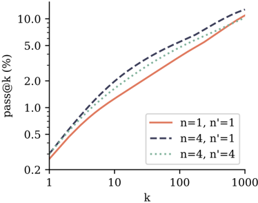
## Chart: pass@k vs. k for different n and n' values
### Overview
The image presents a line chart illustrating the relationship between 'pass@k' (expressed as a percentage) and 'k' for three different combinations of 'n' and 'n'' values. The chart appears to demonstrate how the pass rate changes as 'k' increases, under varying conditions defined by 'n' and 'n''.
### Components/Axes
* **X-axis:** Labeled "k". The scale is logarithmic, with markers at 1, 10, 100, and 1000.
* **Y-axis:** Labeled "pass@k (%)". The scale is linear, ranging from 0.2 to 10.0, with markers at 0.2, 0.5, 1.0, 2.0, 5.0, and 10.0.
* **Legend:** Located in the top-right corner of the chart. It contains the following entries:
* Solid line (orange/brown): "n=1, n'=1"
* Dashed line (dark blue): "n=4, n'=1"
* Dotted line (grey): "n=4, n'=4"
### Detailed Analysis
* **n=1, n'=1 (Solid Orange Line):** This line starts at approximately 0.2 at k=1 and increases steadily, curving upwards. At k=10, the value is approximately 1.0%. At k=100, the value is approximately 3.0%. At k=1000, the value reaches approximately 9.5%.
* **n=4, n'=1 (Dashed Dark Blue Line):** This line also starts at approximately 0.2 at k=1. It increases more rapidly than the solid orange line. At k=10, the value is approximately 1.8%. At k=100, the value is approximately 5.5%. At k=1000, the value reaches approximately 10.0%.
* **n=4, n'=4 (Dotted Grey Line):** This line starts at approximately 0.2 at k=1. It increases at a rate between the solid orange and dashed dark blue lines. At k=10, the value is approximately 1.4%. At k=100, the value is approximately 4.5%. At k=1000, the value reaches approximately 9.8%.
### Key Observations
* All three lines start at the same point (approximately 0.2 at k=1).
* The dashed dark blue line (n=4, n'=1) consistently shows the highest pass@k values across all 'k' values.
* The solid orange line (n=1, n'=1) consistently shows the lowest pass@k values across all 'k' values.
* The dotted grey line (n=4, n'=4) falls between the other two lines, indicating a pass rate between the other two conditions.
* The rate of increase in pass@k diminishes as 'k' increases for all three lines, suggesting diminishing returns.
### Interpretation
The chart demonstrates the impact of 'n' and 'n'' on the 'pass@k' metric. 'pass@k' likely represents the proportion of times a system successfully identifies a correct result within the top 'k' ranked results. 'n' and 'n'' likely represent parameters influencing the system's behavior, potentially related to the number of samples or iterations used.
The data suggests that increasing 'n' from 1 to 4, while keeping 'n'' at 1, significantly improves the pass@k rate. Further increasing 'n'' to 4, while keeping 'n' at 4, provides a slight improvement, but not as substantial as the initial increase in 'n'. This could indicate that the initial increase in 'n' has a more significant impact on performance than increasing 'n'' after a certain point. The logarithmic scale on the x-axis suggests that the benefits of increasing 'k' (the number of considered results) become less pronounced as 'k' grows larger. The diminishing returns observed in the curves suggest that there is a point beyond which increasing 'k' does not significantly improve the pass rate.