## 3D Scatter Plot: Mathematical Relationship Visualization
### Overview
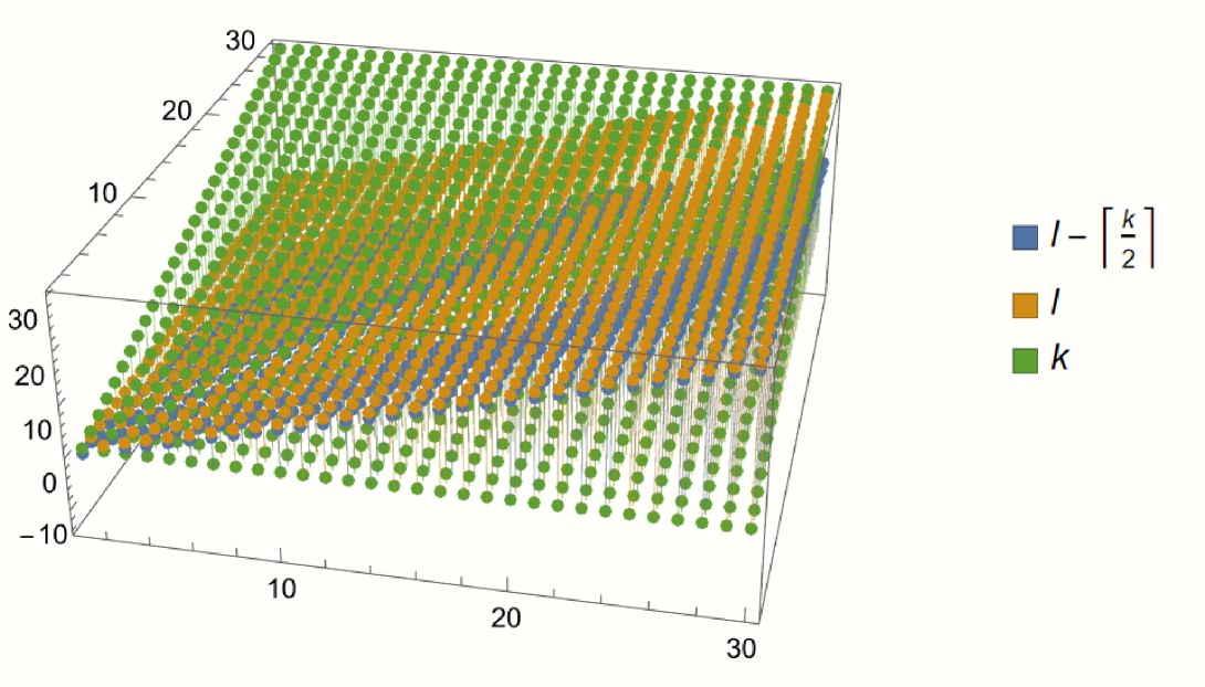
The image displays a 3D scatter plot containing three distinct data series, represented by colored spheres (blue, orange, and green). The plot visualizes the relationship between three variables, likely representing indices or parameters ($l$ and $k$). The data points are arranged in a grid-like structure, forming three distinct, parallel, sloping planes within a 3D coordinate system.
### Components/Axes
* **Vertical Axis (Z-axis):** Ranges from -10 to 30, with major tick marks at -10, 0, 10, 20, and 30.
* **Horizontal Axis (X-axis):** Ranges from 0 to 30, with major tick marks at 10, 20, and 30.
* **Depth Axis (Y-axis):** Ranges from 0 to 30, with major tick marks at 10, 20, and 30.
* **Legend (Positioned on the right):**
* **Blue Square:** $l - [k/2]$
* **Orange Square:** $l$
* **Green Square:** $k$
### Detailed Analysis
The plot is composed of three distinct data series, each forming a planar surface in 3D space.
* **Green Series ($k$):**
* **Visual Trend:** This series forms the highest plane. It slopes upward consistently as both the X and Y coordinates increase.
* **Data Points:** At the furthest extent of the axes (near 30, 30), the green points reach the Z=30 level. Near the origin, the values are close to 0.
* **Orange Series ($l$):**
* **Visual Trend:** This series forms the middle plane. It is parallel to the green plane but consistently offset downwards.
* **Data Points:** The orange points track slightly below the green points across the entire grid.
* **Blue Series ($l - [k/2]$):**
* **Visual Trend:** This series forms the lowest plane. It is significantly offset below the orange plane.
* **Data Points:** The vertical distance between the blue plane and the orange plane increases as the value of $k$ increases, consistent with the subtraction of $[k/2]$.
### Key Observations
* **Parallelism:** All three data series form parallel planes, indicating a linear relationship between the variables.
* **Spacing:** The vertical gap between the Green ($k$) and Orange ($l$) series appears constant. The gap between the Orange ($l$) and Blue ($l - [k/2]$) series increases as $k$ increases, which is visually consistent with the mathematical definition provided in the legend.
* **Density:** The points are distributed in a uniform grid pattern across the X-Y plane, suggesting a systematic sampling of the variables $l$ and $k$.
### Interpretation
This visualization represents a mathematical function or algorithm, likely related to computer science indexing or array manipulation.
* **Mathematical Meaning:** The plot demonstrates the behavior of three functions: $f(k) = k$, $f(l) = l$, and $f(l, k) = l - \lfloor k/2 \rfloor$. The use of square brackets $[k/2]$ in the legend strongly suggests integer division or a floor function, which is common in algorithms involving binary trees, heaps, or specific array partitioning schemes.
* **Relationship:** The green series ($k$) acts as the primary independent variable influencing the vertical position of the blue series. The orange series ($l$) acts as a baseline.
* **Peircean Investigative Note:** The visual "stepping" or separation of the planes confirms that the blue series is a transformation of the other two. The fact that the blue plane is the lowest and has the steepest relative drop-off as $k$ increases confirms the subtractive nature of the $[k/2]$ term. This is likely a visualization of how an index $l$ is modified by a parameter $k$ in a specific computational context.