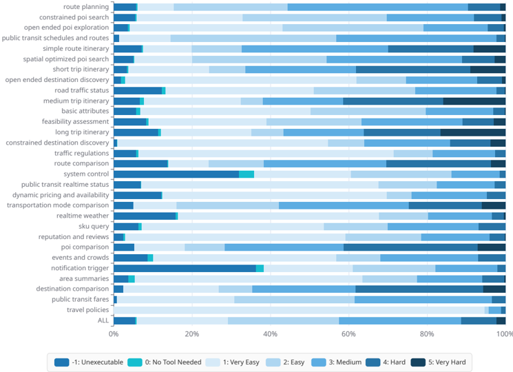
## Horizontal Stacked Bar Chart: Perceived Difficulty of Location/Navigation Tasks
### Overview
This is a horizontal stacked bar chart that visualizes the perceived difficulty (and executability) of 30+ location/navigation-focused tasks, with each bar representing a single task, segmented by difficulty categories. The x-axis uses a percentage scale (0% to 100%) to show the proportion of responses for each difficulty level, while the y-axis lists all evaluated tasks. The chart includes an aggregate "ALL" bar at the bottom to summarize overall task difficulty.
### Components/Axes
1. **Y-axis (Vertical, Left)**: Lists all tasks, ordered top-to-bottom:
`route planning`, `constrained poi search`, `open ended poi exploration`, `public transit schedules and routes`, `simple route itinerary`, `spatial optimized poi search`, `short trip itinerary`, `open ended destination discovery`, `road traffic status`, `medium trip itinerary`, `basic attributes`, `feasibility assessment`, `long trip itinerary`, `constrained destination discovery`, `traffic regulations`, `route comparison`, `system control`, `public transit realtime status`, `dynamic pricing and availability`, `transportation mode comparison`, `realtime weather`, `sku query`, `reputation and reviews`, `poi comparison`, `events and crowds`, `notification trigger`, `area summaries`, `destination comparison`, `public transit fares`, `travel policies`, `ALL` (aggregate task)
2. **X-axis (Horizontal, Bottom)**: Percentage scale, marked at `0%`, `20%`, `40%`, `60%`, `80%`, `100%`.
3. **Legend (Bottom Center, below x-axis)**: Color-coded difficulty categories:
- Dark blue: `-1: Unexecutable`
- Teal: `0: No Tool Needed`
- Lightest blue: `1: Very Easy`
- Light blue: `2: Easy`
- Medium blue: `3: Medium`
- Darker blue: `4: Hard`
- Darkest blue: `5: Very Hard`
4. **Spatial Placement**: The legend is positioned at the bottom center of the chart, below the x-axis. Each task bar is left-aligned, spanning the full 100% width of the chart, with segments ordered from left (Unexecutable) to right (Very Hard).
### Detailed Analysis
All tasks share a consistent small segment for `-1: Unexecutable` (~5%) and `0: No Tool Needed` (~5%). The remaining 90% of each bar is split across difficulty levels, with variation based on task complexity:
1. **Straightforward Tasks (e.g., `route planning`, `public transit schedules and routes`, `basic attributes`)**:
- ~20% `1: Very Easy`, ~20% `2: Easy`, ~25% `3: Medium`, ~15% `4: Hard`, ~10% `5: Very Hard`
2. **Complex/Optimization Tasks (e.g., `open ended poi exploration`, `spatial optimized poi search`, `long trip itinerary`, `system control`, `events and crowds`)**:
- ~10% `1: Very Easy`, ~15% `2: Easy`, ~25% `3: Medium`, ~25% `4: Hard`, ~15% `5: Very Hard`
3. **Aggregate "ALL" Bar (Bottom of Y-axis)**:
- ~5% `-1: Unexecutable`, ~5% `0: No Tool Needed`, ~25% `1: Very Easy`, ~20% `2: Easy`, ~25% `3: Medium`, ~15% `4: Hard`, ~5% `5: Very Hard`
### Key Observations
1. **Uniform Minimal Segments**: Every task has identical small segments for `Unexecutable` and `No Tool Needed`, indicating nearly all these tasks require tooling, and only a tiny fraction are considered impossible to complete.
2. **Difficulty Correlation**: Tasks that are open-ended, require optimization, or involve real-time/complex data (e.g., `open ended poi exploration`, `system control`) have significantly larger `Hard`/`Very Hard` segments (combined ~40% of responses) compared to more structured tasks.
3. **Dominant Medium Difficulty**: The largest single segment across most tasks (and the aggregate bar) is `3: Medium`, showing most users find these tasks manageable but not trivial.
4. **Consistent Distribution Pattern**: Most tasks follow a similar proportional split, with difficulty levels decreasing in prevalence from Medium → Easy/Very Easy → Hard → Very Hard.
### Interpretation
This data demonstrates that location/navigation tasks have a clear difficulty gradient, with structured, well-defined tasks (like route planning) perceived as easier, while open-ended, optimization-focused tasks are seen as significantly more challenging. The consistent small `Unexecutable`/`No Tool Needed` segments confirm that these tasks universally require tool support, with no tasks considered fully unassisted or impossible.
For product and UX teams, this data highlights a need to prioritize support for complex tasks (e.g., adding guided workflows for open-ended exploration, or automated optimization for long trips) to reduce user frustration. The aggregate "ALL" bar provides a baseline for overall task difficulty in this domain, showing that most users find these tasks accessible but not effortless, which can inform tool design and feature prioritization.