## Bar Charts: Distribution of LLM Calls Across Three Datasets
### Overview
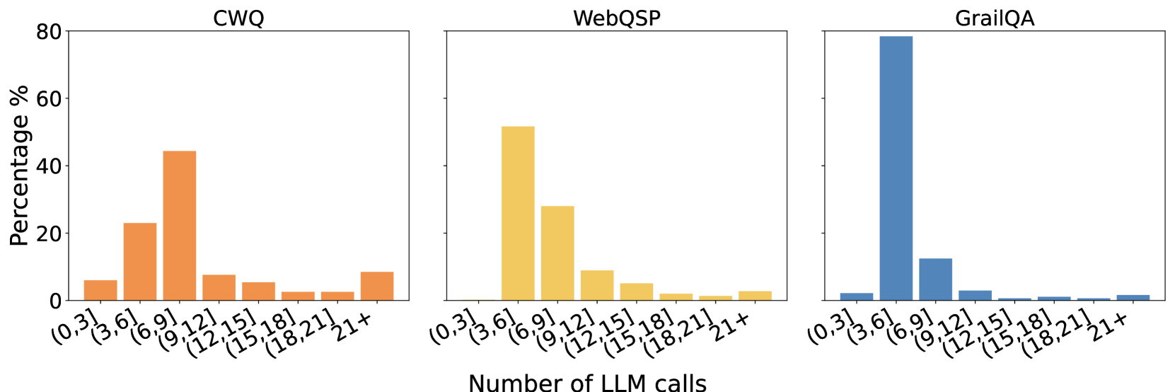
The image displays three adjacent bar charts, each representing the distribution of the number of Large Language Model (LLM) calls required for a different question-answering dataset. The charts share a common x-axis and y-axis scale, allowing for direct comparison of the distributions. The overall title for the x-axis is "Number of LLM calls".
### Components/Axes
* **Chart Titles (Top Center of each subplot):**
* Left Chart: `CWQ`
* Middle Chart: `WebQSP`
* Right Chart: `GrailQA`
* **Y-Axis (Leftmost chart only, applies to all):**
* Label: `Percentage %`
* Scale: Linear, from 0 to 80, with major ticks at 0, 20, 40, 60, 80.
* **X-Axis (Bottom of all charts):**
* Label: `Number of LLM calls` (centered below the three charts).
* Categories (Bins): `(0,3]`, `(3,6]`, `(6,9]`, `(9,12]`, `(12,15]`, `(15,18]`, `(18,21]`, `21+`. These represent ranges of LLM call counts.
* **Data Series (Bar Colors):**
* CWQ: Orange bars.
* WebQSP: Yellow/Gold bars.
* GrailQA: Blue bars.
### Detailed Analysis
**1. CWQ Dataset (Left Chart, Orange Bars):**
* **Trend:** The distribution is somewhat broad, peaking in the middle ranges and tapering off at the extremes.
* **Data Points (Approximate Percentages):**
* `(0,3]`: ~6%
* `(3,6]`: ~23%
* `(6,9]`: ~44% **(Peak)**
* `(9,12]`: ~8%
* `(12,15]`: ~5%
* `(15,18]`: ~2%
* `(18,21]`: ~2%
* `21+`: ~9%
**2. WebQSP Dataset (Middle Chart, Yellow Bars):**
* **Trend:** The distribution is right-skewed, with a strong peak in the lower-middle range and a steady decline thereafter.
* **Data Points (Approximate Percentages):**
* `(0,3]`: ~0% (No visible bar)
* `(3,6]`: ~52% **(Peak)**
* `(6,9]`: ~28%
* `(9,12]`: ~9%
* `(12,15]`: ~5%
* `(15,18]`: ~2%
* `(18,21]`: ~1%
* `21+`: ~3%
**3. GrailQA Dataset (Right Chart, Blue Bars):**
* **Trend:** The distribution is extremely right-skewed and concentrated in a single bin, with very low percentages in all others.
* **Data Points (Approximate Percentages):**
* `(0,3]`: ~2%
* `(3,6]`: ~79% **(Dominant Peak)**
* `(6,9]`: ~12%
* `(9,12]`: ~3%
* `(12,15]`: ~1%
* `(15,18]`: ~1%
* `(18,21]`: ~1%
* `21+`: ~1%
### Key Observations
1. **Peak Location Shift:** The modal (most frequent) number of LLM calls increases from GrailQA (`(3,6]`) to WebQSP (`(3,6]`) to CWQ (`(6,9]`).
2. **Distribution Shape:** GrailQA has the most concentrated distribution, with nearly 80% of samples requiring 3-6 calls. WebQSP is also concentrated but less so. CWQ has the most spread-out distribution, indicating greater variability in the number of calls needed.
3. **High-Call Tail:** All datasets show a small but non-zero percentage of samples requiring 21+ LLM calls (CWQ: ~9%, WebQSP: ~3%, GrailQA: ~1%).
### Interpretation
This data visualizes the computational "effort" or complexity, measured in LLM API calls, required by a system to answer questions from three established benchmarks. The stark differences suggest fundamental variations in the datasets' nature:
* **GrailQA** appears to be the most "efficient" for the system being measured, with the vast majority of questions resolved with very few (3-6) LLM calls. This could imply more straightforward questions, better alignment with the system's capabilities, or a more direct answer path.
* **WebQSP** shows a moderate level of complexity, with most questions requiring 3-9 calls.
* **CWQ** presents the greatest challenge or variability, with a significant portion of questions requiring 6-9 calls and a heavier tail of questions needing many more calls (9+). This suggests CWQ contains more complex, multi-step, or ambiguous questions that force the system to make more exploratory or iterative LLM calls.
The charts effectively argue that benchmark performance cannot be evaluated on accuracy alone; the computational cost (here, LLM calls) varies dramatically across datasets. A system might achieve high accuracy on GrailQA with low cost, but the same system could be much more expensive to run on CWQ. This has practical implications for deployment costs and efficiency.