## Scatter Plot: A-mem vs. Base
### Overview
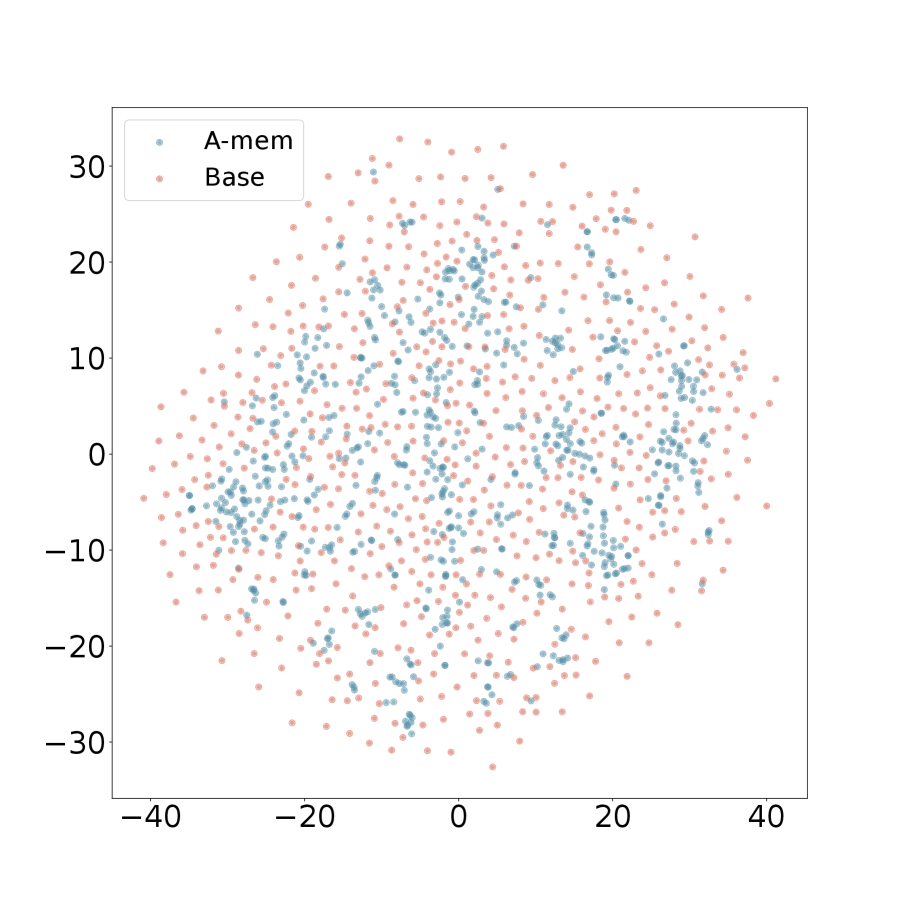
The image is a scatter plot comparing two datasets, labeled "A-mem" and "Base". The plot displays the distribution of data points for each dataset across a two-dimensional space. The x and y axes are not explicitly labeled, but they range from approximately -40 to 40 and -30 to 30, respectively.
### Components/Axes
* **X-axis:** Ranges from approximately -40 to 40, with tick marks at -20, 0, 20, and 40.
* **Y-axis:** Ranges from approximately -30 to 30, with tick marks at -20, -10, 0, 10, 20, and 30.
* **Legend (top-left):**
* "A-mem": Represented by light blue data points.
* "Base": Represented by light red data points.
### Detailed Analysis
* **A-mem (light blue):** The light blue data points are scattered across the plot, with a higher concentration in the central region.
* **Base (light red):** The light red data points are also scattered across the plot, with a distribution that appears similar to "A-mem" but possibly more dispersed.
### Key Observations
* Both datasets exhibit a roughly circular distribution centered around the origin (0,0).
* The "Base" dataset appears to have a slightly wider spread than the "A-mem" dataset.
* There is significant overlap between the two datasets.
### Interpretation
The scatter plot visualizes the distribution of two datasets, "A-mem" and "Base," in a two-dimensional space. The overlapping distributions suggest that the two datasets share some similarities, but the slightly wider spread of the "Base" dataset may indicate some differences. Without further context or axis labels, it is difficult to determine the specific meaning of these distributions. However, the plot provides a visual comparison of the two datasets and highlights their relative similarities and differences in terms of spatial distribution.