## Line Chart: Attention Key Query Score, a=40
### Overview
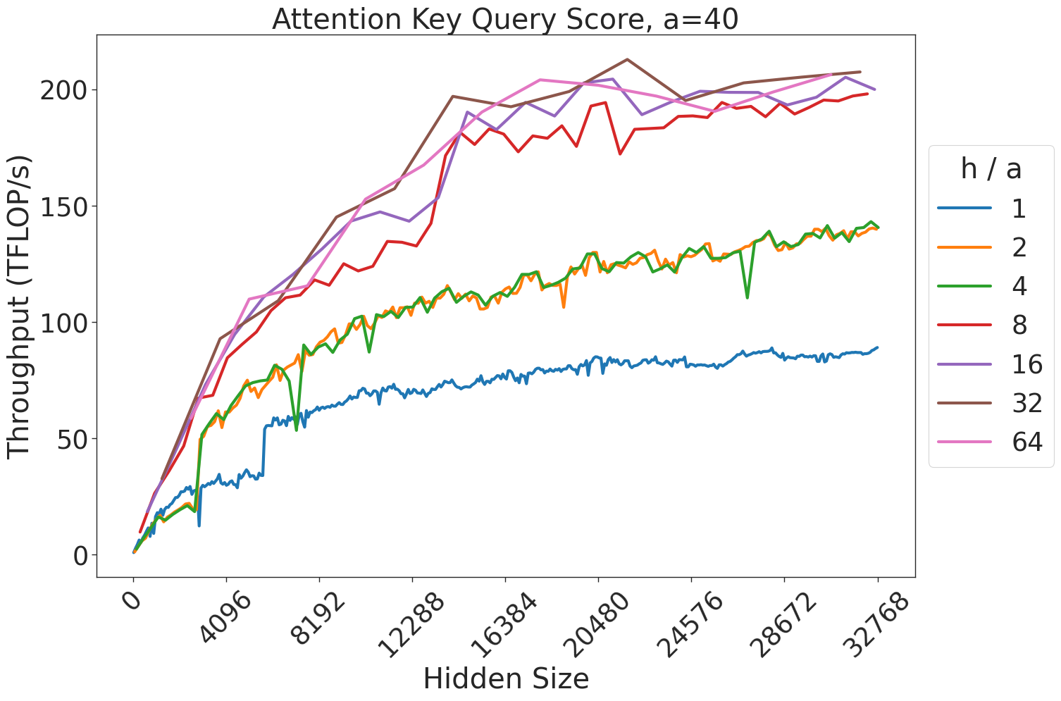
This image is a line chart illustrating the relationship between "Hidden Size" (x-axis) and "Throughput (TFLOP/s)" (y-axis) for various "h/a" ratios. The chart demonstrates how computational throughput scales as the hidden size of a model increases, with different performance profiles based on the "h/a" parameter.
### Components/Axes
* **Title:** "Attention Key Query Score, a=40" (Top center).
* **X-Axis:** "Hidden Size". Scale ranges from 0 to 32768, with major ticks at 0, 4096, 8192, 12288, 16384, 20480, 24576, 28672, and 32768.
* **Y-Axis:** "Throughput (TFLOP/s)". Scale ranges from 0 to 200+, with major ticks at 0, 50, 100, 150, 200.
* **Legend:** Located on the right side. Labeled "h / a".
* **Blue:** 1
* **Orange:** 2
* **Green:** 4
* **Red:** 8
* **Purple:** 16
* **Brown:** 32
* **Pink:** 64
### Detailed Analysis
The chart displays seven distinct data series, which can be grouped into two performance tiers based on their throughput saturation levels.
**Trend Verification:**
All seven lines originate at (0,0) and exhibit a positive, non-linear (concave) growth trend. The rate of throughput increase is highest between Hidden Size 0 and 12,288, after which the curves begin to flatten (saturate).
**Data Series Extraction:**
* **Lower Tier (h/a = 1, 2, 4):**
* **Blue (h/a=1):** The lowest performing series. It rises slowly, reaching approximately 80-90 TFLOP/s at a Hidden Size of 32,768.
* **Orange (h/a=2):** Performs significantly better than Blue. It rises to approximately 140 TFLOP/s at a Hidden Size of 32,768.
* **Green (h/a=4):** Tracks very closely with the Orange line. It exhibits a notable, sharp dip/anomaly around Hidden Size 8,192, dropping briefly before recovering to match the Orange line's trajectory, ending at approximately 140 TFLOP/s.
* **Higher Tier (h/a = 8, 16, 32, 64):**
* **Red (h/a=8):** Shows a steeper initial slope than the lower tier. It reaches approximately 200 TFLOP/s at a Hidden Size of 32,768.
* **Purple (h/a=16):** Follows a similar trajectory to the Red line, slightly outperforming it in the mid-range (12,288 to 20,480), ending at approximately 200 TFLOP/s.
* **Brown (h/a=32):** The highest performing series. It consistently stays at or above the other lines, peaking at approximately 210 TFLOP/s near Hidden Size 20,480, then slightly tapering or stabilizing.
* **Pink (h/a=64):** Closely tracks the Purple and Brown lines, ending at approximately 200 TFLOP/s.
### Key Observations
* **Performance Clustering:** There is a distinct performance gap between the "h/a" ratios of 1, 2, 4 and the ratios of 8, 16, 32, 64. The latter group achieves roughly 40-50% higher throughput than the former.
* **Saturation Point:** The "knee" of the curves—where throughput gains begin to diminish significantly—occurs consistently between Hidden Size 12,288 and 16,384 for all series.
* **Anomalies:** The Green line (h/a=4) contains a sharp, localized drop in throughput at Hidden Size 8,192, which is not present in the other series.
### Interpretation
This chart likely represents a performance benchmark for a GPU-accelerated attention kernel (such as FlashAttention).
* **Hardware Utilization:** The "h/a" ratio likely represents the ratio of the number of attention heads to the head dimension (or a similar architectural parameter). The data suggests that higher "h/a" ratios allow the hardware to achieve much higher TFLOP/s utilization.
* **Bottlenecks:** The saturation observed after a Hidden Size of ~16,384 suggests that the compute units are reaching their maximum theoretical throughput, or that the operation becomes memory-bandwidth bound beyond this point.
* **Optimization:** For developers or researchers, this data indicates that choosing an "h/a" ratio of 8 or higher is critical for maximizing hardware efficiency on this specific architecture, as the performance gains from increasing the ratio diminish significantly once the ratio is 8 or greater (the lines for 8, 16, 32, and 64 are tightly clustered).