## Heatmap: Layer Activity Across Step Counts
### Overview
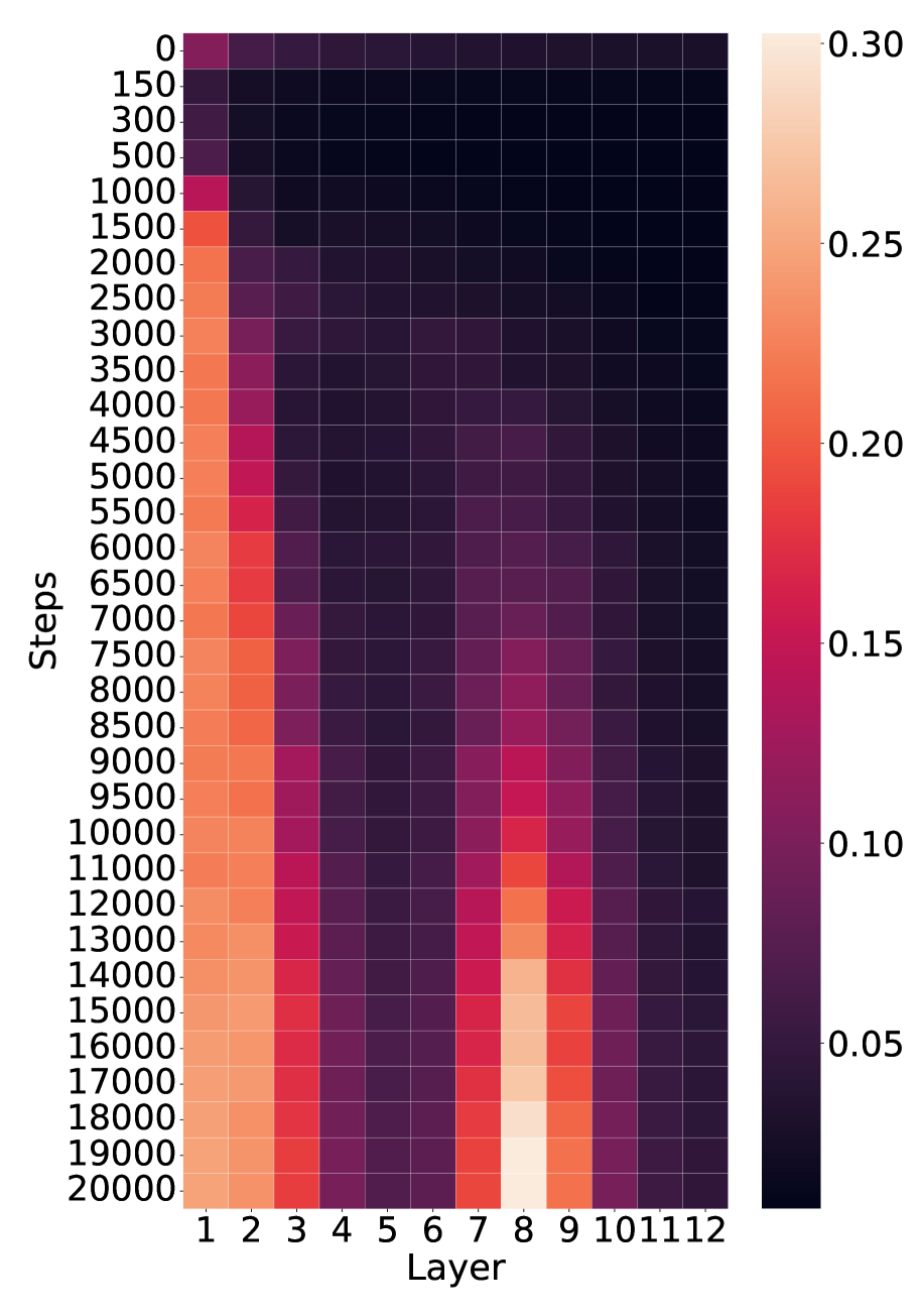
The image is a heatmap visualizing the distribution of values across 12 layers (x-axis) and step counts (y-axis). The color intensity ranges from dark purple (low values) to light orange (high values), with a legend indicating values from 0.05 to 0.30. The heatmap reveals concentrated high-value regions in specific layers and step ranges.
### Components/Axes
- **Y-axis (Steps)**: Labeled "Steps," with values ranging from 0 to 20,000 in increments of 150.
- **X-axis (Layer)**: Labeled "Layer," with categories 1 to 12.
- **Legend**: Positioned on the right, showing a gradient from dark purple (0.05) to light orange (0.30).
- **Gridlines**: Subtle gridlines separate cells for clarity.
### Detailed Analysis
- **Layer 1**: High values (light orange) appear at step counts of ~1,000, 15,000, and 20,000.
- **Layer 8**: Dominates with the highest values (light orange) concentrated around 15,000 steps.
- **Layer 2**: Moderate values (red/orange) at ~1,000 and 15,000 steps.
- **Layers 3–7, 9–12**: Mostly dark purple (low values), with occasional red/orange cells at lower step counts (~1,000–3,000).
- **Step Counts**: High-value regions are sparse, with most cells in the 0.05–0.10 range (dark purple).
### Key Observations
1. **Layer 8** is the most active, with the highest concentration of light orange cells.
2. **Layer 1** shows sporadic high values but lacks consistency.
3. **Layers 3–7, 9–12** exhibit minimal activity, with values predominantly below 0.10.
4. **Step Counts**: High values (0.20–0.30) are rare, occurring only in specific layer-step combinations.
### Interpretation
The heatmap suggests that **Layer 8** is the primary focus of activity, with a strong peak at ~15,000 steps. This could indicate a critical threshold or a specific event tied to this layer. **Layer 1** shows secondary significance but is less consistent. The majority of layers (3–7, 9–12) have negligible activity, implying they may be less relevant or underutilized in the context of the data. The sparse high-value regions suggest that the dataset is dominated by low-intensity interactions, with only a few layers and step counts driving the majority of the observed values. This pattern might reflect a bottleneck or a focal point in the system being analyzed.