\n
## Diagram: Network Evolution
### Overview
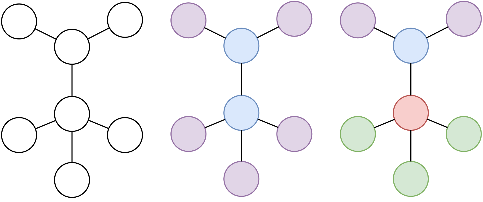
The image presents a series of three network diagrams, illustrating a potential evolution of a network structure over time or under different conditions. Each diagram depicts a network composed of nodes (circles) connected by edges (lines). The diagrams are arranged horizontally, from left to right, suggesting a progression. The color of the nodes changes across the diagrams, potentially indicating different states or roles of the nodes.
### Components/Axes
The diagrams do not have explicit axes or labels. The components are:
* **Nodes:** Represented by circles.
* **Edges:** Represented by lines connecting the nodes.
* **Colors:** Used to differentiate nodes within each diagram and across diagrams. The colors present are:
* White/Black (Diagram 1)
* Lavender/Purple (Diagram 2)
* Blue (Diagram 2 & 3)
* Green (Diagram 3)
* Red/Salmon (Diagram 3)
### Detailed Analysis or Content Details
**Diagram 1 (Leftmost):**
* The network consists of 7 nodes.
* The nodes are connected in a linear chain-like structure.
* All nodes are white with black outlines.
* The network has a length of approximately 6 node-to-node connections.
**Diagram 2 (Center):**
* The network consists of 8 nodes.
* The network has a more branched structure than Diagram 1.
* There are 4 lavender/purple nodes and 4 blue nodes.
* The network appears to have a central blue node connected to three lavender nodes and one other blue node.
* The lavender nodes are connected to each other in a chain-like structure.
**Diagram 3 (Rightmost):**
* The network consists of 8 nodes.
* The network has a branched structure, similar to Diagram 2, but with different colors.
* There are 4 lavender/purple nodes, 2 blue nodes, 1 red/salmon node, and 2 green nodes.
* The network appears to have a central blue node connected to two lavender nodes and one red/salmon node.
* The red/salmon node is connected to two green nodes.
* The lavender nodes are connected to each other in a chain-like structure.
### Key Observations
* The network complexity increases from Diagram 1 to Diagram 2 and remains similar in Diagram 3.
* The color scheme changes significantly across the diagrams, potentially indicating changes in node states or roles.
* Diagram 3 introduces a new color (red/salmon and green), suggesting the emergence of new node types or functionalities.
* The central node (blue) appears to maintain a consistent role across Diagrams 2 and 3, acting as a hub.
### Interpretation
The diagrams likely represent the evolution of a network over time or under different conditions. The change in node colors could signify changes in node status, function, or importance. The increasing complexity from Diagram 1 to Diagram 2 suggests network growth or development. The introduction of new colors in Diagram 3 indicates the emergence of new elements or functionalities within the network.
The consistent presence of the central blue node in Diagrams 2 and 3 suggests that this node plays a critical role in the network's structure and function, potentially acting as a central controller or hub. The branching structure in Diagrams 2 and 3 indicates a more distributed network architecture compared to the linear structure in Diagram 1.
Without additional context, it is difficult to determine the specific meaning of the network evolution. However, the diagrams suggest a dynamic system undergoing changes in structure, function, and complexity. The diagrams could represent a variety of systems, such as social networks, biological networks, or computer networks. The change in colors could represent different states of nodes, such as active/inactive, healthy/infected, or online/offline.