## Bar Chart: Overall Accuracy Comparison
### Overview
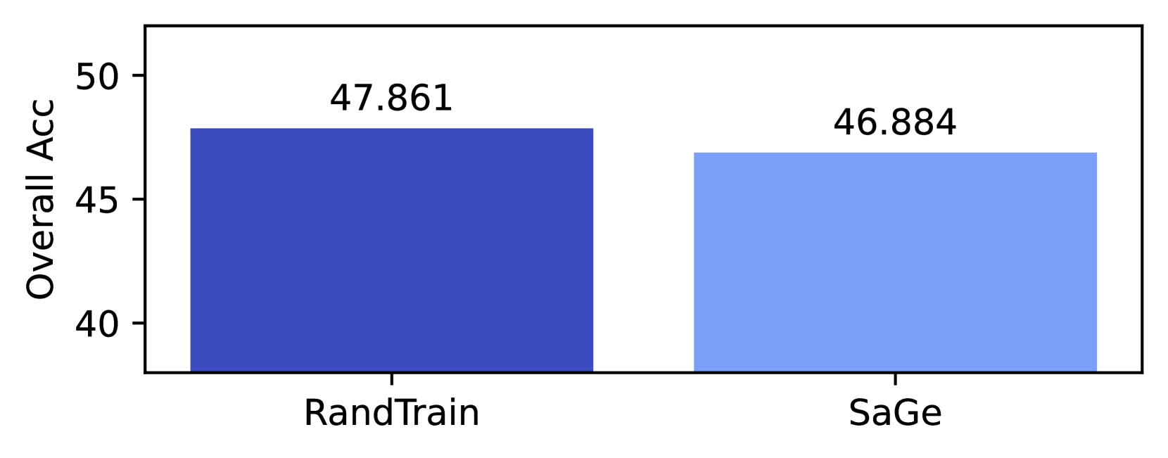
The image displays a simple vertical bar chart comparing the "Overall Acc" (Overall Accuracy) of two distinct methods or models, labeled "RandTrain" and "SaGe". The chart presents a direct performance comparison, with numerical values annotated above each bar.
### Components/Axes
* **Chart Type:** Vertical Bar Chart.
* **Y-Axis:**
* **Label:** "Overall Acc" (presumably Overall Accuracy).
* **Scale:** Linear scale ranging from 40 to 50, with major tick marks at 40, 45, and 50.
* **X-Axis:**
* **Categories:** Two categorical bars.
* **Labels:** "RandTrain" (left bar) and "SaGe" (right bar).
* **Data Series & Legend:** There is no separate legend. The categories are identified by their x-axis labels. The bars are differentiated by color:
* **RandTrain:** Dark blue bar.
* **SaGe:** Light blue bar.
* **Data Labels:** The exact numerical value of each bar's height is displayed directly above it.
### Detailed Analysis
* **RandTrain (Dark Blue Bar):**
* **Position:** Left side of the chart.
* **Value:** 47.861
* **Visual Trend:** The bar extends from the baseline (below 40) to a height corresponding to approximately 47.9 on the y-axis.
* **SaGe (Light Blue Bar):**
* **Position:** Right side of the chart.
* **Value:** 46.884
* **Visual Trend:** The bar is slightly shorter than the RandTrain bar, extending to a height corresponding to approximately 46.9 on the y-axis.
* **Comparison:** The RandTrain method shows a higher overall accuracy than the SaGe method. The numerical difference is 47.861 - 46.884 = 0.977.
### Key Observations
1. **Close Performance:** The two methods have very similar performance levels, with less than a 1-point difference in overall accuracy.
2. **Visual Emphasis:** The y-axis is truncated, starting at 40 instead of 0. This visual choice amplifies the perceived difference between the two bars, making the ~1-point gap appear more significant than it would on a zero-based scale.
3. **Precision:** The accuracy values are reported to three decimal places, suggesting the measurements are precise and likely the result of a computational evaluation.
### Interpretation
This chart provides a clear, at-a-glance comparison of two competing approaches ("RandTrain" and "SaGe") on a single metric: Overall Accuracy. The data suggests that **RandTrain has a slight performance advantage over SaGe** for the task being measured.
The choice to truncate the y-axis is a common technique in technical presentations to highlight small but potentially meaningful differences. A reader should note that while RandTrain is superior in this specific comparison, the absolute difference is under 1%, which may or may not be practically significant depending on the application context (e.g., a 0.977% improvement in a medical diagnosis model is more impactful than in a recommendation system).
The absence of error bars or confidence intervals means we cannot assess the statistical significance of this difference from the chart alone. The chart's primary function is to present the final, computed accuracy values for direct comparison.