## Bar Chart: Comparison of Overall Accuracy Between Two Methods
### Overview
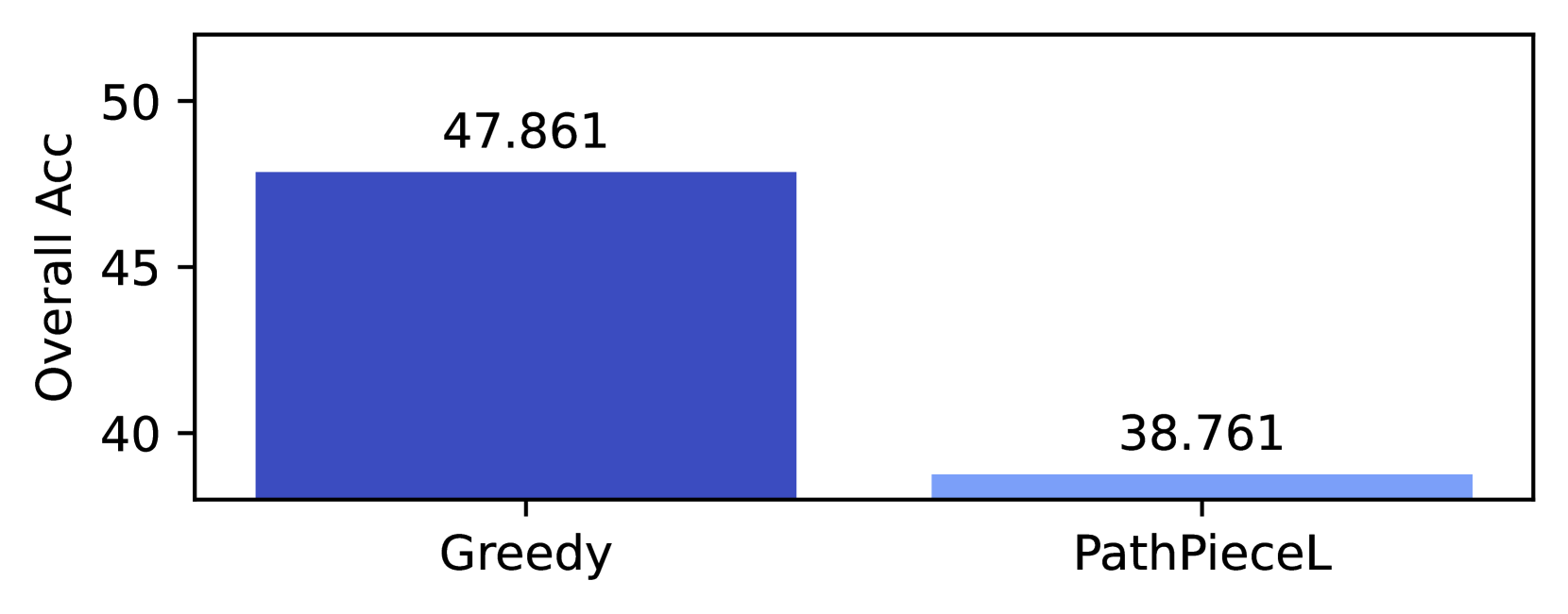
The image displays a simple vertical bar chart comparing the "Overall Acc" (Overall Accuracy) of two distinct methods or algorithms. The chart is presented on a white background with a black border. It contains two bars, each representing a single data point with its exact numerical value annotated above it.
### Components/Axes
* **Chart Type:** Vertical Bar Chart.
* **Y-Axis:**
* **Label:** "Overall Acc" (presumably an abbreviation for Overall Accuracy).
* **Scale:** Linear scale with major tick marks and numerical labels at 40, 45, and 50.
* **Range:** The visible axis spans from slightly below 40 to slightly above 50.
* **X-Axis:**
* **Categories:** Two categorical labels are present below the bars: "Greedy" and "PathPieceL".
* **Data Series & Legend:** There is no separate legend. The two bars are distinguished by color and their corresponding x-axis labels.
* **Bar 1 (Left):** Labeled "Greedy". Colored in a solid, dark blue.
* **Bar 2 (Right):** Labeled "PathPieceL". Colored in a solid, light blue.
* **Data Labels:** The precise numerical value for each bar is displayed directly above it in black text.
### Detailed Analysis
* **Data Point 1 - Greedy:**
* **Position:** Left side of the chart.
* **Color:** Dark blue.
* **Value:** 47.861 (annotated above the bar).
* **Visual Trend:** The bar extends vertically from the baseline (below 40) to a height corresponding to its value, clearly surpassing the 45 mark on the y-axis.
* **Data Point 2 - PathPieceL:**
* **Position:** Right side of the chart.
* **Color:** Light blue.
* **Value:** 38.761 (annotated above the bar).
* **Visual Trend:** The bar is significantly shorter than the "Greedy" bar. Its top aligns just below the 40 mark on the y-axis.
### Key Observations
1. **Significant Performance Gap:** There is a substantial difference in Overall Accuracy between the two methods. The "Greedy" method (47.861) outperforms the "PathPieceL" method (38.761) by approximately **9.1 percentage points**.
2. **Visual Confirmation:** The dark blue "Greedy" bar is visually about 23% taller than the light blue "PathPieceL" bar, which is consistent with the numerical difference.
3. **Baseline Context:** Both values are presented on a scale starting near 40, which visually accentuates the difference between them. The "PathPieceL" value is below the lowest labeled tick mark (40).
### Interpretation
This chart presents a direct, head-to-head comparison of two techniques, likely from a computational or machine learning context, based on a single performance metric: Overall Accuracy.
* **What the data suggests:** The "Greedy" approach demonstrates markedly superior performance compared to "PathPieceL" for the task measured. The magnitude of the difference (over 9 points) is typically considered highly significant in fields where accuracy is a key metric.
* **How elements relate:** The chart's design is minimalist, focusing the viewer's attention solely on the contrast between the two values. The use of different shades of blue groups the data as related (both are accuracy scores) while still differentiating the categories. The placement of exact values above the bars removes any ambiguity in reading the chart.
* **Notable considerations:** The chart does not provide context for what "Greedy" or "PathPieceL" refer to, nor the specific task or dataset used. The y-axis label "Overall Acc" is an abbreviation; in a full technical document, this would be defined (e.g., "Overall Accuracy on the X Benchmark"). The choice to start the y-axis near 40 (a "truncated graph") emphasizes the difference between the two values, which is a common and acceptable practice when the focus is on comparing magnitudes rather than showing absolute zero.