\n
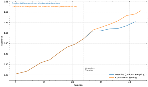
## Line Chart: Baseline vs. Curriculum Learning Accuracy Over Iterations
### Overview
The image displays a line chart comparing the training accuracy of two machine learning approaches over 40+ iterations. The chart illustrates how "Curriculum Learning" (introducing harder problems after an initial phase) compares to a "Baseline" method of uniform sampling throughout training. A key transition point is marked.
### Components/Axes
* **Chart Type:** Line chart with two data series.
* **X-Axis:** Labeled "Iteration". Major tick marks are present at intervals of 10 (0, 10, 20, 30, 40). The axis extends slightly beyond 40.
* **Y-Axis:** Labeled "Accuracy". Major tick marks are present at intervals of 0.05, ranging from 0.30 to 0.65.
* **Legend:** Located in the bottom-right quadrant of the chart area.
* A blue line is labeled "Baseline (Uniform Sampling)".
* An orange line is labeled "Curriculum Learning".
* **Annotations:**
* A vertical, gray, dashed line is positioned at **Iteration 24**. It is labeled "Curriculum Transition" in small text to its right.
* Text in the top-left corner provides context:
* Blue text: "Baseline: Uniform sampling of mixed-easy/hard problems"
* Orange text: "Curriculum: Uniform problems first, then hard problems (transition at iter 24)"
### Detailed Analysis
**Trend Verification & Data Points (Approximate):**
* **Baseline (Uniform Sampling) - Blue Line:**
* **Trend:** Shows a steady, roughly linear upward slope throughout the entire training period.
* **Key Points:**
* Iteration 0: ~0.30
* Iteration 10: ~0.36
* Iteration 20: ~0.44
* Iteration 24 (at transition line): ~0.47
* Iteration 30: ~0.51
* Iteration 40: ~0.55
* Final Point (~Iteration 43): ~0.555
* **Curriculum Learning - Orange Line:**
* **Trend:** Initially follows a similar upward slope to the baseline. After the marked transition point at iteration 24, the slope increases noticeably, showing accelerated improvement.
* **Key Points:**
* Iteration 0: ~0.30 (starts at nearly the same point as Baseline)
* Iteration 10: ~0.36
* Iteration 20: ~0.44
* Iteration 24 (at transition line): ~0.47 (nearly identical to Baseline at this point)
* **Post-Transition:**
* Iteration 30: ~0.52
* Iteration 40: ~0.59
* Final Point (~Iteration 43): ~0.61
**Spatial Grounding:** The two lines are nearly superimposed from iteration 0 to 24. After the vertical "Curriculum Transition" line at x=24, the orange line (Curriculum Learning) diverges upward, consistently staying above the blue line (Baseline) for the remainder of the chart.
### Key Observations
1. **Identical Early Performance:** Both methods perform almost identically for the first 24 iterations, suggesting the initial "uniform problems" phase of the curriculum matches the baseline's mixed sampling.
2. **Divergence at Transition:** A clear and immediate divergence occurs at the marked transition point (Iteration 24). The curriculum learning line breaks away upward.
3. **Accelerated Learning:** The slope of the Curriculum Learning line becomes steeper after iteration 24, indicating a faster rate of accuracy improvement once harder problems are introduced.
4. **Final Performance Gap:** By the end of the plotted data, Curriculum Learning achieves a final accuracy of ~0.61, while the Baseline reaches ~0.555, resulting in a significant performance gap of approximately 0.055 accuracy points.
### Interpretation
The data strongly suggests that the **curriculum learning strategy is more effective than uniform sampling** for this specific task. The key insight is that the benefit is not immediate but is triggered by a deliberate change in training data difficulty.
* **What the data demonstrates:** The chart provides empirical evidence for the "curriculum learning" hypothesis in machine learning. It shows that structuring the learning process—starting with easier, more manageable examples before introducing complexity—can lead to better final model performance than exposing the model to all difficulty levels randomly from the start.
* **Relationship between elements:** The vertical "Curriculum Transition" line is the critical experimental variable. The fact that the performance lines are coincident before this line and diverge after it isolates the transition as the causal factor for the improved outcome. The legend and annotations explicitly define this experimental setup.
* **Notable implications:** The anomaly is not in the data points themselves but in the **sharp change in trend** for the orange line at iteration 24. This indicates a highly responsive learning system. The results imply that for this problem domain, the model benefits from a structured introduction to complexity, potentially allowing it to build a more robust foundational understanding before tackling harder examples, thereby avoiding negative interference or getting stuck in poor local minima early in training.