## Chart: Law School Admissions
### Overview
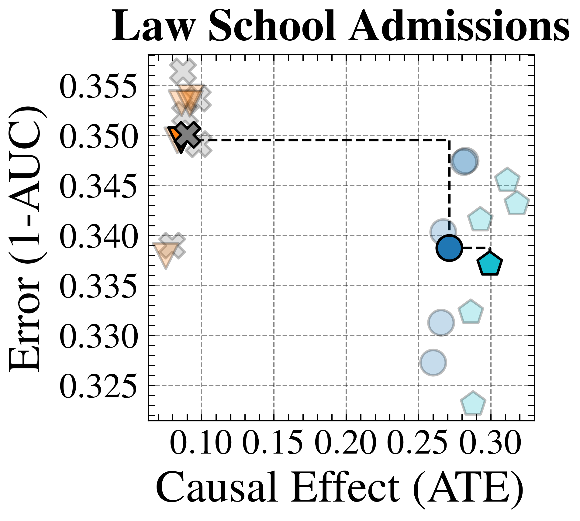
The image is a scatter plot titled "Law School Admissions". It displays data points with varying shapes and colors on a grid, plotting "Error (1-AUC)" on the y-axis against "Causal Effect (ATE)" on the x-axis. There are two distinct clusters of data points, one in the top-left and another in the bottom-right. A dashed line connects two specific data points.
### Components/Axes
* **Title:** Law School Admissions
* **X-axis:** Causal Effect (ATE)
* Scale: 0.10, 0.15, 0.20, 0.25, 0.30
* **Y-axis:** Error (1-AUC)
* Scale: 0.325, 0.330, 0.335, 0.340, 0.345, 0.350, 0.355
* **Data Points:**
* Crosses: Gray and Orange
* Triangles: Gray and Orange
* Circles: Light Blue and Dark Blue
* Pentagons: Light Blue and Teal
* **Connecting Line:** Dashed black line connecting a dark blue circle to a teal pentagon.
### Detailed Analysis
* **Top-Left Cluster:**
* Contains gray crosses and orange triangles.
* Causal Effect (ATE) values are approximately 0.08 to 0.10.
* Error (1-AUC) values range from approximately 0.338 to 0.358.
* **Bottom-Right Cluster:**
* Contains light blue circles and light blue pentagons.
* Causal Effect (ATE) values range from approximately 0.25 to 0.31.
* Error (1-AUC) values range from approximately 0.322 to 0.348.
* **Specific Data Points Connected by Dashed Line:**
* Dark blue circle: Causal Effect (ATE) ≈ 0.26, Error (1-AUC) ≈ 0.339
* Teal pentagon: Causal Effect (ATE) ≈ 0.30, Error (1-AUC) ≈ 0.337
### Key Observations
* There are two distinct clusters of data points, suggesting two different performance profiles.
* The top-left cluster has low Causal Effect (ATE) and high Error (1-AUC).
* The bottom-right cluster has higher Causal Effect (ATE) and lower Error (1-AUC).
* The dashed line highlights a specific transition or relationship between two data points in the bottom-right cluster.
### Interpretation
The scatter plot likely represents the performance of different models or strategies related to law school admissions. The x-axis, "Causal Effect (ATE)", could represent the impact of a particular intervention or factor on admissions outcomes. The y-axis, "Error (1-AUC)", represents the error rate of the model.
The top-left cluster suggests a set of models or strategies that have a low impact on admissions (low Causal Effect) and high error rates. The bottom-right cluster suggests models or strategies that have a higher impact on admissions and lower error rates.
The dashed line connecting the dark blue circle and teal pentagon could represent an optimization or adjustment made to a specific model, resulting in a shift from one performance point to another. The teal pentagon represents a better performing model than the dark blue circle.