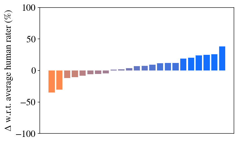
## Bar Chart: Delta w.r.t. Average Human Rater
### Overview
The image is a bar chart displaying the difference (delta) with respect to the average human rater, expressed as a percentage. The bars are arranged along the x-axis, with the y-axis representing the percentage difference. The bars are colored in a gradient from orange to blue, with orange bars indicating negative differences and blue bars indicating positive differences.
### Components/Axes
* **X-axis:** Represents different raters or categories (unlabeled).
* **Y-axis:** "Δ w.r.t. average human rater (%)". The scale ranges from -100% to 100%, with markers at -100, -50, 0, 50, and 100.
* **Bars:** Each bar represents the difference between a specific rater's score and the average human rater's score. The color of the bars transitions from orange to blue.
### Detailed Analysis
The chart shows a distribution of differences relative to the average human rater.
* **Negative Differences (Orange Bars):** The bars on the left side of the chart are orange and represent raters who scored lower than the average human rater. The leftmost bar has a value of approximately -35%. The second bar has a value of approximately -25%. The remaining orange bars are between -10% and 0%.
* **Positive Differences (Blue Bars):** The bars on the right side of the chart are blue and represent raters who scored higher than the average human rater. The values range from approximately 0% to 40%. The rightmost bar has a value of approximately 40%.
### Key Observations
* There is a clear trend from negative differences (orange bars) to positive differences (blue bars).
* The distribution appears to be somewhat skewed towards positive differences, as there are more blue bars than orange bars.
* The largest negative difference is approximately -35%, while the largest positive difference is approximately 40%.
### Interpretation
The bar chart illustrates the variability in ratings compared to the average human rater. The color gradient helps to visually distinguish between raters who scored lower (orange) and higher (blue) than the average. The chart suggests that while some raters consistently score lower than the average, a larger number of raters tend to score higher. The magnitude of the differences indicates the degree of agreement or disagreement among the raters.