## Bar Chart: Delta w.r.t. Average Human Rater
### Overview
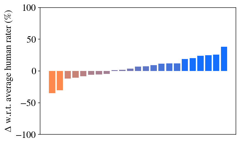
The image displays a vertical bar chart showing the percentage change (delta) relative to an average human rater. The chart contains 20 bars arranged in ascending order from left to right, transitioning from negative to positive values. The bars are colored with a gradient, starting with orange on the left, moving through brownish and purple hues in the middle, and ending with blue on the right. There is no chart title, legend, or x-axis label present.
### Components/Axes
* **Y-Axis (Vertical):**
* **Label:** "Δ w.r.t. average human rater (%)"
* **Scale:** Linear scale ranging from -100 to 100.
* **Major Tick Marks:** At -100, -50, 0, 50, and 100.
* **X-Axis (Horizontal):**
* **Label:** None present.
* **Content:** 20 discrete, unlabeled categories represented by individual bars.
* **Legend:** None present. Color is used as a visual cue for the value's position in the sorted sequence.
* **Data Series:** A single series of 20 data points, each represented by a bar.
### Detailed Analysis
The data represents a sorted distribution of percentage deltas. The trend is a consistent, monotonic increase from the leftmost to the rightmost bar.
**Estimated Data Points (from left to right):**
The following values are approximate visual estimates based on the bar heights relative to the y-axis grid.
1. Bar 1 (Orange): ~ -35%
2. Bar 2 (Orange): ~ -30%
3. Bar 3 (Brown): ~ -15%
4. Bar 4 (Brown): ~ -12%
5. Bar 5 (Brown): ~ -8%
6. Bar 6 (Brown): ~ -7%
7. Bar 7 (Purple): ~ -5%
8. Bar 8 (Purple): ~ -3%
9. Bar 9 (Purple): ~ -1%
10. Bar 10 (Purple): ~ 0% (appears to be at the baseline)
11. Bar 11 (Blue-Purple): ~ +2%
12. Bar 12 (Blue-Purple): ~ +5%
13. Bar 13 (Blue): ~ +7%
14. Bar 14 (Blue): ~ +10%
15. Bar 15 (Blue): ~ +12%
16. Bar 16 (Blue): ~ +12%
17. Bar 17 (Blue): ~ +18%
18. Bar 18 (Blue): ~ +20%
19. Bar 19 (Blue): ~ +25%
20. Bar 20 (Blue): ~ +38%
**Trend Verification:** The visual trend is a clear, steady upward slope from the first bar (most negative) to the last bar (most positive). The rate of increase appears relatively constant, with a slight acceleration in the final few bars.
### Key Observations
1. **Sorted Distribution:** The data is presented in strictly ascending order, which is a deliberate choice to show the full range and distribution of performance relative to the human baseline.
2. **Crossover Point:** The 10th bar sits at or very near the 0% line, indicating that half of the items perform at or below the average human rater, and half perform at or above it.
3. **Range:** The total spread of the data is substantial, from approximately -35% to +38%, a range of about 73 percentage points.
4. **Color Gradient:** The color shift from orange (negative) to blue (positive) provides an immediate visual cue for performance, with the middle (near-zero) values represented by neutral, desaturated tones.
5. **Missing Context:** The chart lacks a title, legend, and x-axis labels. This omits crucial information about what the 20 bars represent (e.g., different models, tasks, or conditions).
### Interpretation
This chart visualizes the performance of 20 distinct entities (likely AI models, algorithms, or experimental conditions) compared to a human performance benchmark. The "delta" metric suggests a direct comparison where 0% represents parity with the average human rater.
The data demonstrates a wide spectrum of capability. The leftmost entities significantly underperform the human baseline, while the rightmost entities outperform it by a notable margin. The smooth, sorted progression suggests a continuum of performance rather than distinct clusters.
The most significant insight is the existence of entities that surpass human performance (the blue bars on the right). The top performer exceeds the human average by nearly 40%, which is a substantial margin in many evaluation contexts. Conversely, the worst performer lags by about 35%.
**Without additional context, the specific meaning of the 20 categories is unknown.** However, the chart's structure is classic for benchmarking results, often seen in machine learning research to compare multiple models on a standardized task. The color gradient is an effective design choice to reinforce the quantitative ranking with a qualitative visual signal.