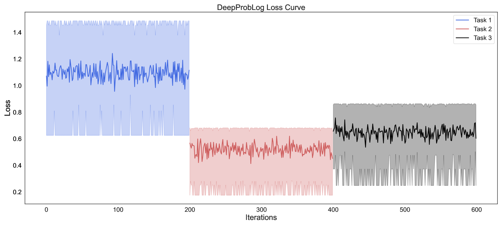
## Line Chart: DeepProbLog Loss Curve
### Overview
This image is a line chart titled "DeepProbLog Loss Curve," displaying the training loss values for three distinct tasks over a series of iterations. The chart uses three colored lines, each with a corresponding shaded area, to represent the loss trajectory and its variability for each task.
### Components/Axes
* **Title:** "DeepProbLog Loss Curve" (centered at the top).
* **X-Axis:** Labeled "Iterations." The scale runs from 0 to 600, with major tick marks at 0, 100, 200, 300, 400, 500, and 600.
* **Y-Axis:** Labeled "Loss." The scale runs from 0.2 to 1.4, with major tick marks at 0.2, 0.4, 0.6, 0.8, 1.0, 1.2, and 1.4.
* **Legend:** Located in the top-right corner. It contains three entries:
* A blue line labeled "Task 1"
* A red line labeled "Task 2"
* A black line labeled "Task 3"
### Detailed Analysis
The chart presents three separate data series, each occupying a distinct segment of the iteration axis.
1. **Task 1 (Blue Line & Shaded Area):**
* **Spatial Grounding & Trend:** This series is plotted from iteration 0 to approximately 200. The blue line shows a highly volatile, noisy pattern with no clear upward or downward trend. It oscillates rapidly around a central value.
* **Data Points:** The central line fluctuates primarily between loss values of 1.0 and 1.2. The shaded blue area, representing the range or variance, extends from a lower bound of approximately 0.6 to an upper bound of approximately 1.5.
2. **Task 2 (Red Line & Shaded Area):**
* **Spatial Grounding & Trend:** This series is plotted from iteration 200 to 400. The red line also exhibits high-frequency noise but shows a very slight downward trend over its 200-iteration span.
* **Data Points:** The central line fluctuates primarily between loss values of 0.4 and 0.6. The shaded red area extends from a lower bound of approximately 0.2 to an upper bound of approximately 0.7.
3. **Task 3 (Black Line & Shaded Area):**
* **Spatial Grounding & Trend:** This series is plotted from iteration 400 to 600. The black line is similarly noisy but displays a slight upward trend over its duration.
* **Data Points:** The central line fluctuates primarily between loss values of 0.6 and 0.8. The shaded grey area extends from a lower bound of approximately 0.2 to an upper bound of approximately 0.9.
### Key Observations
* **Distinct Loss Regimes:** Each task operates within a clearly separated range of loss values. Task 1 has the highest loss (~1.1), Task 2 has the lowest (~0.5), and Task 3 is intermediate (~0.7).
* **High Variance:** All three tasks show significant variance (indicated by the wide shaded areas) around their mean loss, suggesting noisy training dynamics or inherent stochasticity in the tasks.
* **Sequential Training:** The tasks are trained sequentially, not concurrently, as their data series do not overlap on the iteration axis.
* **Trend Subtlety:** While all lines are noisy, Task 2 shows a subtle improvement (decreasing loss), and Task 3 shows a subtle degradation (increasing loss) over their respective training windows.
### Interpretation
The chart demonstrates the training progression of the DeepProbLog model on three different tasks. The data suggests that:
1. **Task Difficulty:** Task 2 appears to be the "easiest" for the model to learn, as it achieves and maintains the lowest loss value. Task 1 is the "hardest," with the highest loss.
2. **Training Stability:** The high variance across all tasks indicates that the training process is unstable or that the loss function has a lot of local noise. This could be due to factors like small batch sizes, a complex loss landscape, or the probabilistic nature of the model.
3. **Sequential Learning Behavior:** The model's performance does not carry over between tasks. When training switches from Task 1 to Task 2, the loss drops dramatically, and when it switches to Task 3, the loss increases again. This implies the model is likely being retrained or fine-tuned for each task from a similar starting point, rather than continually learning a joint representation.
4. **Potential Overfitting/Underfitting:** The slight upward trend in Task 3's loss could be an early sign of overfitting to that specific task's training data, or it could indicate that the model's capacity is being strained. The slight downward trend in Task 2 suggests continued, albeit slow, learning.
In summary, this loss curve provides a diagnostic view of a multi-task training regimen, highlighting differences in task difficulty, the noisy nature of the optimization process, and the compartmentalized learning of each task.