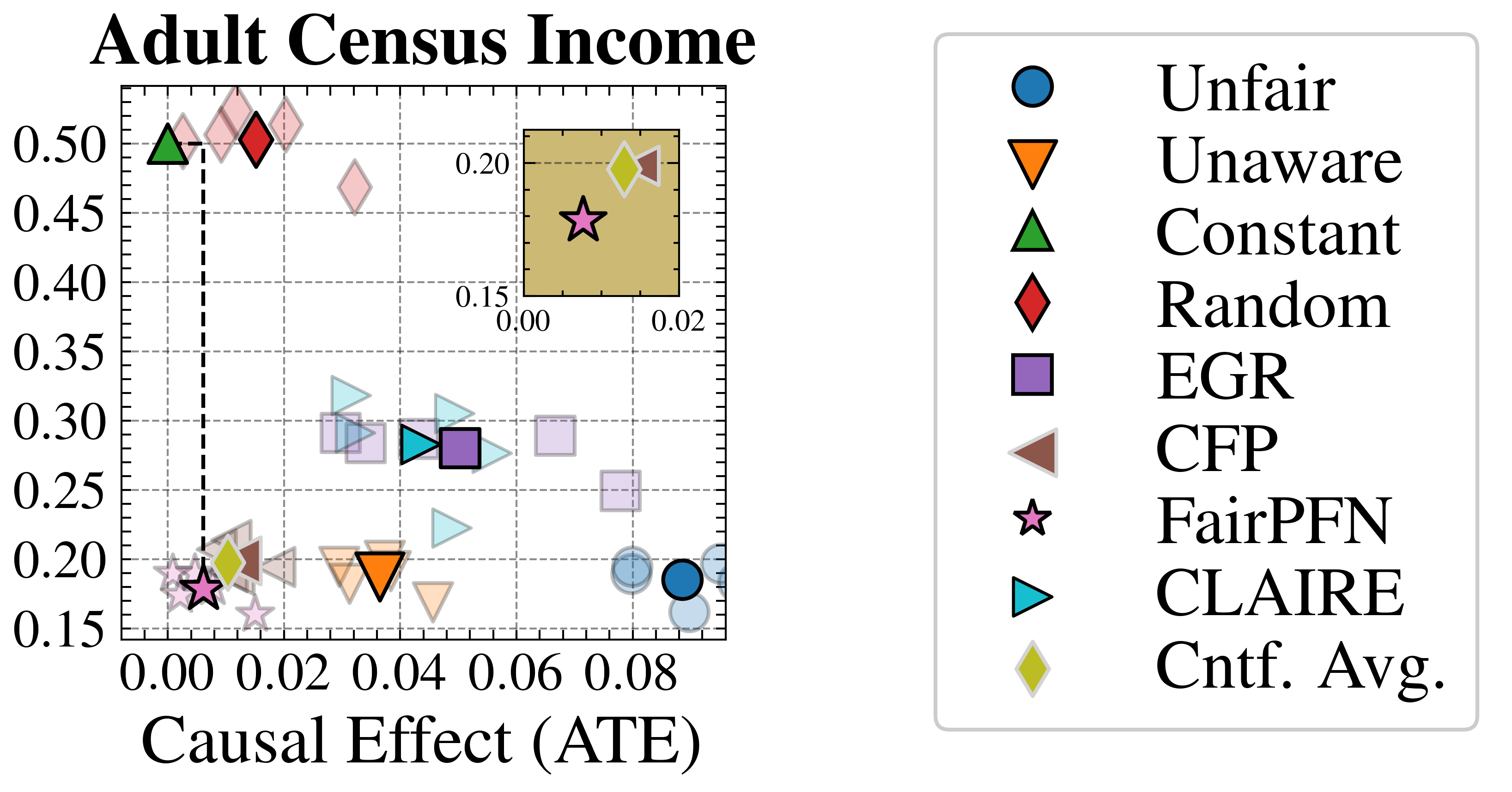
## Scatter Plot: Adult Census Income
### Overview
The image is a scatter plot titled "Adult Census Income". It displays data points representing different algorithms or methods, plotted against "Causal Effect (ATE)" on the x-axis and an unspecified metric on the y-axis. A legend on the right identifies each data point type. An inset plot provides a zoomed-in view of the lower-left region of the main plot.
### Components/Axes
* **Title:** Adult Census Income
* **X-axis:** Causal Effect (ATE)
* Scale: 0.00 to 0.08, with tick marks at intervals of 0.02.
* **Y-axis:** No explicit label, but the scale ranges from 0.15 to 0.50, with tick marks at intervals of 0.05.
* **Legend:** Located on the right side of the plot.
* Unfair (Blue Circle)
* Unaware (Orange Downward Triangle)
* Constant (Green Upward Triangle)
* Random (Red Diamond)
* EGR (Purple Square)
* CFP (Brown Sideways Triangle)
* FairPFN (Pink Star)
* CLAIRE (Teal Rightward Triangle)
* Cntf. Avg. (Yellow Diamond)
* **Inset Plot:** Located in the top-right corner of the main plot area.
* X-axis: 0.00 to 0.02
* Y-axis: 0.15 to 0.20
### Detailed Analysis
* **Unfair (Blue Circle):** Located around x=0.08, y=0.19.
* **Unaware (Orange Downward Triangle):** Located around x=0.04, y=0.19.
* **Constant (Green Upward Triangle):** Located around x=0.00, y=0.50.
* **Random (Red Diamond):** Located around x=0.01, y=0.50.
* **EGR (Purple Square):** Located around x=0.05, y=0.28.
* **CFP (Brown Sideways Triangle):** Located around x=0.01, y=0.21.
* **FairPFN (Pink Star):** Located around x=0.00, y=0.18.
* **CLAIRE (Teal Rightward Triangle):** Several points are clustered around x=0.04, y=0.30.
* **Cntf. Avg. (Yellow Diamond):** Located around x=0.01, y=0.20.
### Key Observations
* The 'Constant' and 'Random' methods have a causal effect close to zero but a high y-axis value (around 0.50).
* The 'Unfair' and 'Unaware' methods have a higher causal effect (around 0.08 and 0.04 respectively) but a lower y-axis value (around 0.19).
* The 'FairPFN' method is clustered near the origin (low causal effect and low y-axis value).
* The inset plot provides a closer look at the cluster of points near the origin, including 'FairPFN', 'CFP', and 'Cntf. Avg.'.
### Interpretation
The scatter plot visualizes the trade-offs between "Causal Effect (ATE)" and another unspecified metric for different algorithms or methods related to adult census income. The plot suggests that some methods (like 'Constant' and 'Random') prioritize a high y-axis value at the expense of causal effect, while others (like 'Unfair' and 'Unaware') exhibit the opposite behavior. The 'FairPFN' method appears to achieve a balance between the two metrics, as it is located near the origin. The clustering of points suggests that certain methods may have similar performance characteristics. The inset plot highlights the subtle differences among methods with low causal effects.