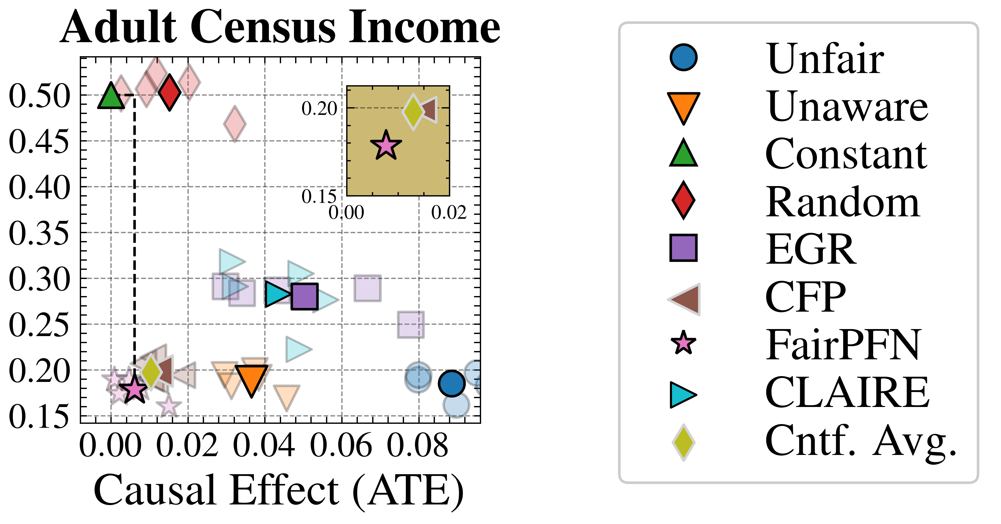
## Scatter Plot: Adult Census Income
### Overview
This image presents a scatter plot visualizing the relationship between "Causal Effect (ATE)" on the x-axis and an unnamed y-axis, presumably representing some measure of fairness or performance. The plot compares several different fairness-aware algorithms and baseline methods. A zoomed-in inset plot highlights a specific region of the data.
### Components/Axes
* **Title:** "Adult Census Income" (top-center)
* **X-axis Label:** "Causal Effect (ATE)" (bottom-center)
* **Y-axis Label:** Not explicitly labeled, but the scale ranges from approximately 0.15 to 0.52.
* **Legend:** Located in the top-right corner, listing the following algorithms/methods with corresponding marker shapes and colors:
* Unfair (Blue Circle)
* Unaware (Orange Downward Triangle)
* Constant (Green Upward Triangle)
* Random (Red Diamond)
* EGR (Purple Square)
* CFP (Gray Circle)
* FairPFN (White Star)
* CLAIRE (Blue Downward Triangle)
* Cntf. Avg. (Yellow Diamond)
* **Inset Plot:** A zoomed-in section of the main plot, located in the top-right quadrant, with x-axis ranging from approximately 0.00 to 0.02 and y-axis ranging from approximately 0.15 to 0.20.
### Detailed Analysis
The main plot displays data points for each of the algorithms listed in the legend.
* **Unfair (Blue Circle):** Located near (0.08, 0.20).
* **Unaware (Orange Downward Triangle):** Located near (0.04, 0.48).
* **Constant (Green Upward Triangle):** Located near (0.00, 0.50).
* **Random (Red Diamond):** Several points are scattered between approximately (0.02, 0.25) and (0.08, 0.35).
* **EGR (Purple Square):** Located near (0.06, 0.30).
* **CFP (Gray Circle):** Located near (0.04, 0.25).
* **FairPFN (White Star):** Located near (0.06, 0.42) and (0.00, 0.18).
* **CLAIRE (Blue Downward Triangle):** Located near (0.04, 0.30).
* **Cntf. Avg. (Yellow Diamond):** Several points are scattered between approximately (0.02, 0.20) and (0.08, 0.30).
**Trends:**
* The "Constant" method consistently shows the highest y-axis values.
* The "Unaware" method generally has higher y-axis values than "Unfair".
* "FairPFN" has two distinct data points, one with a high y-axis value and one with a low y-axis value.
* The "Random" and "Cntf. Avg." methods exhibit a wider spread of values.
**Inset Plot:**
* The inset plot focuses on a region with lower "Causal Effect (ATE)" values.
* A "FairPFN" (White Star) data point is visible at approximately (0.01, 0.18).
### Key Observations
* There is a noticeable spread in the data, indicating that different algorithms perform differently in terms of the measured metrics.
* The "Constant" method appears to achieve the highest values on the y-axis, but it's unclear what this axis represents without further context.
* The presence of multiple data points for "FairPFN" suggests variability in its performance.
* The inset plot highlights the performance of "FairPFN" in a specific region of the "Causal Effect (ATE)" range.
### Interpretation
The scatter plot likely aims to compare the trade-offs between fairness and causal effect for different algorithmic approaches on the Adult Census Income dataset. The x-axis, "Causal Effect (ATE)", represents the average treatment effect, indicating the impact of a decision on an individual's income. The y-axis likely represents a fairness metric, where higher values indicate better fairness.
The plot suggests that achieving high fairness (high y-axis values) may come at the cost of a lower causal effect (lower x-axis values). The "Constant" method, while achieving the highest fairness, has a relatively low causal effect. The "Unaware" method, which does not explicitly consider fairness, has a higher causal effect but potentially lower fairness.
The two data points for "FairPFN" suggest that its performance is sensitive to certain conditions or parameters. The inset plot focuses on a region where "FairPFN" performs relatively well, indicating that it may be a viable option for achieving both fairness and a reasonable causal effect in specific scenarios.
The spread of data points for "Random" and "Cntf. Avg." indicates that these methods are less consistent in their performance. The overall goal of the visualization is to help decision-makers choose the most appropriate algorithm based on their specific priorities and constraints.