\n
## Charts: Temperature Effect and Linear Regression Coefficient
### Overview
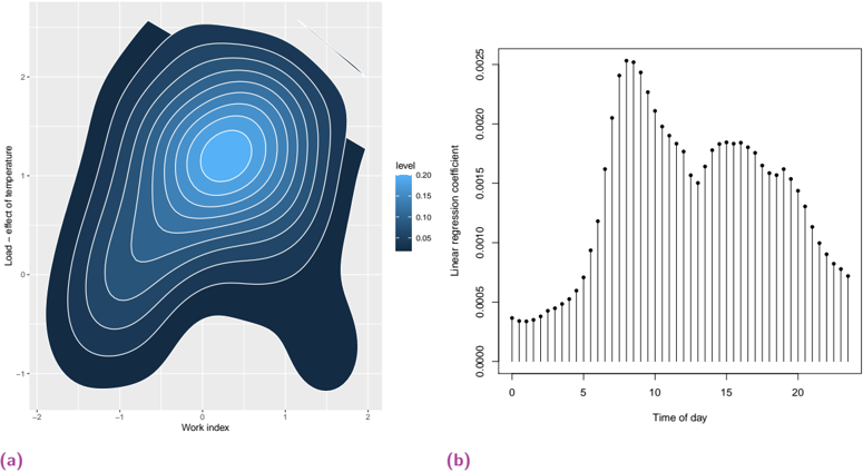
The image presents two charts: (a) a 2D contour plot showing the relationship between "Work index" and "Load - effect of temperature", with a color scale representing the "level"; and (b) a bar chart displaying the "Linear regression coefficient" against "Time of day".
### Components/Axes
**Chart (a): Contour Plot**
* **X-axis:** "Work index", ranging from approximately -2 to 2.
* **Y-axis:** "Load - effect of temperature", ranging from approximately -1.5 to 2.5.
* **Color Scale/Legend:** "level", ranging from 0.00 to 0.20, with colors transitioning from dark blue to light blue.
* **Contours:** Multiple contour lines representing different levels of the "level" variable.
**Chart (b): Bar Chart**
* **X-axis:** "Time of day", ranging from 0 to 22.
* **Y-axis:** "Linear regression coefficient", ranging from approximately 0.000 to 0.0025.
* **Bars:** Vertical bars representing the linear regression coefficient at each time of day.
* **Error Bars:** Small vertical lines extending above and below each bar, indicating the uncertainty or standard error.
### Detailed Analysis or Content Details
**Chart (a): Contour Plot**
The contour plot shows a complex relationship between Work Index and Load - effect of temperature. The highest "level" (lightest blue) is concentrated around a Work Index of approximately 0.5 and a Load - effect of temperature of approximately 1.5. The contours become denser and darker blue as you move away from this peak, indicating lower levels. The contour lines are tightly packed in the central region, suggesting a steep gradient in the "level" variable. The lowest levels (darkest blue) are found at the extremes of both axes, particularly at Work Index values near -2 and Load - effect of temperature values near -1.5.
**Chart (b): Bar Chart**
The bar chart shows a clear trend in the linear regression coefficient over the course of the day. The coefficient starts at approximately 0.0002 at Time of day 0, increases rapidly to a peak around Time of day 12, reaching approximately 0.0022, and then gradually decreases to approximately 0.0005 at Time of day 22. The error bars are relatively small, indicating a consistent relationship. The error bars are largest around Time of day 0 and Time of day 22.
Here's a breakdown of approximate values from the bar chart:
* Time of day 0: Coefficient ≈ 0.0002, Error ≈ 0.0001
* Time of day 5: Coefficient ≈ 0.0008, Error ≈ 0.0001
* Time of day 10: Coefficient ≈ 0.0018, Error ≈ 0.0001
* Time of day 12: Coefficient ≈ 0.0022, Error ≈ 0.0001
* Time of day 15: Coefficient ≈ 0.0018, Error ≈ 0.0001
* Time of day 20: Coefficient ≈ 0.0008, Error ≈ 0.0001
* Time of day 22: Coefficient ≈ 0.0005, Error ≈ 0.0001
### Key Observations
* **Chart (a):** The highest "level" is observed at a specific combination of Work Index and Load - effect of temperature.
* **Chart (b):** The linear regression coefficient exhibits a strong diurnal pattern, peaking around midday (Time of day 12) and declining towards the beginning and end of the day. The error bars suggest that the relationship is relatively stable across different time points.
### Interpretation
The data suggests a complex interaction between work index and temperature effect, with an optimal combination leading to the highest "level" (presumably a desirable outcome). The diurnal pattern in the linear regression coefficient indicates that the relationship between time of day and some underlying variable is strongest around midday. This could be related to factors such as solar radiation, human activity patterns, or other time-dependent variables. The error bars provide a measure of the uncertainty in the estimated coefficients, allowing for a more robust interpretation of the results. The combination of these two charts suggests a system where both workload and time of day play a significant role in determining the outcome. The contour plot identifies optimal conditions, while the bar chart reveals how these conditions change throughout the day.