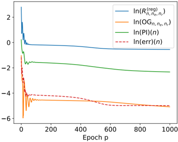
## Line Chart: Logarithmic Loss vs. Epoch
### Overview
The image presents a line chart illustrating the logarithmic loss of four different metrics – Regularized Risk (R), Observed Gradient (OG), Prediction Information (PI), and Error – as a function of the epoch (p). The y-axis represents the natural logarithm of each metric, while the x-axis represents the epoch number, ranging from 0 to 1000. The chart appears to track the convergence of a model during training.
### Components/Axes
* **X-axis:** "Epoch p" - Represents the training epoch, ranging from 0 to approximately 1000.
* **Y-axis:** Logarithmic scale, ranging from approximately -6 to 2. No explicit label is given, but the legend indicates the values represent ln(metric).
* **Legend:** Located in the top-right corner.
* Blue Solid Line: ln(R<sup>(reg)</sup><sub>n,ne,n’</sub>)
* Orange Solid Line: ln(OG<sub>n,ne,n’</sub>)
* Green Solid Line: ln(PI(n))
* Red Dashed Line: ln(err(n))
### Detailed Analysis
The chart displays four distinct lines, each representing the logarithmic loss of a different metric over epochs.
* **ln(R<sup>(reg)</sup><sub>n,ne,n’</sub>) (Blue Line):** This line starts at approximately 2.2 at epoch 0, rapidly decreases to around -0.5 by epoch 50, and then plateaus, fluctuating between approximately -0.5 and -0.2 for the remainder of the epochs. The trend is initially steep, then becomes relatively flat.
* **ln(OG<sub>n,ne,n’</sub>) (Orange Line):** This line begins at approximately -4.5 at epoch 0, and gradually increases to around -3.5 by epoch 1000. The trend is consistently upward, but the rate of increase slows down over time.
* **ln(PI(n)) (Green Line):** This line starts at approximately -1.8 at epoch 0, and decreases steadily to around -2.5 by epoch 1000. The trend is consistently downward, but the rate of decrease slows down over time.
* **ln(err(n)) (Red Dashed Line):** This line begins at approximately -4.5 at epoch 0, and gradually increases to around -3.8 by epoch 1000. The trend is consistently upward, but the rate of increase slows down over time.
Approximate Data Points (sampled):
| Epoch (p) | ln(R<sup>(reg)</sup><sub>n,ne,n’</sub>) | ln(OG<sub>n,ne,n’</sub>) | ln(PI(n)) | ln(err(n)) |
|---|---|---|---|---|
| 0 | 2.2 | -4.5 | -1.8 | -4.5 |
| 50 | -0.5 | -4.0 | -2.1 | -4.2 |
| 200 | -0.3 | -3.8 | -2.3 | -4.0 |
| 500 | -0.2 | -3.6 | -2.4 | -3.9 |
| 1000 | -0.2 | -3.5 | -2.5 | -3.8 |
### Key Observations
* The Regularized Risk (blue line) converges relatively quickly and stabilizes at a low logarithmic loss.
* The Observed Gradient, Prediction Information, and Error metrics all show a gradual increase in logarithmic loss over time, indicating a potential divergence or slow convergence.
* The Error metric (red dashed line) and Observed Gradient (orange line) are initially very close, but diverge slightly over time.
* The Prediction Information (green line) is consistently between the Regularized Risk and the other two metrics.
### Interpretation
The chart suggests that the model is converging in terms of regularized risk, but may be experiencing issues with gradient estimation or error minimization. The increasing logarithmic loss for the Observed Gradient, Prediction Information, and Error metrics could indicate that the model is overfitting, or that the learning rate is too high, causing the optimization process to oscillate or diverge. The rapid convergence of the regularized risk suggests that the regularization term is effectively preventing overfitting. The difference between the metrics could be due to the specific calculations and interpretations of each metric within the model. Further investigation into the model's architecture, hyperparameters, and training data would be necessary to determine the root cause of the observed behavior. The logarithmic scale compresses the differences, so the actual magnitude of the changes in the metrics may be smaller than they appear.