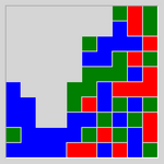
## Categorical Grid Heatmap: Color Distribution Pattern
### Overview
The image displays a 10x10 grid of colored squares, forming a categorical heatmap or spatial distribution chart. There are no textual labels, axis titles, legends, or numerical markers present in the image. The information is conveyed entirely through color coding and spatial arrangement. The grid uses four distinct colors: blue, green, red, and light gray.
### Components/Axes
* **Grid Structure:** A 10x10 matrix of square cells.
* **Color Legend (Inferred):** No explicit legend is provided. The colors are:
* **Blue**
* **Green**
* **Red**
* **Light Gray**
* **Axes/Labels:** None present. The grid lacks X/Y axis labels, a title, or any explanatory text.
### Detailed Analysis
The grid can be segmented into regions based on color dominance. The following is a cell-by-cell description, reading left-to-right, top-to-bottom (Row 1 is the top row).
**Row 1:** Gray, Gray, Gray, Gray, Gray, Gray, Gray, Gray, Green, Red
**Row 2:** Gray, Gray, Gray, Gray, Gray, Gray, Gray, Blue, Green, Red
**Row 3:** Gray, Gray, Gray, Gray, Gray, Gray, Blue, Blue, Green, Red
**Row 4:** Gray, Gray, Gray, Gray, Gray, Blue, Blue, Green, Green, Red
**Row 5:** Gray, Gray, Gray, Gray, Blue, Blue, Green, Green, Red, Red
**Row 6:** Gray, Gray, Gray, Blue, Blue, Green, Green, Red, Red, Red
**Row 7:** Gray, Gray, Blue, Blue, Green, Green, Red, Red, Red, Red
**Row 8:** Gray, Blue, Blue, Green, Green, Red, Red, Red, Red, Red
**Row 9:** Blue, Blue, Green, Green, Red, Red, Red, Red, Red, Red
**Row 10:** Blue, Blue, Blue, Blue, Red, Red, Red, Red, Red, Red
**Spatial Distribution Summary:**
* **Light Gray Region:** Occupies a large, contiguous block in the **top-left** quadrant, forming a rough triangular or stepped shape. It spans from Row 1, Column 1 down to approximately Row 8, Column 1, and extends rightward to varying degrees in each row.
* **Blue Region:** Concentrated in the **bottom-left** quadrant. It forms a dense cluster from Row 10, Column 1 up to Row 5, Column 5, with a protrusion up the leftmost column.
* **Green Region:** Forms a diagonal band or cluster running from the **center-left** (around Row 7, Column 3) towards the **top-right** (Row 1, Column 9). It is generally sandwiched between the blue and red regions.
* **Red Region:** Dominates the **right side and bottom-right** quadrant. It is most dense from Row 5, Column 8 down to Row 10, Column 10, and also occupies the top-right corner (Row 1, Column 10).
### Key Observations
1. **No Textual Data:** The chart contains zero alphanumeric information. All meaning must be inferred from color and position.
2. **Clear Color Segregation:** The colors are not randomly mixed. They form distinct, contiguous regions with sharp boundaries, suggesting categorical separation or a gradient of some property.
3. **Diagonal Gradient Pattern:** There is a clear visual trend from the **top-left (Gray)** to the **bottom-right (Red)**, with **Blue** and **Green** forming intermediate bands. The progression is roughly: Gray -> Blue -> Green -> Red.
4. **Asymmetry:** The distribution is not symmetrical. The gray and blue areas are more block-like, while the green and red areas form more diagonal or scattered patterns.
5. **Density Variation:** The red region appears to have the highest density of its color in the bottom-right corner, while the gray region is most solid in the top-left.
### Interpretation
Without labels, the precise meaning is ambiguous, but the visual structure suggests several possibilities:
* **Categorical Heatmap:** This could represent the distribution of four discrete categories across a two-dimensional space (e.g., terrain types on a map, material composition in a sample, or classification results in a machine learning model). The sharp boundaries imply hard categories rather than a continuous variable.
* **Phase Diagram or Transition Map:** The diagonal gradient from Gray to Red via Blue and Green might illustrate a transition between states or phases across two changing parameters (the implicit X and Y axes). The gray area could represent an initial or undefined state.
* **Spatial Process Output:** It could be the result of a simulation (e.g., cellular automaton, diffusion-limited aggregation) showing the growth or spread of different "agents" or "materials" (represented by colors) from different starting points.
* **Notable Anomaly:** The single **Red** cell in the top-right corner (Row 1, Column 10) is isolated from the main red mass by green and blue cells. This could be a significant outlier, a seed point, or an error in the data generation process.
**Conclusion:** The image is a purely visual, non-textual data representation showing a structured, non-random distribution of four categories across a grid. The primary information is the spatial relationship and relative proportions of the colored regions, indicating a strong directional trend or gradient from the top-left to the bottom-right of the mapped area. To extract factual data, a legend or accompanying text defining the meaning of each color is essential.