\n
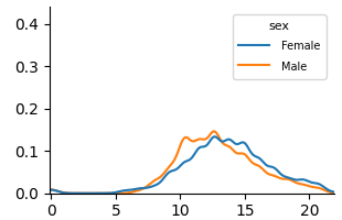
## Line Chart: Distribution Comparison by Sex
### Overview
The image displays a line chart comparing two distributions, labeled "Female" and "Male," across a numerical range. The chart appears to show probability density or frequency distributions, with both series exhibiting a unimodal, roughly bell-shaped curve. The visual suggests a comparison of a continuous variable between two groups.
### Components/Axes
* **Chart Type:** Line chart (density plot).
* **Legend:** Located in the top-right corner. It contains the title "sex" and two entries:
* A blue line labeled "Female".
* An orange line labeled "Male".
* **X-Axis:** A horizontal numerical axis. It has major tick marks and labels at intervals of 5, specifically at `0`, `5`, `10`, `15`, and `20`. The axis extends slightly beyond 20. **No descriptive title or label is present for this axis.**
* **Y-Axis:** A vertical numerical axis. It has major tick marks and labels at intervals of 0.1, specifically at `0.0`, `0.1`, `0.2`, `0.3`, and `0.4`. **No descriptive title or label is present for this axis.**
### Detailed Analysis
**Trend Verification:**
* **Female (Blue Line):** The line starts near y=0 at x=0, remains low until approximately x=5, then begins a steady ascent. It reaches a peak density between x=13 and x=14, with a y-value of approximately 0.14. After the peak, it descends steadily, approaching y=0 near x=20.
* **Male (Orange Line):** This line follows a very similar trajectory. It also starts near y=0, begins rising around x=5, and peaks slightly earlier than the female line, around x=12-13. Its peak value is marginally higher, at approximately y=0.15. It then descends, crossing below the female line around x=16, and also approaches y=0 near x=20.
**Data Point Extraction (Approximate Values):**
| X-Value (Approx.) | Female (Blue) Y-Value (Approx.) | Male (Orange) Y-Value (Approx.) | Notes |
| :--- | :--- | :--- | :--- |
| 0 | ~0.00 | ~0.00 | Both lines originate near the origin. |
| 5 | ~0.01 | ~0.01 | Both distributions begin to rise. |
| 10 | ~0.08 | ~0.10 | Male line is slightly above Female line. |
| 12 | ~0.12 | ~0.15 | Male line appears to reach its peak. |
| 13 | ~0.14 | ~0.14 | Lines are very close; Female may be at its peak. |
| 15 | ~0.12 | ~0.10 | Female line is now above Male line. |
| 16 | ~0.10 | ~0.08 | **Intersection Point:** Lines cross here. |
| 18 | ~0.04 | ~0.03 | Both lines are descending. |
| 20 | ~0.01 | ~0.01 | Both lines converge near zero. |
### Key Observations
1. **Missing Context:** The most significant observation is the complete absence of labels for the X and Y axes. This makes it impossible to know what variable is being measured (e.g., age, score, time) or what the y-axis represents (e.g., probability density, frequency, count).
2. **Similar Distributions:** The two distributions are remarkably similar in shape, range, and central tendency. Both are unimodal and centered around the 12-14 range on the x-axis.
3. **Subtle Differences:** The male distribution has a slightly higher and earlier peak. The female distribution has a slightly longer "tail" to the right, as evidenced by it being the higher line after x=16.
4. **Range:** Both distributions are effectively contained within the x-axis range of 0 to 20.
### Interpretation
The chart demonstrates a comparison of two very similar distributions. Without axis labels, the specific subject matter is unknown, but the pattern is classic for comparing a continuous variable across two groups (e.g., test scores, reaction times, physical measurements).
The data suggests that the central tendency (mean/median) for the measured variable is nearly identical for females and males in this dataset. The slight differences in peak height and position could indicate minor variations in concentration around the mode, but the overall overlap is substantial. The crossing of the lines around x=16 is a key point, indicating where the relative frequency of the two groups inverts.
**Primary Limitation:** The lack of axis titles renders the chart scientifically uninterpretable. It shows a *relationship* but provides no information about the *entities* in that relationship. To be useful for technical documentation, the axes must be labeled to define the variables (e.g., "Age (years)" for the x-axis and "Probability Density" for the y-axis).