\n
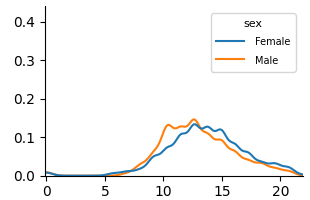
## Line Chart: Distribution by Sex
### Overview
The image presents a line chart depicting the distribution of a variable (likely age or a similar continuous measure) across two sexes: Female and Male. The y-axis represents the density or frequency, while the x-axis ranges from 0 to 20.
### Components/Axes
* **X-axis:** Labeled with numerical values from 0 to 20, representing the range of the variable being measured.
* **Y-axis:** Labeled with a scale from 0.0 to 0.4, representing the density or frequency of the variable.
* **Legend:** Located in the top-right corner, identifies the two lines:
* "Female" - represented by a blue line.
* "Sex" - the legend title.
* "Male" - represented by an orange line.
### Detailed Analysis
* **Female (Blue Line):** The line starts at approximately 0.0 at x=0, gradually increases, reaching a peak density of approximately 0.12 at around x=12. It then declines, approaching 0.0 again by x=20.
* **Male (Orange Line):** The line starts at approximately 0.0 at x=0, increases more rapidly than the female line, peaking at approximately 0.14 at around x=10. It then declines, crossing the female line around x=13, and approaching 0.0 by x=20.
* **Trend Comparison:** The male distribution peaks earlier (around x=10) and at a slightly higher density than the female distribution (around x=12). Both distributions are roughly symmetrical, but the male distribution appears to have a slightly sharper peak and a faster decline.
### Key Observations
* The male distribution shows a higher concentration of values in the range of 8-12 compared to the female distribution.
* Both distributions exhibit a similar overall shape, suggesting a common underlying process, but with a shift in the peak location.
* The distributions are relatively smooth, indicating a large sample size or a continuous variable.
### Interpretation
The chart suggests that the variable being measured (likely age or a similar continuous measure) is distributed differently between males and females. The earlier peak in the male distribution could indicate that males tend to have lower values of this variable, while the later peak in the female distribution suggests females tend to have higher values. The similarity in the overall shape of the distributions suggests that the underlying process generating these values is similar for both sexes, but with a systematic difference in the central tendency. Without knowing what the x-axis represents, it's difficult to draw more specific conclusions. However, if the x-axis represents age, this could indicate that the male population in the dataset tends to be younger on average than the female population.