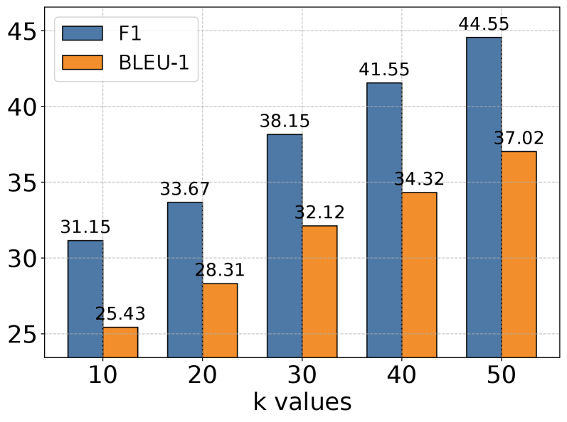
## Bar Chart: F1 and BLEU-1 Scores vs. k Values
### Overview
The image is a bar chart comparing F1 and BLEU-1 scores for different values of 'k'. The x-axis represents 'k values' ranging from 10 to 50, and the y-axis represents the scores. The chart displays two data series: F1 scores (represented by blue bars) and BLEU-1 scores (represented by orange bars).
### Components/Axes
* **X-axis:** 'k values' with markers at 10, 20, 30, 40, and 50.
* **Y-axis:** Numerical scale ranging from approximately 25 to 45, with gridlines at intervals of 5.
* **Legend (top-left):**
* Blue: F1
* Orange: BLEU-1
### Detailed Analysis
* **F1 (Blue Bars):** The F1 score generally increases as the 'k value' increases.
* k = 10: F1 = 31.15
* k = 20: F1 = 33.67
* k = 30: F1 = 38.15
* k = 40: F1 = 41.55
* k = 50: F1 = 44.55
* **BLEU-1 (Orange Bars):** The BLEU-1 score also increases as the 'k value' increases.
* k = 10: BLEU-1 = 25.43
* k = 20: BLEU-1 = 28.31
* k = 30: BLEU-1 = 32.12
* k = 40: BLEU-1 = 34.32
* k = 50: BLEU-1 = 37.02
### Key Observations
* The F1 score is consistently higher than the BLEU-1 score for all 'k values'.
* Both F1 and BLEU-1 scores show a positive correlation with 'k values'.
* The increase in F1 score appears to be more pronounced than the increase in BLEU-1 score as 'k' increases.
### Interpretation
The chart suggests that increasing the 'k value' improves both F1 and BLEU-1 scores, indicating better performance in whatever task these metrics are evaluating. The F1 score consistently outperforms the BLEU-1 score, implying that the system or model being evaluated performs better according to the F1 metric. The increasing trend suggests that further increasing 'k' might lead to even higher scores, although this is not explicitly shown in the chart. The relationship between 'k' and these metrics is likely related to the specific algorithm or model being used, and further investigation would be needed to understand the underlying reasons for this trend.