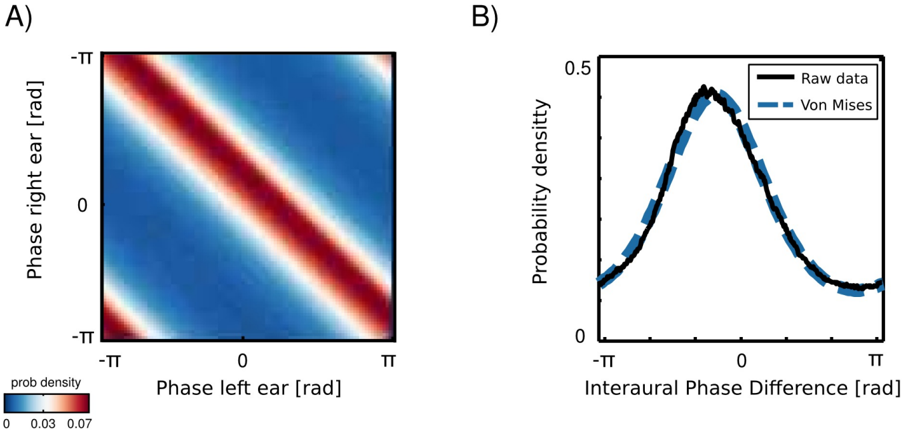
## Heatmap and Line Graph: Phase Relationship Analysis
### Overview
The image contains two panels:
- **Panel A**: A heatmap showing probability density as a function of phase differences between left and right ears.
- **Panel B**: A line graph comparing raw data and a Von Mises distribution for interaural phase differences.
### Components/Axes
#### Panel A (Heatmap)
- **X-axis**: "Phase left ear [rad]" (range: -π to π, labeled as -TT to TT).
- **Y-axis**: "Phase right ear [rad]" (range: -π to π, labeled as -TT to TT).
- **Color Scale**: Probability density (0.03 to 0.07), with red indicating higher density.
- **Legend**: Located at the bottom-left corner, labeled "prob density" with a gradient from blue (low) to red (high).
#### Panel B (Line Graph)
- **X-axis**: "Interaural Phase Difference [rad]" (range: -π to π, labeled as -TT to TT).
- **Y-axis**: "Probability density" (range: 0 to 0.5).
- **Legend**: Located at the top-right corner, with two entries:
- **Black line**: "Raw data"
- **Blue dashed line**: "Von Mises"
### Detailed Analysis
#### Panel A
- The heatmap exhibits a **diagonal red stripe** from the bottom-left to top-right, indicating a strong correlation between the phases of the left and right ears.
- Probability density is highest along this diagonal (red regions) and decreases toward the edges (blue regions).
- The color gradient confirms that the maximum probability density (~0.07) occurs near the diagonal, while minimum density (~0.03) is at the corners.
#### Panel B
- The **raw data** (black line) forms a symmetric unimodal distribution centered at 0 rad, peaking at ~0.45 probability density.
- The **Von Mises distribution** (blue dashed line) closely follows the raw data, with a peak at 0 rad and a slight deviation in the tails.
- Both distributions are symmetric about 0 rad, with no significant outliers.
### Key Observations
1. **Panel A**: The diagonal red stripe suggests a linear relationship between the phases of the two ears, with maximum probability when their phases are equal (0 rad difference).
2. **Panel B**: The Von Mises distribution closely matches the raw data, indicating that the phase differences follow a circular von Mises distribution, typical for angular data.
3. **Color Consistency**: In Panel A, red regions align with the legend’s high-density values, and blue regions align with low-density values.
### Interpretation
- **Panel A** demonstrates that the phases of the left and right ears are strongly correlated, with the highest likelihood of matching phases (0 rad difference). This could reflect binaural hearing mechanisms or synchronization in auditory processing.
- **Panel B** validates that the raw data aligns with the theoretical Von Mises distribution, confirming that interaural phase differences are circularly symmetric and concentrated near 0 rad. The slight deviation in the tails may indicate minor noise or measurement variability.
- The use of the Von Mises distribution (a circular analog of the Gaussian distribution) is appropriate here, as phase data inherently wraps around 2π radians.
*Note: All values are approximate, with uncertainty arising from the visual representation of the heatmap and line graph.*