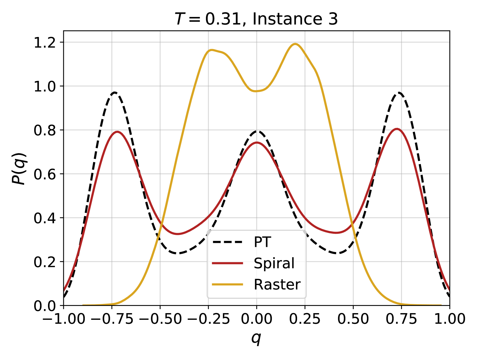
## Line Chart: Probability Distribution of 'q' for Different Trajectories
### Overview
This image presents a line chart illustrating the probability distribution of a variable 'q' for three different trajectories: PT, Spiral, and Raster. The chart displays the probability P(q) on the y-axis against the values of 'q' on the x-axis, ranging from -1.00 to 1.00. The chart is titled "T = 0.31, Instance 3", indicating a specific parameter setting and instance number.
### Components/Axes
* **X-axis:** Labeled 'q', ranging from -1.00 to 1.00 with increments of 0.25.
* **Y-axis:** Labeled 'P(q)', ranging from 0.0 to 1.2 with increments of 0.2.
* **Title:** "T = 0.31, Instance 3" positioned at the top-center of the chart.
* **Legend:** Located in the bottom-left corner, identifying the three lines:
* PT (dashed black line)
* Spiral (solid maroon line)
* Raster (solid goldenrod line)
* **Grid:** A light gray grid is present, aiding in the reading of values.
### Detailed Analysis
The chart displays three distinct probability distributions.
* **Raster (Goldenrod):** This line exhibits a bimodal distribution. It starts at approximately P(q) = 0.0 at q = -1.00, rises to a peak of approximately P(q) = 1.18 at q = -0.25, then decreases to a local minimum of approximately P(q) = 0.0 at q = 0.25, and finally rises again to a peak of approximately P(q) = 1.18 at q = 0.75, before decreasing to approximately P(q) = 0.0 at q = 1.00.
* **Spiral (Maroon):** This line also shows a bimodal distribution, but with lower peak values and a different shape. It starts at approximately P(q) = 0.1 at q = -1.00, rises to a peak of approximately P(q) = 0.75 at q = -0.25, decreases to a local minimum of approximately P(q) = 0.25 at q = 0.25, and rises again to a peak of approximately P(q) = 0.75 at q = 0.75, before decreasing to approximately P(q) = 0.1 at q = 1.00.
* **PT (Black Dashed):** This line exhibits a similar bimodal distribution to the Spiral line, but with a wider spread and lower peak values. It starts at approximately P(q) = 0.1 at q = -1.00, rises to a peak of approximately P(q) = 0.95 at q = -0.75, decreases to a local minimum of approximately P(q) = 0.3 at q = 0.0, and rises again to a peak of approximately P(q) = 0.95 at q = 0.75, before decreasing to approximately P(q) = 0.1 at q = 1.00.
### Key Observations
* The Raster trajectory has the highest probability values, particularly around q = -0.25 and q = 0.75.
* The Spiral and PT trajectories have similar shapes, but the PT trajectory has a slightly wider spread and higher peak values.
* All three trajectories exhibit bimodal distributions, suggesting that the variable 'q' tends to cluster around two distinct values for each trajectory.
* The distributions are not symmetrical.
### Interpretation
The chart demonstrates the probability distributions of the variable 'q' for three different trajectories (PT, Spiral, and Raster) under specific conditions (T = 0.31, Instance 3). The bimodal nature of the distributions suggests that 'q' is not randomly distributed but rather favors two specific values for each trajectory. The differences in the distributions between the trajectories indicate that the way 'q' is distributed depends on the trajectory followed. The Raster trajectory appears to have the most pronounced preference for the two values, as indicated by its higher peak probabilities. The parameter 'T' likely influences the shape and position of these distributions, and the specific instance number suggests that there is variability in the distributions even under the same conditions. This data could be used to understand the behavior of a system where 'q' represents a key variable and the trajectories represent different paths or states within the system. The differences in distributions could be used to differentiate between the trajectories or to predict the value of 'q' given a specific trajectory.