\n
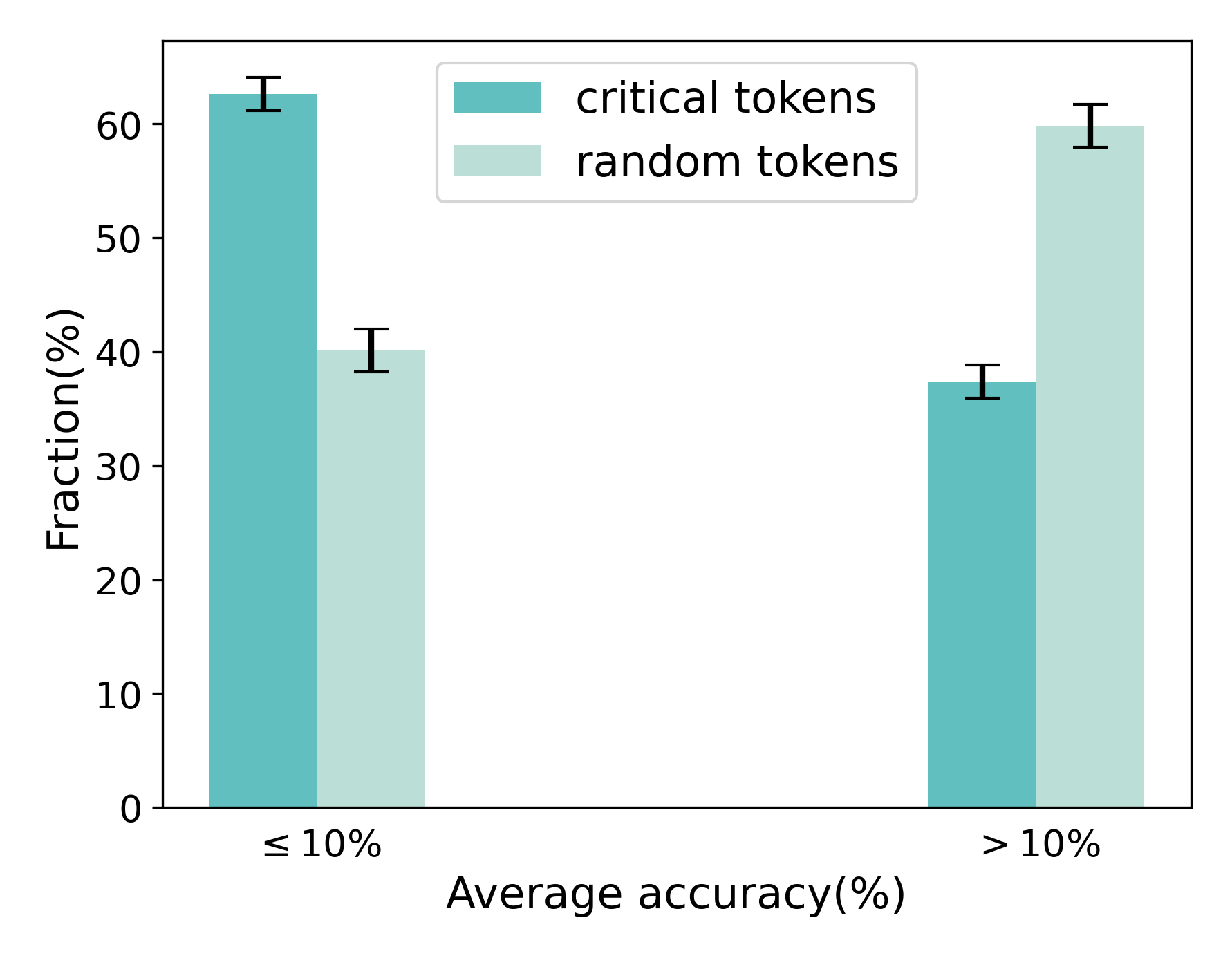
## Bar Chart: Fraction vs. Average Accuracy for Token Types
### Overview
This bar chart compares the fraction of tokens (expressed as a percentage) for "critical tokens" and "random tokens" across two categories of average accuracy (also expressed as a percentage): "≤ 10%" and "> 10%". Error bars are included for each data point, indicating the variability or confidence interval.
### Components/Axes
* **X-axis:** "Average accuracy (%)" with two categories: "≤ 10%" and "> 10%".
* **Y-axis:** "Fraction (%)" ranging from 0% to 60%.
* **Legend:** Located in the top-right corner, distinguishing between:
* "critical tokens" (represented by a teal/green color)
* "random tokens" (represented by a light teal/green color)
* **Error Bars:** Vertical lines extending above each bar, representing the standard error or confidence interval.
### Detailed Analysis
The chart presents four data series, two for each accuracy category, and each series has an associated error bar.
**1. Average Accuracy ≤ 10%**
* **Critical Tokens:** The bar for critical tokens is approximately 62% tall, with an error bar extending to approximately 65%.
* **Random Tokens:** The bar for random tokens is approximately 40% tall, with an error bar extending to approximately 43%.
**2. Average Accuracy > 10%**
* **Critical Tokens:** The bar for critical tokens is approximately 36% tall, with an error bar extending to approximately 39%.
* **Random Tokens:** The bar for random tokens is approximately 60% tall, with an error bar extending to approximately 63%.
### Key Observations
* For tokens with average accuracy ≤ 10%, the fraction of critical tokens is significantly higher than that of random tokens.
* For tokens with average accuracy > 10%, the fraction of random tokens is significantly higher than that of critical tokens.
* The error bars suggest a relatively low degree of uncertainty in the measurements.
### Interpretation
The data suggests a strong inverse relationship between average accuracy and the fraction of critical tokens. When average accuracy is low (≤ 10%), critical tokens are more prevalent. Conversely, when average accuracy is high (> 10%), random tokens are more prevalent. This could indicate that critical tokens are more likely to be associated with errors or lower-performing elements, while random tokens are more likely to be associated with successful or higher-performing elements.
The chart implies that identifying and focusing on critical tokens might be a useful strategy for improving overall accuracy, particularly in scenarios where accuracy is initially low. The shift in prevalence between token types as accuracy increases suggests that addressing the issues related to critical tokens leads to improved performance, and they become less dominant as the system improves. The error bars indicate that these trends are relatively robust and not likely due to random chance.