\n
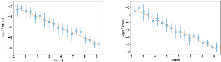
## Chart: Log(L^2 error) vs. Log(n)
### Overview
The image presents two identical scatter plots displaying the relationship between log(L^2 error) and log(n). Each plot shows a series of data points represented by blue star markers with error bars, and a superimposed orange line indicating a trend. The plots appear to be comparing the error rate as a function of the input size, likely in a machine learning or statistical modeling context.
### Components/Axes
* **X-axis Label:** log(n) - ranging from approximately 2 to 9.
* **Y-axis Label:** log(L^2 error) - ranging from approximately -2 to -10 in the left plot and -2 to -8 in the right plot.
* **Data Points:** Blue star markers with vertical error bars.
* **Trend Line:** Orange solid line.
* **No Legend:** There is no explicit legend, but the orange line clearly represents a fitted trend to the data points.
### Detailed Analysis or Content Details
**Left Plot:**
The trend line slopes downward, indicating that as log(n) increases, log(L^2 error) decreases. This suggests that the error decreases as 'n' increases.
* At log(n) ≈ 2, log(L^2 error) ≈ -1.8.
* At log(n) ≈ 3, log(L^2 error) ≈ -3.
* At log(n) ≈ 4, log(L^2 error) ≈ -4.2.
* At log(n) ≈ 5, log(L^2 error) ≈ -5.2.
* At log(n) ≈ 6, log(L^2 error) ≈ -6.1.
* At log(n) ≈ 7, log(L^2 error) ≈ -7.1.
* At log(n) ≈ 8, log(L^2 error) ≈ -8.2.
* At log(n) ≈ 9, log(L^2 error) ≈ -9.3.
**Right Plot:**
The trend line also slopes downward, similar to the left plot.
* At log(n) ≈ 2, log(L^2 error) ≈ -1.8.
* At log(n) ≈ 3, log(L^2 error) ≈ -3.
* At log(n) ≈ 4, log(L^2 error) ≈ -4.2.
* At log(n) ≈ 5, log(L^2 error) ≈ -5.2.
* At log(n) ≈ 6, log(L^2 error) ≈ -6.1.
* At log(n) ≈ 7, log(L^2 error) ≈ -7.1.
* At log(n) ≈ 8, log(L^2 error) ≈ -8.2.
* At log(n) ≈ 9, log(L^2 error) ≈ -8.6.
The error bars indicate the variability or uncertainty associated with each data point. The length of the error bars appears relatively consistent across the range of log(n) values.
### Key Observations
* Both plots exhibit a strong negative correlation between log(n) and log(L^2 error).
* The trend lines in both plots are nearly identical, suggesting consistent results.
* The error bars provide a measure of the data's spread around the trend line.
* The right plot has slightly higher error values at log(n) = 9 than the left plot.
### Interpretation
The plots demonstrate a clear relationship between the size of the input ('n') and the error rate (L^2 error). The negative correlation suggests that as the input size increases, the error decreases. This is a common observation in many machine learning algorithms, where more data typically leads to better model performance. The logarithmic scale on both axes indicates that the relationship may not be linear, but rather follow a power law or similar functional form. The error bars provide a measure of the uncertainty in the error estimates, which is important for assessing the reliability of the results. The fact that the two plots are nearly identical suggests that the observed relationship is robust and not specific to a particular dataset or experimental setup. The plots likely represent a learning curve, showing how the error decreases as the model is trained on more data.