## Scatter Plot: Model Performance vs. Loss Metrics
### Overview
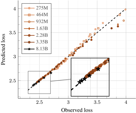
The image is a scatter plot comparing **observed loss** (x-axis) and **predicted loss** (y-axis) across different model sizes. A dashed line represents the line of perfect prediction (y = x). Data points are grouped by model size, with varying colors and markers. An inset zooms into the lower-left quadrant for detailed analysis.
---
### Components/Axes
- **X-axis (Observed Loss)**: Ranges from 2.5 to 4.0, labeled "Observed loss."
- **Y-axis (Predicted Loss)**: Ranges from 2.5 to 4.0, labeled "Predicted loss."
- **Legend**: Located in the top-left corner, mapping model sizes to colors and markers:
- **275M**: Light orange circles (△)
- **464M**: Light orange squares (■)
- **932M**: Light orange diamonds (◇)
- **1.63B**: Dark orange circles (●)
- **2.28B**: Dark orange squares (■)
- **3.35B**: Dark orange diamonds (◇)
- **8.13B**: Black stars (★)
- **Inset**: A zoomed-in view of the lower-left quadrant (x: 2.5–3.0, y: 2.5–3.0).
---
### Detailed Analysis
1. **Dashed Line**: Represents the ideal scenario where predicted loss equals observed loss. All data points deviate from this line.
2. **Data Trends**:
- **Larger Models (1.63B–8.13B)**: Data points cluster closer to the dashed line, indicating better alignment between observed and predicted losses.
- **Smaller Models (275M–932M)**: Points are more dispersed, showing higher variance in predictions.
- **8.13B Model**: Black stars (★) align most tightly with the dashed line, suggesting optimal performance.
3. **Inset**: Highlights the lower range (2.5–3.0) where smaller models (275M–464M) show a linear trend, while larger models (1.63B–3.35B) exhibit tighter clustering.
---
### Key Observations
- **Model Size Correlation**: Larger models (e.g., 8.13B) demonstrate higher accuracy, with predicted losses tightly matching observed values.
- **Variance in Smaller Models**: Smaller models (e.g., 275M) exhibit significant scatter, indicating less reliable predictions.
- **Inset Insight**: The lower loss range (2.5–3.0) shows improved linearity for smaller models, but larger models still outperform.
---
### Interpretation
The plot suggests a **positive correlation between model size and prediction accuracy**. Larger models (e.g., 8.13B) achieve near-perfect alignment with the dashed line, implying they better capture the underlying patterns in the data. Smaller models, while showing some linear trends in low-loss ranges, struggle with consistency, likely due to limited capacity. The inset reinforces this by isolating the lower-loss region, where even smaller models show modest improvement but remain outperformed by larger counterparts. This highlights the trade-off between computational resources and predictive performance in machine learning systems.