## Line Chart: Accuracy vs. Sample Size
### Overview
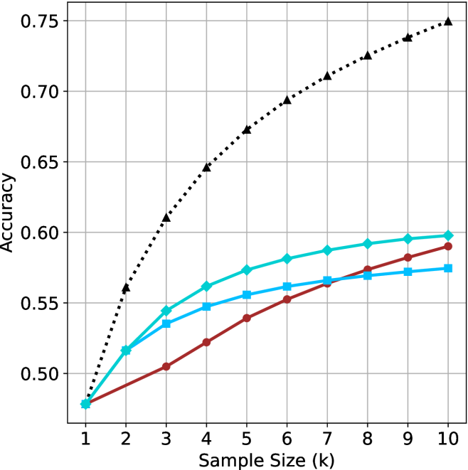
The image is a line chart comparing the accuracy of three different methods as a function of sample size. The x-axis represents the sample size (k), ranging from 1 to 10. The y-axis represents the accuracy, ranging from 0.50 to 0.75. Three data series are plotted, each represented by a different color and marker.
### Components/Axes
* **X-axis:** Sample Size (k), with tick marks at 1, 2, 3, 4, 5, 6, 7, 8, 9, and 10.
* **Y-axis:** Accuracy, with tick marks at 0.50, 0.55, 0.60, 0.65, 0.70, and 0.75.
* **Data Series:**
* Black dotted line with triangle markers.
* Turquoise line with diamond markers.
* Brown line with circle markers.
* Light Blue line with square markers.
### Detailed Analysis
**1. Black Dotted Line (Triangle Markers):**
* Trend: The accuracy increases rapidly at first, then the rate of increase slows down as the sample size increases.
* Data Points:
* k=1: Accuracy ≈ 0.48
* k=2: Accuracy ≈ 0.56
* k=3: Accuracy ≈ 0.61
* k=4: Accuracy ≈ 0.64
* k=5: Accuracy ≈ 0.67
* k=6: Accuracy ≈ 0.69
* k=7: Accuracy ≈ 0.71
* k=8: Accuracy ≈ 0.72
* k=9: Accuracy ≈ 0.74
* k=10: Accuracy ≈ 0.75
**2. Turquoise Line (Diamond Markers):**
* Trend: The accuracy increases steadily, but the rate of increase slows down as the sample size increases.
* Data Points:
* k=1: Accuracy ≈ 0.48
* k=2: Accuracy ≈ 0.52
* k=3: Accuracy ≈ 0.54
* k=4: Accuracy ≈ 0.57
* k=5: Accuracy ≈ 0.58
* k=6: Accuracy ≈ 0.59
* k=7: Accuracy ≈ 0.59
* k=8: Accuracy ≈ 0.59
* k=9: Accuracy ≈ 0.60
* k=10: Accuracy ≈ 0.60
**3. Brown Line (Circle Markers):**
* Trend: The accuracy increases steadily, but the rate of increase slows down as the sample size increases.
* Data Points:
* k=1: Accuracy ≈ 0.48
* k=2: Accuracy ≈ 0.50
* k=3: Accuracy ≈ 0.52
* k=4: Accuracy ≈ 0.54
* k=5: Accuracy ≈ 0.55
* k=6: Accuracy ≈ 0.56
* k=7: Accuracy ≈ 0.57
* k=8: Accuracy ≈ 0.58
* k=9: Accuracy ≈ 0.59
* k=10: Accuracy ≈ 0.59
**4. Light Blue Line (Square Markers):**
* Trend: The accuracy increases steadily, but the rate of increase slows down as the sample size increases.
* Data Points:
* k=1: Accuracy ≈ 0.48
* k=2: Accuracy ≈ 0.51
* k=3: Accuracy ≈ 0.53
* k=4: Accuracy ≈ 0.54
* k=5: Accuracy ≈ 0.55
* k=6: Accuracy ≈ 0.56
* k=7: Accuracy ≈ 0.57
* k=8: Accuracy ≈ 0.57
* k=9: Accuracy ≈ 0.57
* k=10: Accuracy ≈ 0.58
### Key Observations
* The black dotted line (triangle markers) consistently shows the highest accuracy across all sample sizes.
* The turquoise line (diamond markers) consistently shows the second highest accuracy across all sample sizes.
* The brown line (circle markers) consistently shows the third highest accuracy across all sample sizes.
* The light blue line (square markers) consistently shows the lowest accuracy across all sample sizes.
* All methods show diminishing returns in accuracy as the sample size increases beyond a certain point.
### Interpretation
The chart compares the performance of four different methods (represented by the four lines) in terms of accuracy as the sample size increases. The black dotted line (triangle markers) represents the most effective method, as it achieves the highest accuracy with increasing sample size. The other methods (turquoise, brown, and light blue lines) show lower accuracy levels. The diminishing returns observed for all methods suggest that increasing the sample size beyond a certain point does not significantly improve accuracy. This information is valuable for determining the optimal sample size for each method, balancing accuracy with the cost and effort of acquiring larger samples.