## Line Chart: Accuracy vs. Sample Size (k)
### Overview
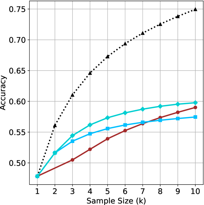
This image is a line chart plotting the "Accuracy" (y-axis) against the "Sample Size (k)" (x-axis). The chart displays four distinct data series, each represented by a unique color and marker style. All four series originate from the same starting point at a sample size of 1. There is no legend provided in the image to identify what specific models or methods these lines represent.
### Components/Axes
* **X-Axis:** Labeled "Sample Size (k)". The scale is linear, ranging from 1 to 10 in integer increments.
* **Y-Axis:** Labeled "Accuracy". The scale ranges from 0.50 to 0.75, with major grid lines at 0.05 intervals.
* **Grid:** A light gray grid is overlaid on the chart area to assist in reading values.
* **Data Series (No Legend Provided):**
1. **Black Dotted Line:** Marked with upward-pointing triangles.
2. **Cyan (Light Blue) Solid Line:** Marked with diamonds.
3. **Dark Red (Maroon) Solid Line:** Marked with circles.
4. **Medium Blue Solid Line:** Marked with squares.
### Detailed Analysis
All four series begin at approximately (1, 0.48). As the sample size increases, all series exhibit a positive trend (accuracy increases), though the rate of improvement (slope) varies significantly.
**1. Black Dotted Line (Triangles):**
* **Trend:** This series shows the steepest upward trajectory and maintains the highest accuracy across all sample sizes.
* **Data Points (Approximate):**
* k=1: 0.48
* k=3: 0.61
* k=5: 0.675
* k=10: 0.75
**2. Cyan Solid Line (Diamonds):**
* **Trend:** This series shows the second-highest accuracy. It rises quickly between k=1 and k=3, then begins to plateau significantly from k=5 to k=10.
* **Data Points (Approximate):**
* k=1: 0.48
* k=3: 0.545
* k=5: 0.575
* k=10: 0.60
**3. Dark Red Solid Line (Circles):**
* **Trend:** This series starts with the lowest slope but maintains a more consistent, steady upward trajectory compared to the other solid lines. It crosses the Medium Blue (square) line between k=7 and k=8.
* **Data Points (Approximate):**
* k=1: 0.48
* k=3: 0.505
* k=5: 0.54
* k=10: 0.59
**4. Medium Blue Solid Line (Squares):**
* **Trend:** This series rises initially but exhibits the most pronounced flattening (diminishing returns) as the sample size increases, particularly after k=5.
* **Data Points (Approximate):**
* k=1: 0.48
* k=3: 0.535
* k=5: 0.555
* k=10: 0.575
### Key Observations
* **Performance Gap:** The Black Dotted series is a clear outlier, performing significantly better than the other three methods. At k=10, it achieves an accuracy of 0.75, whereas the next best method (Cyan) is at 0.60.
* **Clustering:** The three solid-line series are clustered relatively close together, all falling within the 0.57–0.60 accuracy range at k=10.
* **Crossover:** The Dark Red (circle) line demonstrates a "slow and steady" improvement, eventually overtaking the Medium Blue (square) line, which appears to saturate earlier.
### Interpretation
This chart likely represents a comparison of machine learning model performance, possibly in a few-shot learning or active learning context, where "Sample Size (k)" refers to the number of training examples per class.
* **Superiority of the Black Series:** The Black Dotted series represents a method that is substantially more data-efficient or robust than the others, as it gains accuracy much faster as more samples are added.
* **Diminishing Returns:** All four lines exhibit a concave shape, indicating that the marginal gain in accuracy decreases as the sample size increases. This is a classic characteristic of learning curves in machine learning.
* **Methodological Differences:** The fact that the Red (circle) line continues to climb while the Blue (square) line flattens suggests that the Red method may be better suited for larger sample sizes, whereas the Blue method might be optimized for very small sample sizes but lacks the capacity to leverage additional data effectively.