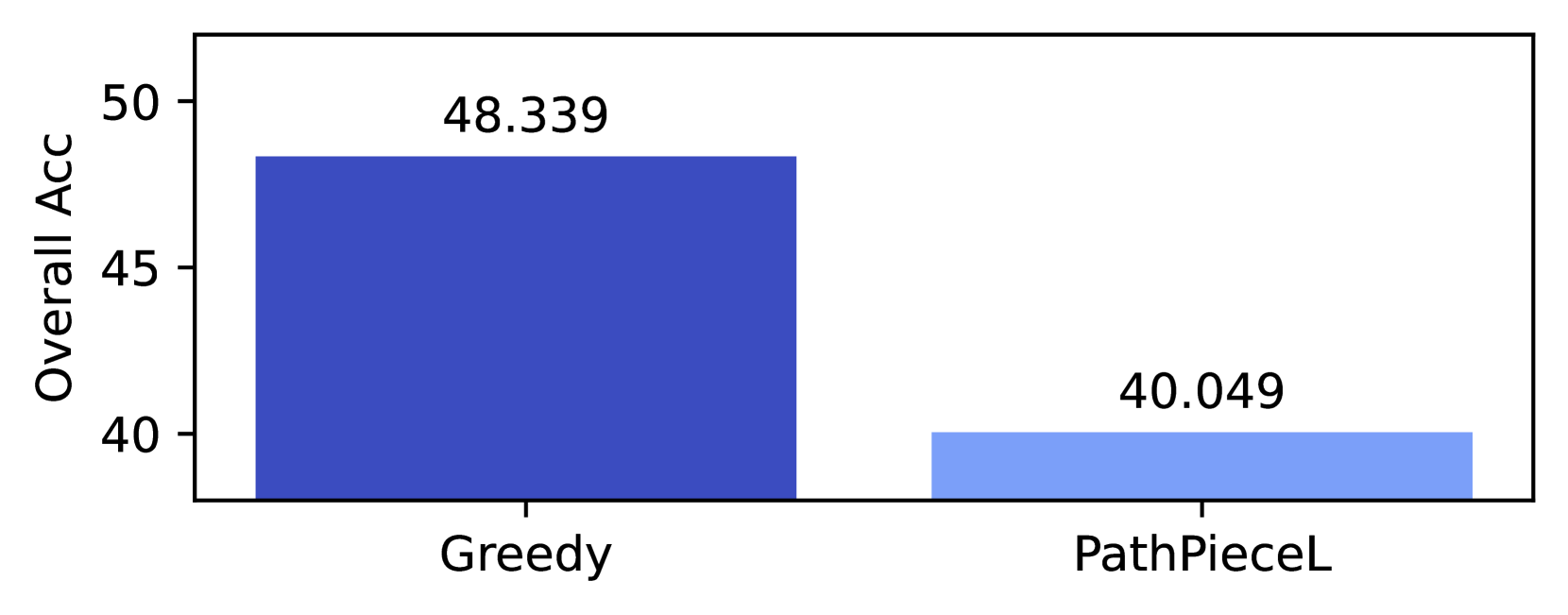
## Bar Chart: Overall Accuracy Comparison
### Overview
The image is a simple vertical bar chart comparing the "Overall Acc" (Overall Accuracy) of two distinct methods or models, labeled "Greedy" and "PathPieceL". The chart presents a single performance metric for each.
### Components/Axes
* **Y-Axis (Vertical):**
* **Label:** "Overall Acc"
* **Scale:** Linear scale with major tick marks and numerical labels at 40, 45, and 50.
* **Range:** The visible axis spans from slightly below 40 to slightly above 50.
* **X-Axis (Horizontal):**
* **Categories:** Two categorical labels are present:
1. "Greedy" (positioned on the left)
2. "PathPieceL" (positioned on the right)
* **Data Series (Bars):**
* **Bar 1 (Left):** Corresponds to "Greedy". It is a solid, dark blue bar.
* **Bar 2 (Right):** Corresponds to "PathPieceL". It is a solid, light blue bar.
* **Data Labels:** Each bar has its exact numerical value displayed directly above it.
* Above "Greedy" bar: `48.339`
* Above "PathPieceL" bar: `40.049`
### Detailed Analysis
* **Greedy Method:**
* **Visual Trend:** The dark blue bar is significantly taller than the light blue bar.
* **Data Point:** The accuracy value is explicitly stated as **48.339**.
* **Spatial Grounding:** The bar originates from the x-axis at the "Greedy" label and extends vertically to a height corresponding to approximately 48.3 on the y-axis scale.
* **PathPieceL Method:**
* **Visual Trend:** The light blue bar is shorter than the dark blue bar.
* **Data Point:** The accuracy value is explicitly stated as **40.049**.
* **Spatial Grounding:** The bar originates from the x-axis at the "PathPieceL" label and extends vertically to a height corresponding to approximately 40.0 on the y-axis scale.
### Key Observations
1. **Clear Performance Gap:** There is a substantial difference in overall accuracy between the two methods. The "Greedy" method outperforms "PathPieceL".
2. **Magnitude of Difference:** The numerical difference is `48.339 - 40.049 = 8.290` percentage points (assuming "Acc" is percentage-based).
3. **Visual Encoding:** The chart uses color (dark blue vs. light blue) and spatial separation (left vs. right) to distinguish the two categories. No separate legend is present, as the category labels are placed directly below their respective bars.
### Interpretation
The data demonstrates that, for the given task and evaluation metric ("Overall Acc"), the "Greedy" approach is markedly more effective than the "PathPieceL" approach. The difference of over 8 percentage points is likely significant in most technical contexts, suggesting "Greedy" is the superior method based on this single metric.
The chart's design is minimalist and direct, focusing the viewer's attention solely on the comparison of the two final accuracy scores. It does not provide information on variance, statistical significance, the nature of the task, or the underlying mechanisms of the methods. Therefore, while the chart clearly answers "which performed better?", it does not explain "why?" or "under what conditions?". To draw broader conclusions, one would need additional context about the experimental setup and results from other metrics.