## Line Chart: R1-Qwen1 | AIME25
### Overview
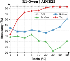
The image is a line chart titled "R1-Qwen1 | AIME25". It plots the performance metric "Accuracy (%)" against a variable "Ratio (%)" for four different methods or conditions labeled "Full", "Bottom", "Random", and "Top". The chart demonstrates how the accuracy of each method changes as the ratio increases from 2% to 50%.
### Components/Axes
* **Chart Title:** "R1-Qwen1 | AIME25" (centered at the top).
* **Y-Axis (Vertical):**
* **Label:** "Accuracy (%)"
* **Scale:** Linear, ranging from 20 to 60.
* **Major Ticks:** 20, 30, 40, 50, 60.
* **X-Axis (Horizontal):**
* **Label:** "Ratio (%)"
* **Scale:** Appears to be a logarithmic or non-linear scale, with marked points at 2, 4, 6, 8, 10, 20, 30, 40, 50.
* **Legend:** Located in the top-right corner of the plot area. It defines four data series:
1. **Full:** Red line with solid circle markers (●).
2. **Bottom:** Blue line with solid square markers (■).
3. **Random:** Green line with solid triangle markers (▲).
4. **Top:** Gray line with "x" markers (×).
### Detailed Analysis
The chart contains four distinct data series, each with a unique visual trend:
1. **"Top" Series (Gray line with × markers):**
* **Trend:** Perfectly horizontal, constant line.
* **Data Points:** Maintains an accuracy of **60%** at every plotted ratio (2, 4, 6, 8, 10, 20, 30, 40, 50).
* **Spatial Grounding:** This line is positioned at the very top of the chart's data range.
2. **"Full" Series (Red line with ● markers):**
* **Trend:** Strong, consistent upward slope that plateaus at higher ratios.
* **Data Points (Approximate):**
* Ratio 2%: ~35%
* Ratio 4%: ~42%
* Ratio 6%: ~50%
* Ratio 8%: ~55%
* Ratio 10%: ~57%
* Ratio 20%: ~59%
* Ratio 30%: ~60%
* Ratio 40%: ~60%
* Ratio 50%: ~60%
* **Spatial Grounding:** Starts as the second-lowest line at Ratio 2% but rises to converge with the "Top" line at 60% from Ratio 30% onward.
3. **"Bottom" Series (Blue line with ■ markers):**
* **Trend:** Fluctuating, with a general slight upward trend, ending with a notable increase.
* **Data Points (Approximate):**
* Ratio 2%: ~42%
* Ratio 4%: ~38%
* Ratio 6%: ~39%
* Ratio 8%: ~40%
* Ratio 10%: ~39%
* Ratio 20%: ~38%
* Ratio 30%: ~40%
* Ratio 40%: ~43%
* Ratio 50%: ~50%
* **Spatial Grounding:** Generally occupies the middle range of the chart, below "Full" and "Top" but above "Random".
4. **"Random" Series (Green line with ▲ markers):**
* **Trend:** Fluctuating with a general downward trend until Ratio 30%, followed by a recovery.
* **Data Points (Approximate):**
* Ratio 2%: ~34%
* Ratio 4%: ~33%
* Ratio 6%: ~34%
* Ratio 8%: ~33%
* Ratio 10%: ~36%
* Ratio 20%: ~30%
* Ratio 30%: ~22% (notable low point)
* Ratio 40%: ~27%
* Ratio 50%: ~31%
* **Spatial Grounding:** This is consistently the lowest-performing series across all ratios.
### Key Observations
* **Performance Hierarchy:** A clear and consistent performance hierarchy is visible: **Top > Full > Bottom > Random**. This order holds for almost all data points, with the exception that "Full" surpasses "Bottom" after Ratio 4%.
* **Plateau Effect:** The "Full" method shows diminishing returns, plateauing at the maximum accuracy of 60% once the ratio reaches approximately 20-30%.
* **Stability vs. Sensitivity:** The "Top" method is perfectly stable and unaffected by the ratio. In contrast, the "Random" method is highly sensitive and volatile, showing the worst performance and a significant dip at Ratio 30%.
* **Convergence:** At the highest measured ratio (50%), the "Bottom" method shows a sharp increase, narrowing the gap with the "Full" and "Top" methods.
### Interpretation
This chart likely compares different data selection or sampling strategies ("Full", "Bottom", "Random", "Top") for a model or algorithm (R1-Qwen1) on a specific task (AIME25). The "Ratio (%)" probably represents the percentage of a dataset used for training, fine-tuning, or evaluation.
* **"Top"** likely represents using only the highest-quality or most relevant data subset. Its constant 60% accuracy suggests this subset is both highly effective and sufficient on its own; adding more data (increasing the ratio) provides no benefit.
* **"Full"** represents using the entire dataset. Its rising accuracy indicates that incorporating more data improves performance, but only up to a point (saturation at ~20% ratio), after which the added data is redundant or of lower quality than the "Top" subset.
* **"Bottom"** likely uses the lowest-quality data. Its generally lower accuracy is expected, but its final uptick at 50% ratio is an interesting anomaly. It could suggest that at very high inclusion rates, even low-quality data begins to contribute useful signal, or it could be a measurement artifact.
* **"Random"** serves as a baseline. Its poor and erratic performance confirms that the other methods are leveraging some meaningful structure in the data. The dip at 30% is an outlier that may warrant investigation into that specific data slice.
**Overall Conclusion:** The data suggests that for this task, a curated high-quality data subset ("Top") is the most efficient and effective strategy. While using all data ("Full") can eventually match that performance, it requires significantly more data (a higher ratio). Strategies based on low-quality ("Bottom") or random data are substantially inferior. The chart effectively argues for the value of data quality over sheer quantity.