## Violin Plots: Predicted Causal Effect vs. Base Causal Effect for Fairness Evaluation
### Overview
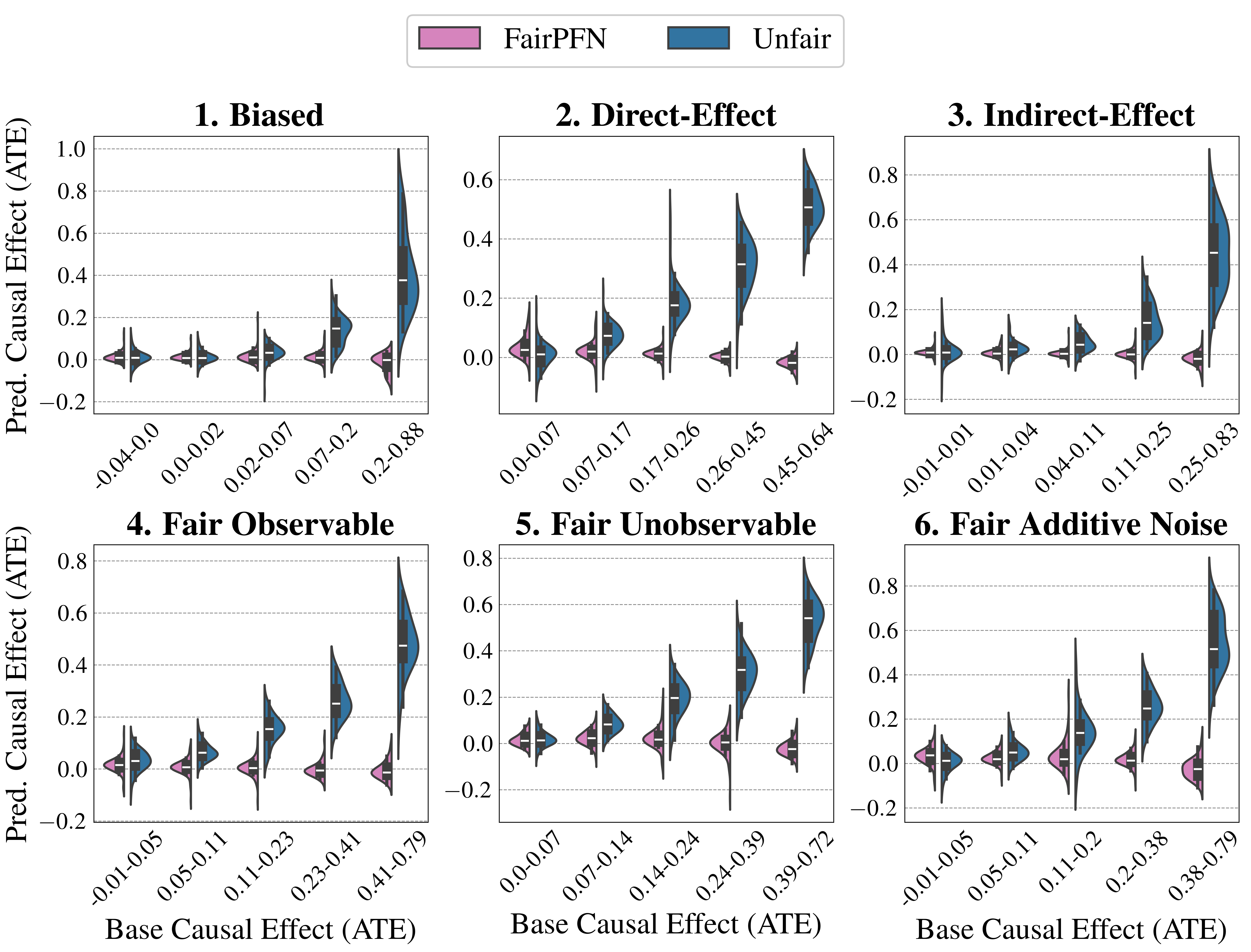
The image presents six violin plots, each comparing the predicted causal effect (ATE) against the base causal effect (ATE) under different fairness scenarios. Each plot is labeled with a number (1-6) and a descriptive title indicating the fairness setting being evaluated. The plots visually represent the distribution of predicted causal effects for varying base causal effects. Two colors are used: a purple shade representing "FairPFN" and a teal shade representing "Unfair". A legend is positioned in the top-right corner of the image.
### Components/Axes
* **X-axis:** "Base Causal Effect (ATE)". The scale ranges from approximately -0.04 to 0.88, with varying ranges for each subplot.
* **Y-axis:** "Pred. Causal Effect (ATE)". The scale ranges from approximately -0.2 to 1.0, with varying ranges for each subplot.
* **Legend:**
* Color: Purple (approximately #D87093) - Label: "FairPFN"
* Color: Teal (approximately #4682B4) - Label: "Unfair"
* **Subplot Titles:**
1. Biased
2. Direct-Effect
3. Indirect-Effect
4. Fair Observable
5. Fair Unobservable
6. Fair Additive Noise
### Detailed Analysis or Content Details
**Plot 1: Biased**
* The violin plot shows a distribution of points. The teal ("Unfair") distribution is wider and extends further into negative values than the purple ("FairPFN") distribution.
* Base Causal Effect (ATE) ranges from -0.04 to 0.02 for the teal distribution and 0.02 to 0.88 for the purple distribution.
* Predicted Causal Effect (ATE) ranges from -0.2 to 0.8 for both distributions.
**Plot 2: Direct-Effect**
* The teal ("Unfair") distribution is concentrated around lower base causal effects (0.00 to 0.17) and shows a wider spread in predicted causal effects. The purple ("FairPFN") distribution is more concentrated around higher base causal effects (0.17 to 0.45).
* Base Causal Effect (ATE) ranges from 0.00 to 0.45.
* Predicted Causal Effect (ATE) ranges from -0.2 to 0.6.
**Plot 3: Indirect-Effect**
* The teal ("Unfair") distribution is more spread out across the base causal effect range (0.01 to 0.83) and shows a wider range of predicted causal effects. The purple ("FairPFN") distribution is more concentrated around higher base causal effects (0.25 to 0.83).
* Base Causal Effect (ATE) ranges from 0.01 to 0.83.
* Predicted Causal Effect (ATE) ranges from -0.2 to 0.8.
**Plot 4: Fair Observable**
* Both the teal ("Unfair") and purple ("FairPFN") distributions are relatively similar, with a concentration of points around lower base causal effects (0.00 to 0.23).
* Base Causal Effect (ATE) ranges from -0.01 to 0.79.
* Predicted Causal Effect (ATE) ranges from -0.2 to 0.4.
**Plot 5: Fair Unobservable**
* The teal ("Unfair") distribution is more spread out across the base causal effect range (0.00 to 0.39) and shows a wider range of predicted causal effects. The purple ("FairPFN") distribution is more concentrated around higher base causal effects (0.24 to 0.39).
* Base Causal Effect (ATE) ranges from 0.00 to 0.39.
* Predicted Causal Effect (ATE) ranges from -0.2 to 0.4.
**Plot 6: Fair Additive Noise**
* The teal ("Unfair") distribution is concentrated around lower base causal effects (0.01 to 0.11) and shows a wider spread in predicted causal effects. The purple ("FairPFN") distribution is more concentrated around higher base causal effects (0.24 to 0.38).
* Base Causal Effect (ATE) ranges from -0.01 to 0.79.
* Predicted Causal Effect (ATE) ranges from -0.2 to 0.4.
### Key Observations
* In the "Biased" scenario (Plot 1), the "Unfair" distribution extends significantly into negative predicted causal effects, suggesting a potential for under-prediction.
* The "Direct-Effect" (Plot 2), "Indirect-Effect" (Plot 3), and "Fair Additive Noise" (Plot 6) scenarios show a clear separation between the "FairPFN" and "Unfair" distributions, with "FairPFN" generally predicting higher causal effects for higher base causal effects.
* The "Fair Observable" (Plot 4) scenario shows the least difference between the "FairPFN" and "Unfair" distributions.
* The "Fair Unobservable" (Plot 5) scenario shows a moderate difference between the "FairPFN" and "Unfair" distributions.
### Interpretation
The plots demonstrate the impact of different fairness settings on the predicted causal effect. The "FairPFN" method appears to mitigate bias in scenarios with direct and indirect effects, as well as additive noise, by aligning the predicted causal effect more closely with the base causal effect. The "Unfair" method, in contrast, exhibits more variability and potential for under-prediction, particularly in the "Biased" scenario. The "Fair Observable" scenario suggests that fairness is easier to achieve when the relevant variables are directly observable. The plots highlight the importance of considering fairness when developing and deploying causal inference models, and the potential benefits of using fairness-aware methods like "FairPFN". The violin plots effectively visualize the distribution of predicted causal effects under different conditions, allowing for a clear comparison of the performance of the "FairPFN" and "Unfair" methods. The varying ranges on the x-axis suggest that the base causal effect distributions differ across the scenarios.