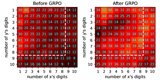
## Heatmap Comparison: Before and After GRPO
### Overview
The image displays two side-by-side heatmaps comparing numerical data distributions before and after a process labeled "GRPO." Each heatmap is a 10x10 grid where the x-axis represents the "number of x's digits" and the y-axis represents the "number of y's digits," both ranging from 1 to 10. The cells contain integer values, and their color intensity (from dark red to bright yellow) corresponds to the magnitude of these values, with brighter colors indicating higher numbers. A dashed white rectangle highlights a specific region in each heatmap for focused comparison.
### Components/Axes
* **Chart Type:** Two comparative heatmaps.
* **Titles:**
* Left Heatmap: "Before GRPO"
* Right Heatmap: "After GRPO"
* **Axes Labels:**
* X-axis (both charts): "number of x's digits"
* Y-axis (both charts): "number of y's digits"
* **Axis Scales:** Both axes are categorical, with markers for integers 1 through 10.
* **Legend/Color Scale:** No explicit legend is provided. The color gradient serves as an implicit scale: darker reds represent lower values, transitioning through orange to bright yellow for the highest values.
* **Highlighted Region:** A dashed white rectangle is drawn on each heatmap, encompassing the sub-grid from x=7 to x=10 and y=1 to y=8.
### Detailed Analysis
**Data Extraction - Before GRPO (Left Heatmap):**
The values generally decrease from the top-left to the bottom-right. The highest values are concentrated in the top-left corner (low digit counts for both x and y).
| y\x | 1 | 2 | 3 | 4 | 5 | 6 | 7 | 8 | 9 | 10 |
| :--- | :-: | :-: | :-: | :-: | :-: | :-: | :-: | :-: | :-: | :-: |
| **1** | 38 | 46 | 28 | 22 | 28 | 23 | 22 | 14 | 11 | 14 |
| **2** | 33 | 28 | 27 | 25 | 23 | 17 | 20 | 23 | 18 | 14 |
| **3** | 41 | 27 | 20 | 22 | 19 | 14 | 15 | 17 | 17 | 16 |
| **4** | 30 | 20 | 24 | 20 | 18 | 19 | 15 | 17 | 18 | 17 |
| **5** | 30 | 32 | 25 | 22 | 16 | 21 | 15 | 20 | 18 | 19 |
| **6** | 41 | 34 | 28 | 21 | 20 | 14 | 19 | 19 | 17 | 17 |
| **7** | 38 | 30 | 25 | 18 | 23 | 18 | 14 | 14 | 12 | 12 |
| **8** | 32 | 22 | 15 | 18 | 23 | 18 | 14 | 11 | 12 | 12 |
| **9** | 23 | 16 | 17 | 20 | 17 | 14 | 10 | 10 | 8 | 8 |
| **10** | 17 | 14 | 16 | 14 | 14 | 12 | 9 | 7 | 7 | 7 |
**Data Extraction - After GRPO (Right Heatmap):**
The overall value distribution shifts significantly. Values are generally higher, especially in the central and right-hand regions. The pattern is less uniformly decreasing.
| y\x | 1 | 2 | 3 | 4 | 5 | 6 | 7 | 8 | 9 | 10 |
| :--- | :-: | :-: | :-: | :-: | :-: | :-: | :-: | :-: | :-: | :-: |
| **1** | 34 | 52 | 46 | 36 | 32 | 35 | 42 | 49 | 39 | 32 |
| **2** | 31 | 44 | 36 | 28 | 25 | 25 | 32 | 43 | 40 | 44 |
| **3** | 27 | 34 | 20 | 14 | 13 | 26 | 33 | 30 | 42 | 42 |
| **4** | 14 | 19 | 27 | 20 | 23 | 26 | 33 | 44 | 38 | 36 |
| **5** | 8 | 22 | 24 | 26 | 33 | 36 | 39 | 44 | 42 | 37 |
| **6** | 21 | 30 | 36 | 34 | 33 | 34 | 41 | 44 | 38 | 36 |
| **7** | 26 | 38 | 36 | 38 | 30 | 33 | 45 | 39 | 34 | 32 |
| **8** | 26 | 26 | 34 | 30 | 40 | 40 | 41 | 30 | 30 | 24 |
| **9** | 23 | 29 | 33 | 30 | 33 | 30 | 37 | 33 | 22 | 20 |
| **10** | 25 | 29 | 37 | 36 | 33 | 29 | 38 | 22 | 17 | 23 |
### Key Observations
1. **Value Increase:** The "After GRPO" heatmap shows a substantial increase in values across most of the grid, particularly in the central and right-hand columns (x=5 to x=10). The maximum value increases from 46 (Before, at x=2,y=1) to 52 (After, at x=2,y=1).
2. **Pattern Shift:** The "Before" data shows a strong diagonal trend where values decrease as both x and y increase. The "After" data disrupts this pattern; high values are more dispersed, with notable peaks appearing in the upper-right quadrant (e.g., x=8,y=1=49; x=9,y=3=42).
3. **Highlighted Region Change:** The area within the dashed rectangle (x=7-10, y=1-8) undergoes the most dramatic transformation. "Before," this region contains some of the lowest values (e.g., 7, 8, 10, 11, 12). "After," it contains many of the highest values on the chart (e.g., 49, 44, 45, 44, 41).
4. **Low-Value Persistence:** The bottom-right corner (high x, high y) remains an area of relatively lower values in both charts, though the absolute numbers are higher "After GRPO."
### Interpretation
This visualization demonstrates the impact of the "GRPO" process on a system where performance or output (represented by the cell value) is a function of the complexity of two inputs, x and y (measured by their digit count).
* **What the data suggests:** GRPO appears to be a method that significantly enhances outcomes, especially for problems of moderate to high complexity (mid-to-high digit counts for x and y). The process seems to "activate" or improve performance in regions that were previously weak (the highlighted rectangle), shifting the system's optimal operating point.
* **Relationship between elements:** The two heatmaps are direct before-and-after snapshots. The axes define the problem space, the cell values are the performance metric, and the color provides an immediate visual cue for magnitude. The dashed rectangle directs the viewer's attention to the zone of most significant change.
* **Notable anomalies/trends:** The most striking trend is the inversion of performance in the highlighted region—from among the worst to among the best. This suggests GRPO is particularly effective at solving problems that were previously intractable or poorly handled. The persistence of lower values in the extreme bottom-right (e.g., x=10,y=10) indicates a potential limit or boundary condition that GRPO does not overcome, possibly representing a fundamental complexity barrier.
**Language Declaration:** All text in the image is in English.