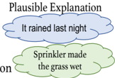
## Diagram: Plausible Explanation
### Overview
The image is a simple diagram illustrating two **plausible explanations** for a phenomenon (e.g., wet grass). It uses two cloud-shaped elements to represent alternative hypotheses, with distinct colors and labels.
### Components/Axes
- **Title**: "Plausible Explanation" (top of the diagram).
- **Cloud 1 (Top)**:
- Color: Blue.
- Label: "It rained last night."
- **Cloud 2 (Bottom)**:
- Color: Green.
- Label: "Sprinkler made the grass wet."
- **No axes, legends, or numerical data** are present.
### Detailed Analysis
- The diagram visually separates two hypotheses using spatial positioning (top vs. bottom) and color differentiation (blue vs. green).
- No quantitative data, trends, or relationships between the elements are depicted.
- Text is explicitly embedded in the cloud shapes, with no additional annotations or contextual clues.
### Key Observations
1. The two explanations are presented as mutually exclusive or competing hypotheses.
2. Color coding (blue for rain, green for sprinkler) may imply categorical distinctions (e.g., natural vs. artificial causes).
3. No evidence of causality, probability, or interdependence between the explanations is provided.
### Interpretation
The diagram serves as a conceptual tool to contrast two possible causes for an observed outcome (e.g., wet grass). By isolating the explanations into distinct visual elements, it encourages critical evaluation of which hypothesis is more likely based on additional evidence (e.g., weather reports, sprinkler schedules). The absence of connecting lines or shared attributes suggests the explanations are independent, though real-world scenarios might involve overlapping factors (e.g., rain and sprinklers occurring simultaneously).
**Note**: This diagram lacks empirical data, so no statistical or numerical conclusions can be drawn. It is purely illustrative of logical reasoning frameworks.