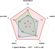
## Radar Chart: OlympiaBenchmark Performance Comparison
### Overview
The image displays a pentagonal radar chart (spider chart) titled "OlympiaBenchmark." It compares the performance of three different methods or models across five distinct evaluation axes. The chart uses colored lines to represent each method, with the area enclosed by each line indicating its overall performance profile.
### Components/Axes
* **Chart Type:** Radar Chart (Pentagonal)
* **Title:** "OlympiaBenchmark" (centered at the top).
* **Axes (5):** Radiating from the center to the vertices of the pentagon. Each axis represents a different benchmark, model, or task. Labels are placed at the outer end of each axis.
1. **Top Vertex:** `Qwen2.5-72B`
2. **Top-Right Vertex:** `4o-mini`
3. **Bottom-Right Vertex:** `4o-mini-0125`
4. **Bottom-Left Vertex:** `AWQ23`
5. **Top-Left Vertex:** `MATO23`
* **Axis Scale:** Each axis has numerical markers from `0` (center) to `100` (outer edge), with labeled increments at `20`, `40`, `60`, and `80`.
* **Legend:** Located at the bottom center of the chart. It defines three data series:
* **Blue Line/Square:** `Qwen2.5-72B`
* **Green Line/Square:** `MFT`
* **Red Line/Square:** `MFT + WE`
### Detailed Analysis
The chart plots three data series, each forming a closed polygon. Performance values are estimated based on where each line intersects an axis relative to the scale markers.
**1. Data Series: Qwen2.5-72B (Blue Line)**
* **Visual Trend:** Forms a moderately sized, relatively symmetric pentagon, indicating balanced but not exceptional performance across all benchmarks.
* **Estimated Values per Axis:**
* `Qwen2.5-72B` axis: ~80
* `4o-mini` axis: ~60
* `4o-mini-0125` axis: ~40
* `AWQ23` axis: ~60
* `MATO23` axis: ~80
**2. Data Series: MFT (Green Line)**
* **Visual Trend:** Forms an irregular shape that peaks sharply on the `Qwen2.5-72B` axis but contracts significantly on the `4o-mini` and `4o-mini-0125` axes, suggesting specialized or inconsistent performance.
* **Estimated Values per Axis:**
* `Qwen2.5-72B` axis: ~90 (highest point for this series)
* `4o-mini` axis: ~50
* `4o-mini-0125` axis: ~30 (lowest point for this series)
* `AWQ23` axis: ~70
* `MATO23` axis: ~60
**3. Data Series: MFT + WE (Red Line)**
* **Visual Trend:** Forms the largest, most expansive pentagon, enclosing the other two series on almost all axes. This indicates the highest and most consistent overall performance.
* **Estimated Values per Axis:**
* `Qwen2.5-72B` axis: ~95
* `4o-mini` axis: ~70
* `4o-mini-0125` axis: ~60
* `AWQ23` axis: ~80
* `MATO23` axis: ~85
### Key Observations
1. **Performance Hierarchy:** The `MFT + WE` (red) series consistently outperforms or matches the `MFT` (green) series on every axis. The `Qwen2.5-72B` (blue) series generally sits between them or is surpassed by both.
2. **Largest Improvement:** The most dramatic performance gain from `MFT` to `MFT + WE` occurs on the `4o-mini-0125` axis, where the score approximately doubles from ~30 to ~60.
3. **Specialization vs. Generalization:** The `MFT` method shows a strong specialization for the `Qwen2.5-72B` benchmark but underperforms on `4o-mini-0125`. The addition of "WE" appears to correct this weakness, leading to a more generalized, high-performance profile.
4. **Baseline Comparison:** The baseline `Qwen2.5-72B` model shows its strongest performance on its own namesake axis (`~80`) and on `MATO23` (`~80`), but is notably weaker on `4o-mini-0125` (`~40`).
### Interpretation
This radar chart from the "OlympiaBenchmark" visually argues for the superiority of the `MFT + WE` method. The data suggests that while the `MFT` technique alone offers targeted improvements (especially on the `Qwen2.5-72B` task), it introduces significant performance regressions on other tasks like `4o-mini-0125`. The critical insight is that the "WE" component acts as a crucial stabilizer or enhancer, mitigating MFT's weaknesses and boosting its strengths across the board. The resulting `MFT + WE` profile is not just an incremental improvement but a transformation into a robust, state-of-the-art solution that dominates the evaluated landscape. The chart effectively communicates that combining MFT with WE yields a system that is both more powerful and more reliable than its individual components or the baseline model.