## Line Chart: Probability Distribution of q
### Overview
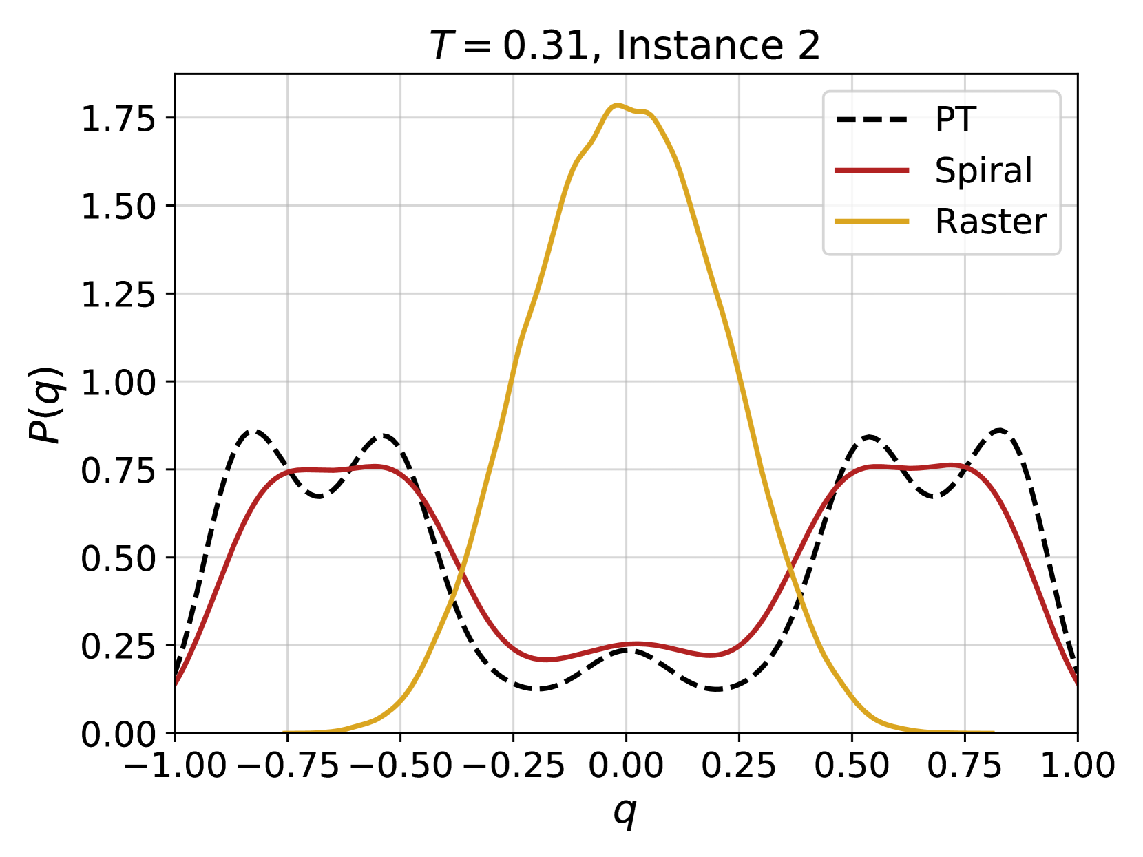
The image presents a line chart illustrating the probability distribution of a variable 'q' under three different conditions: PT, Spiral, and Raster. The chart displays the probability P(q) as a function of q, ranging from -1.00 to 1.00. The chart is labeled with "T = 0.31, Instance 2" at the top center.
### Components/Axes
* **X-axis:** Labeled 'q', ranging from -1.00 to 1.00 with increments of 0.25.
* **Y-axis:** Labeled 'P(q)', ranging from 0.00 to 1.75 with increments of 0.25.
* **Legend:** Located in the top-right corner, identifying the three lines:
* PT (dashed black line)
* Spiral (solid maroon line)
* Raster (solid goldenrod line)
### Detailed Analysis
The chart shows three distinct probability distributions.
* **Raster (Goldenrod):** This line exhibits a strong peak centered around q = 0.00. The distribution is approximately symmetrical.
* At q = -1.00, P(q) ≈ 0.05
* At q = -0.75, P(q) ≈ 0.15
* At q = -0.50, P(q) ≈ 0.30
* At q = -0.25, P(q) ≈ 0.60
* At q = 0.00, P(q) ≈ 1.70
* At q = 0.25, P(q) ≈ 0.60
* At q = 0.50, P(q) ≈ 0.30
* At q = 0.75, P(q) ≈ 0.15
* At q = 1.00, P(q) ≈ 0.05
* **Spiral (Maroon):** This line shows a more complex distribution with two peaks, one around q = -0.75 and another around q = 0.50.
* At q = -1.00, P(q) ≈ 0.65
* At q = -0.75, P(q) ≈ 0.80
* At q = -0.50, P(q) ≈ 0.70
* At q = -0.25, P(q) ≈ 0.45
* At q = 0.00, P(q) ≈ 0.25
* At q = 0.25, P(q) ≈ 0.45
* At q = 0.50, P(q) ≈ 0.75
* At q = 0.75, P(q) ≈ 0.65
* At q = 1.00, P(q) ≈ 0.60
* **PT (Black Dashed):** This line exhibits a wave-like pattern with multiple peaks and troughs. It generally has lower probability values compared to the other two lines.
* At q = -1.00, P(q) ≈ 0.75
* At q = -0.75, P(q) ≈ 0.80
* At q = -0.50, P(q) ≈ 0.60
* At q = -0.25, P(q) ≈ 0.30
* At q = 0.00, P(q) ≈ 0.15
* At q = 0.25, P(q) ≈ 0.30
* At q = 0.50, P(q) ≈ 0.60
* At q = 0.75, P(q) ≈ 0.80
* At q = 1.00, P(q) ≈ 0.75
### Key Observations
* The Raster distribution is highly concentrated around q = 0.
* The Spiral distribution is bimodal, suggesting two preferred values for q.
* The PT distribution is more evenly distributed across the range of q, with lower peak probabilities.
* The Raster distribution has the highest peak probability.
### Interpretation
The chart demonstrates how the probability distribution of 'q' varies depending on the method used (PT, Spiral, Raster). The parameter 'T = 0.31' and 'Instance 2' likely represent specific settings or conditions under which these distributions were generated. The Raster method appears to favor values of 'q' close to zero, while the Spiral method exhibits a preference for both negative and positive values of 'q'. The PT method shows a more uniform distribution, indicating less preference for any particular value of 'q'.
The differences in these distributions could be significant depending on what 'q' represents in the context of the underlying system or model. For example, if 'q' represents an angle, the Raster method might indicate a tendency for alignment, while the Spiral method suggests a preference for rotational symmetry. The PT method could represent a more random or unbiased process. The specific values of 'T' and the instance number suggest that these distributions are part of a larger study or simulation, and further analysis of different parameter settings and instances would be needed to draw more definitive conclusions.