## Heatmap/Scatter Plot: Radial Cluster Distribution
### Overview
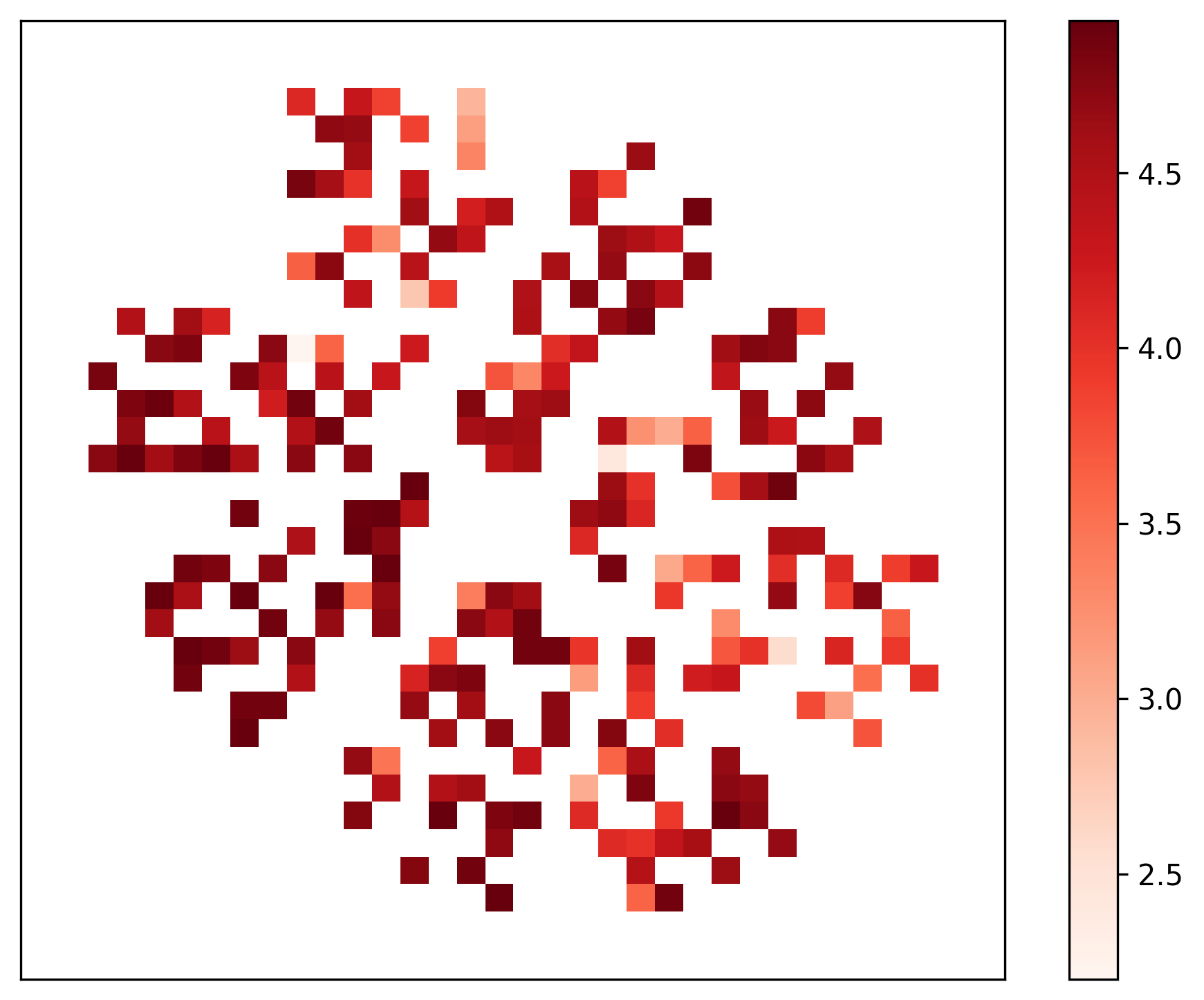
The image displays a heatmap-style visualization of data points arranged in a distinct, radially symmetric pattern. The data is organized into six primary clusters or "arms" that radiate outward from a central, empty void. The color of each data point corresponds to a numerical value, with a color gradient ranging from light red/white (lower values) to dark maroon (higher values). The visualization lacks explicit X or Y axis labels, suggesting this is a dimensionality reduction projection (such as t-SNE or UMAP) where the spatial positioning represents similarity between data points.
### Components/Axes
* **Main Plot Area:** A square field containing the data points. There are no numerical axes or grid lines.
* **Legend:** A vertical color bar located on the right side of the image.
* **Scale:** Ranges from 2.5 (bottom) to 4.5 (top).
* **Tick Marks:** Increments of 0.5 (2.5, 3.0, 3.5, 4.0, 4.5).
* **Color Mapping:**
* **White/Very Light Red:** Represents values near 2.5.
* **Medium Red:** Represents values near 3.5.
* **Dark Maroon:** Represents values near 4.5 and above.
### Detailed Analysis
The data is distributed into six distinct clusters arranged in a hexagonal formation.
* **Spatial Distribution:**
* **Central Void:** The center of the plot is completely empty, indicating a lack of data points in the central region of the projection.
* **Cluster Density:** The clusters are not uniform. Some clusters (e.g., the top-left and bottom-left) appear denser with more data points, while others (e.g., the right-hand side) appear slightly more sparse.
* **Value Distribution (Color Analysis):**
* **Core Values:** The "inner" edges of the clusters—those closest to the central void—consistently exhibit the darkest maroon colors, corresponding to values in the 4.0–4.5+ range.
* **Peripheral Values:** The "outer" edges of the clusters, or the tips of the arms, tend to transition toward lighter red and white, corresponding to values in the 2.5–3.0 range.
* **Gradient Trend:** There is a clear visual gradient within each cluster: high-value "cores" transitioning to lower-value "peripheries."
### Key Observations
* **Radial Symmetry:** The plot exhibits a high degree of six-fold rotational symmetry.
* **Value-Position Correlation:** The data suggests a strong correlation between the "centrality" of a point within its cluster and its numerical value. The most extreme values (darkest red) are clustered toward the center of the overall plot, while the lower values (lighter red) are pushed toward the outer boundaries.
* **Cluster Separation:** The clusters are well-defined with clear gaps between them, suggesting that the underlying data represents six distinct categories or states that are mathematically distant from one another.
### Interpretation
This visualization is characteristic of a dimensionality reduction technique applied to a dataset with six distinct classes or clusters.
* **Data Meaning:** The "hole" in the center suggests that the data points are inherently repelled from a central origin, or that the algorithm used to generate this plot (e.g., t-SNE) has pushed the clusters apart to maximize separation.
* **Structural Significance:** The fact that the highest values (darkest red) are located at the "inner" part of each cluster suggests that the "core" of each category represents the most prototypical or intense version of that data type. The lower values (lighter red) at the periphery likely represent data points that are more ambiguous or transitional, sitting on the boundary between the core of their cluster and the "empty space" between clusters.
* **Anomaly/Outlier Note:** There are no significant outliers; the data is tightly constrained within the six defined arms, indicating a very clean, well-separated dataset.