\n
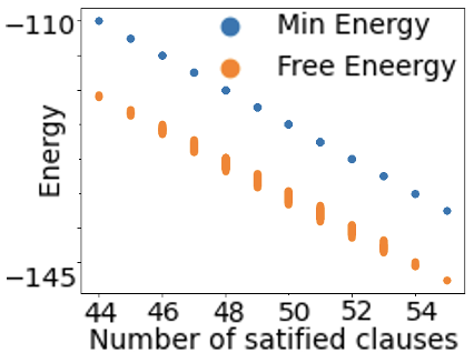
## Scatter Plot: Energy vs. Number of Satisfied Clauses
### Overview
The image is a scatter plot comparing two energy metrics ("Min Energy" and "Free Eneergy") against the "Number of satisfied clauses." The plot shows a clear negative correlation for both data series, where energy values decrease as the number of satisfied clauses increases.
### Components/Axes
* **X-Axis:**
* **Label:** "Number of satisfied clauses"
* **Scale:** Linear, ranging from 44 to 54.
* **Major Tick Marks:** 44, 46, 48, 50, 52, 54.
* **Y-Axis:**
* **Label:** "Energy"
* **Scale:** Linear, ranging from approximately -145 to -110.
* **Major Tick Marks:** -145, -130, -110.
* **Legend:**
* **Position:** Top-right corner of the plot area.
* **Series 1:** "Min Energy" represented by blue circles.
* **Series 2:** "Free Eneergy" represented by orange circles. (Note: "Eneergy" appears to be a typographical error for "Energy").
### Detailed Analysis
The plot contains two distinct data series, each with 11 data points corresponding to integer values of the x-axis from 44 to 54.
**1. Data Series: "Min Energy" (Blue Circles)**
* **Visual Trend:** The blue points form a line that slopes downward from left to right, indicating a consistent decrease in "Min Energy" as the number of satisfied clauses increases.
* **Approximate Data Points (x, y):**
* (44, -110)
* (45, -112)
* (46, -114)
* (47, -116)
* (48, -118)
* (49, -120)
* (50, -122)
* (51, -124)
* (52, -126)
* (53, -128)
* (54, -130)
**2. Data Series: "Free Eneergy" (Orange Circles)**
* **Visual Trend:** The orange points also form a line that slopes downward from left to right, parallel to but consistently below the "Min Energy" series. This indicates "Free Eneergy" is always lower than "Min Energy" for the same number of satisfied clauses.
* **Approximate Data Points (x, y):**
* (44, -118)
* (45, -120)
* (46, -122)
* (47, -124)
* (48, -126)
* (49, -128)
* (50, -130)
* (51, -132)
* (52, -134)
* (53, -136)
* (54, -138)
### Key Observations
1. **Strong Negative Correlation:** Both energy metrics exhibit a near-perfect linear decrease as the number of satisfied clauses increases.
2. **Consistent Offset:** The "Free Eneergy" values are consistently lower than the "Min Energy" values by approximately 8 units across the entire range.
3. **Data Density:** There is exactly one data point for each integer value on the x-axis from 44 to 54, suggesting a systematic evaluation.
4. **Label Typo:** The legend contains a clear spelling error ("Eneergy").
### Interpretation
This chart likely originates from a field like computational physics, optimization theory, or machine learning (e.g., evaluating models like Boltzmann machines or energy-based models). The "Number of satisfied clauses" suggests a problem involving constraint satisfaction (like SAT solving).
The data demonstrates a fundamental trade-off: achieving a higher degree of constraint satisfaction (more clauses met) is associated with a lower system energy state. In many physical and computational systems, lower energy corresponds to a more stable or optimal configuration. The consistent gap between "Min Energy" and "Free Eneergy" suggests these are two related but distinct calculations of the system's energy, with "Free Eneergy" (likely "Free Energy," a key concept in statistical mechanics) being a more relaxed or entropic measure that is always lower than the strict "Min Energy." The linearity of the relationship is striking and implies a direct, predictable coupling between the objective (satisfying clauses) and the system's energy landscape.